橫浜拉麵 Yokohama Ramen
T Branding
AD Ting-An Ho
PM Ting-An Ho
SP LW Design
HD Szu&Yu Design
PH YHLAA
Year 2024
類別 品牌塑造
藝指 何庭安
專管 何庭安
空間 龍圍設計
內裝 細述設計
攝影 李易暹
年份 2024
AD Ting-An Ho
PM Ting-An Ho
SP LW Design
HD Szu&Yu Design
PH YHLAA
Year 2024
類別 品牌塑造
藝指 何庭安
專管 何庭安
空間 龍圍設計
內裝 細述設計
攝影 李易暹
年份 2024
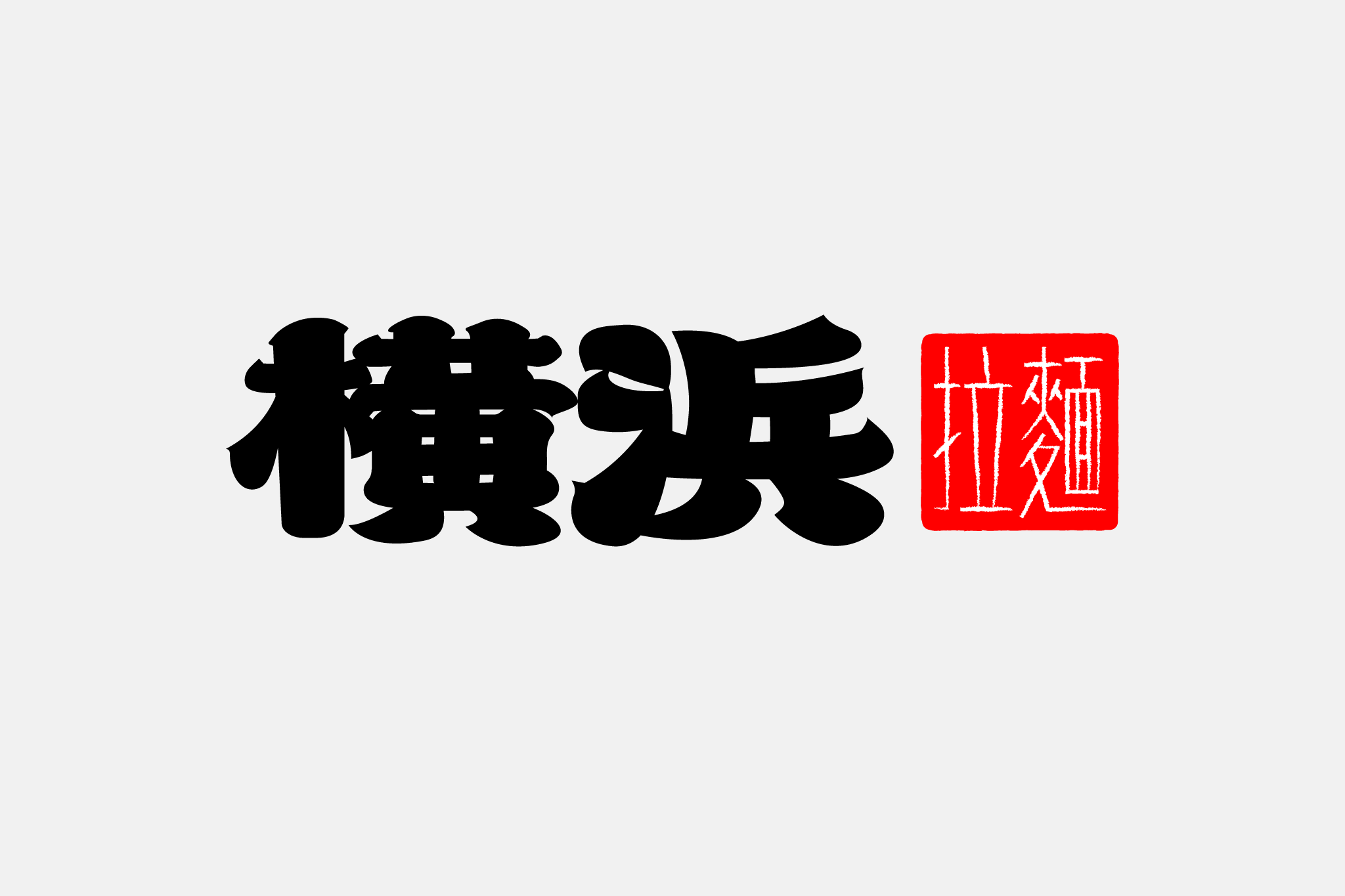
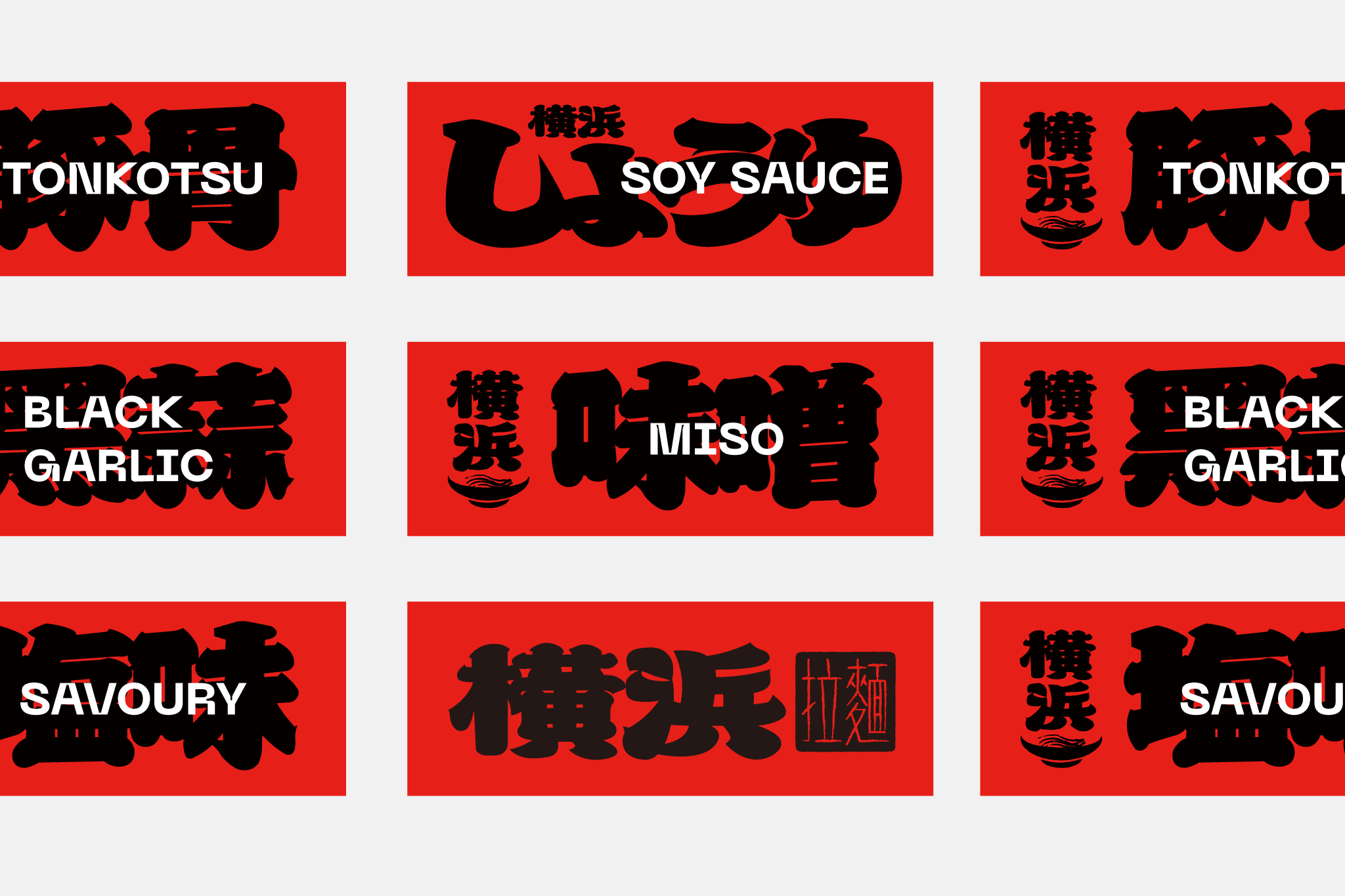
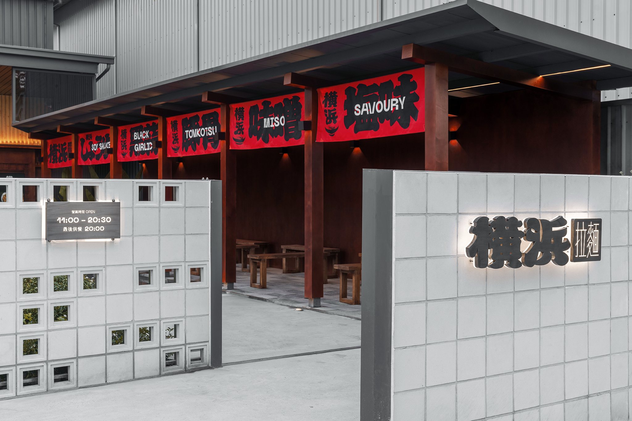
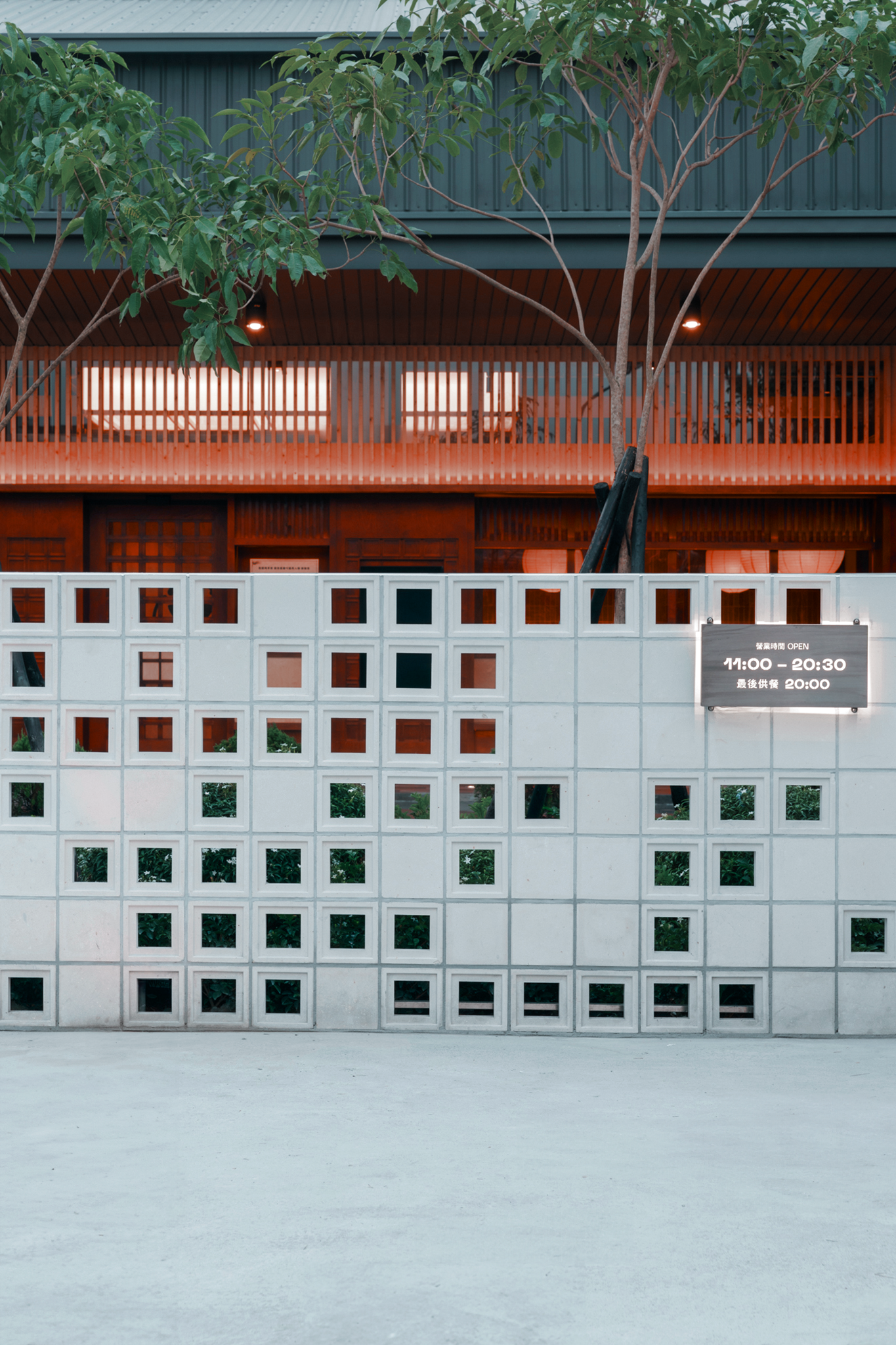
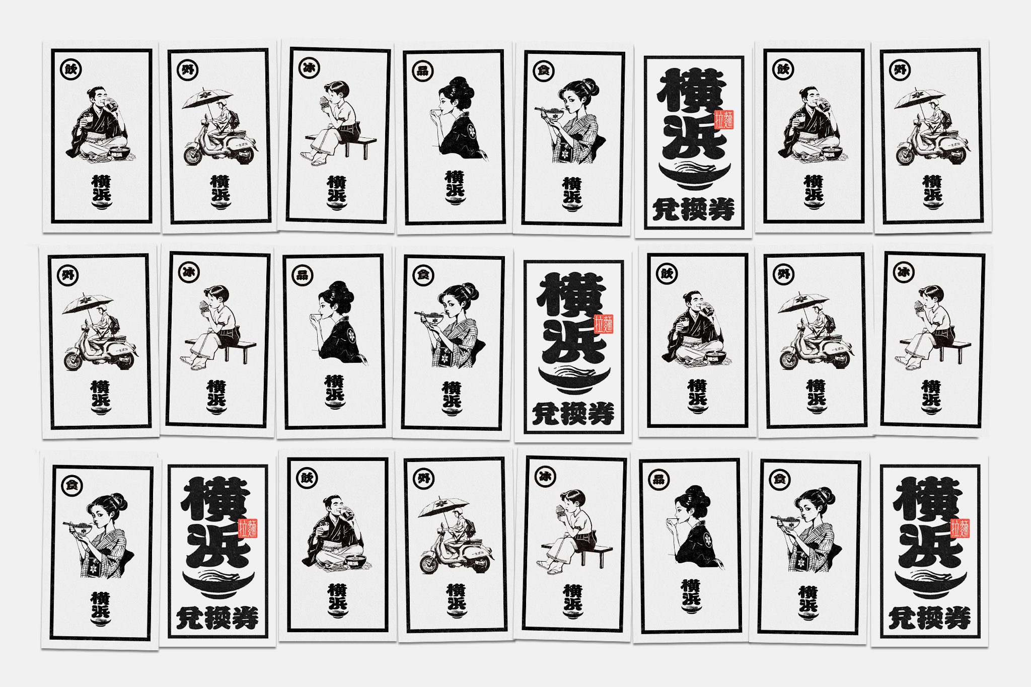
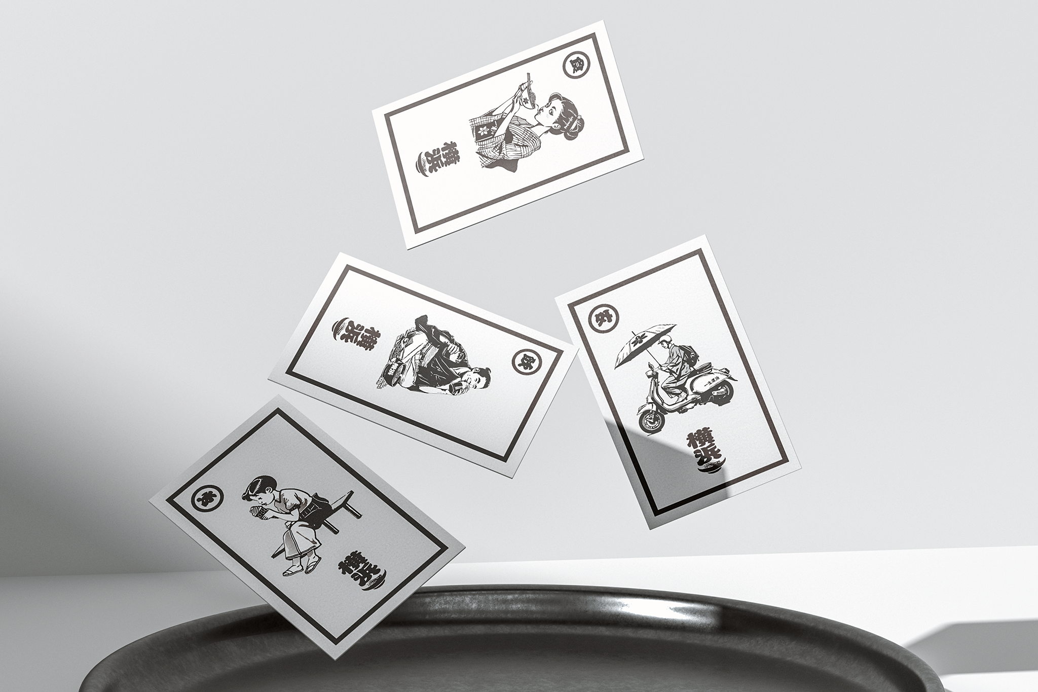
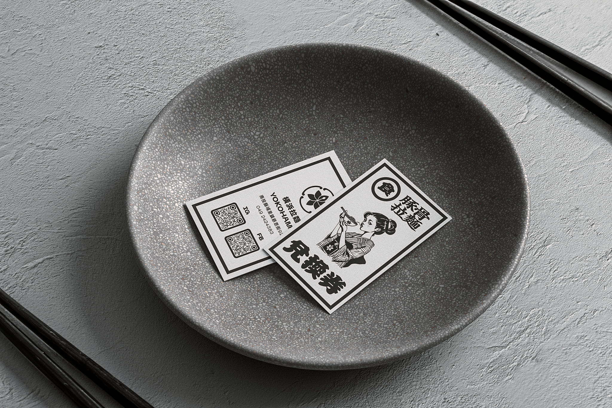
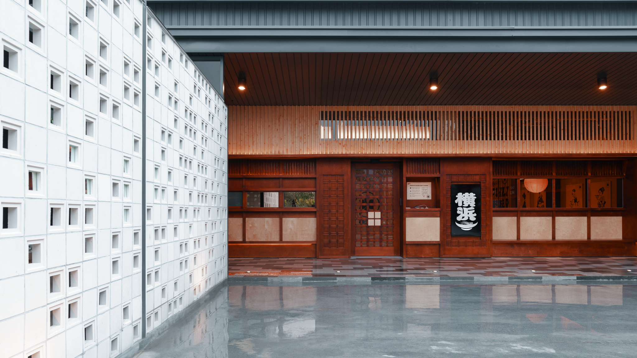
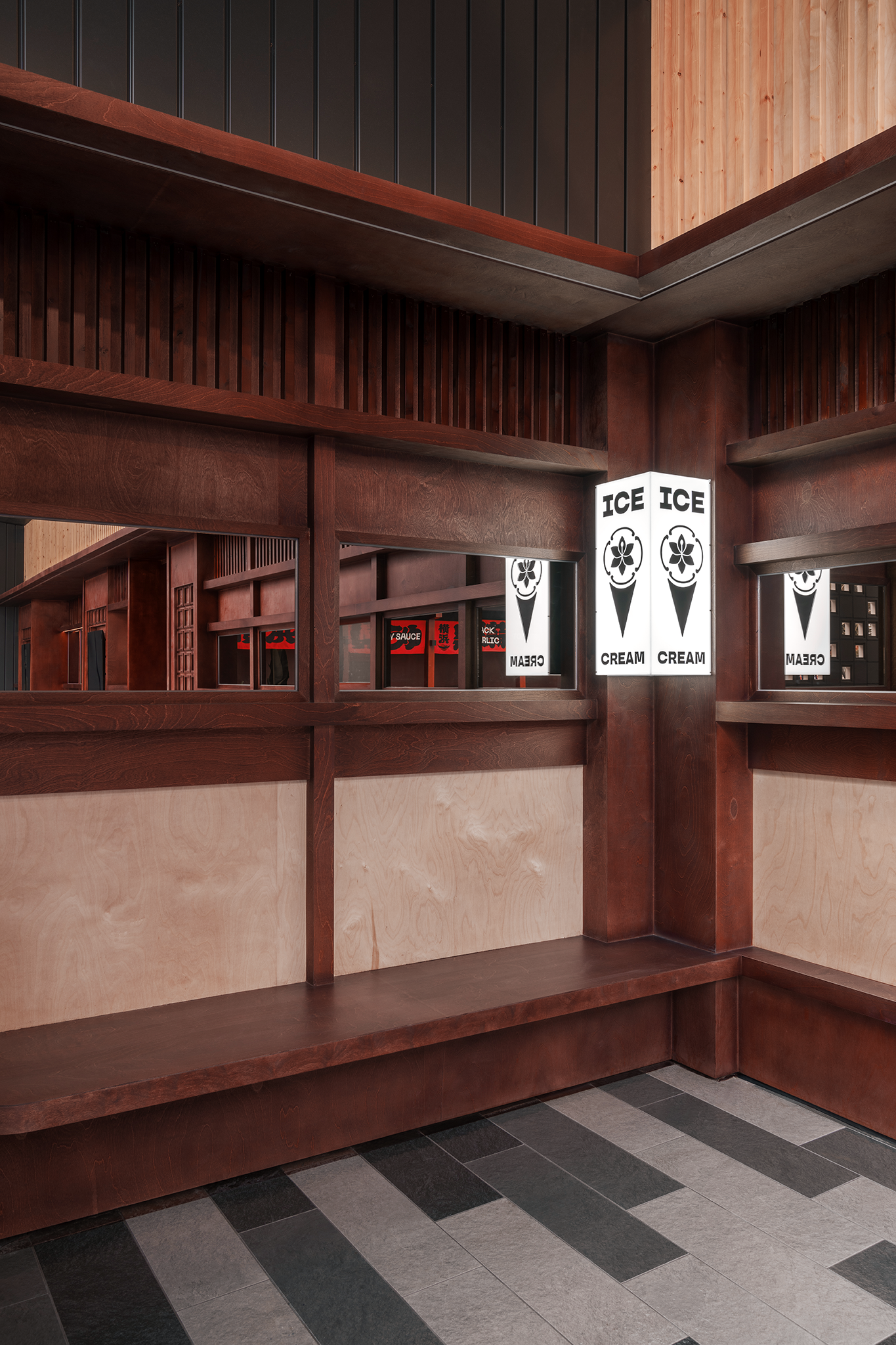
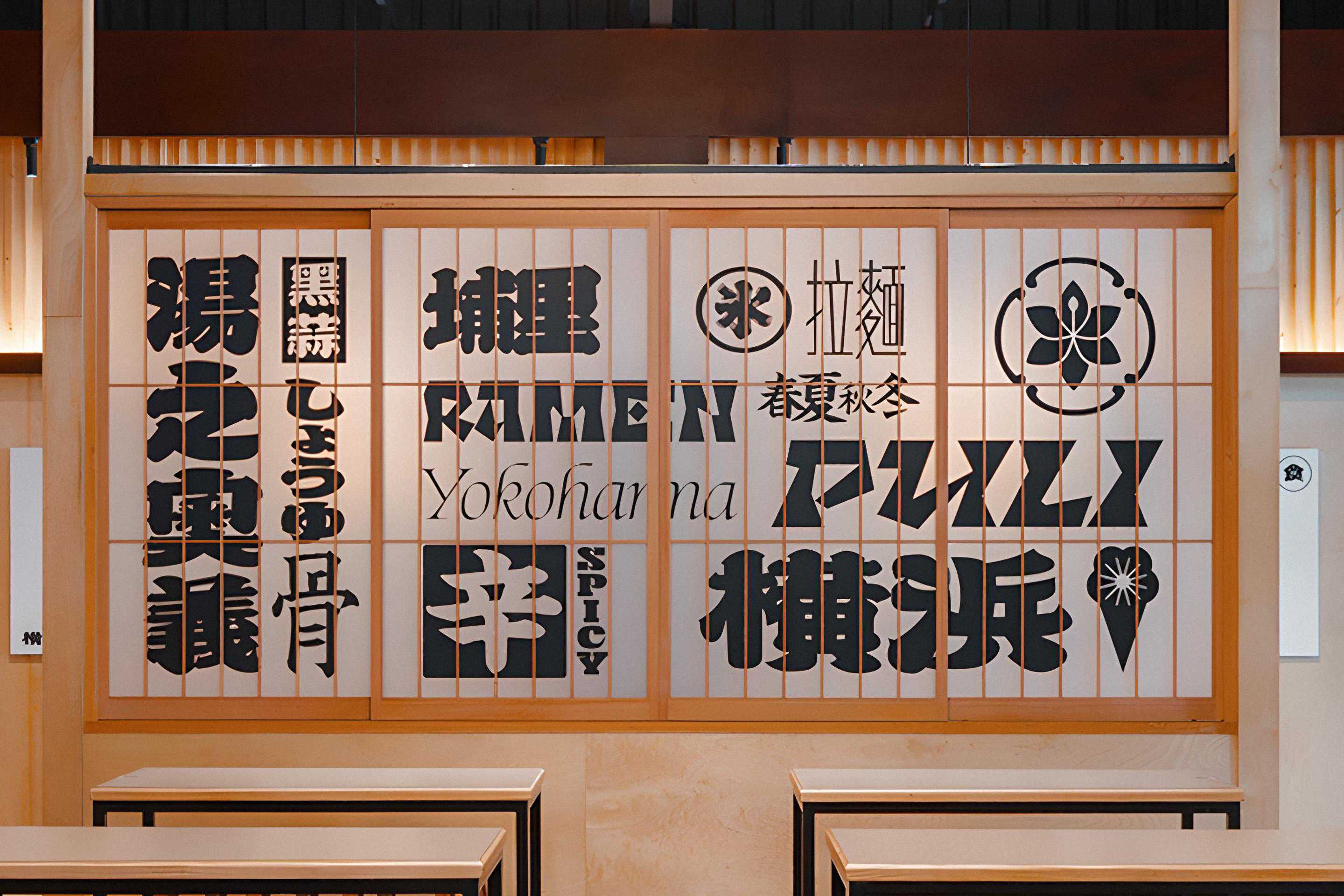
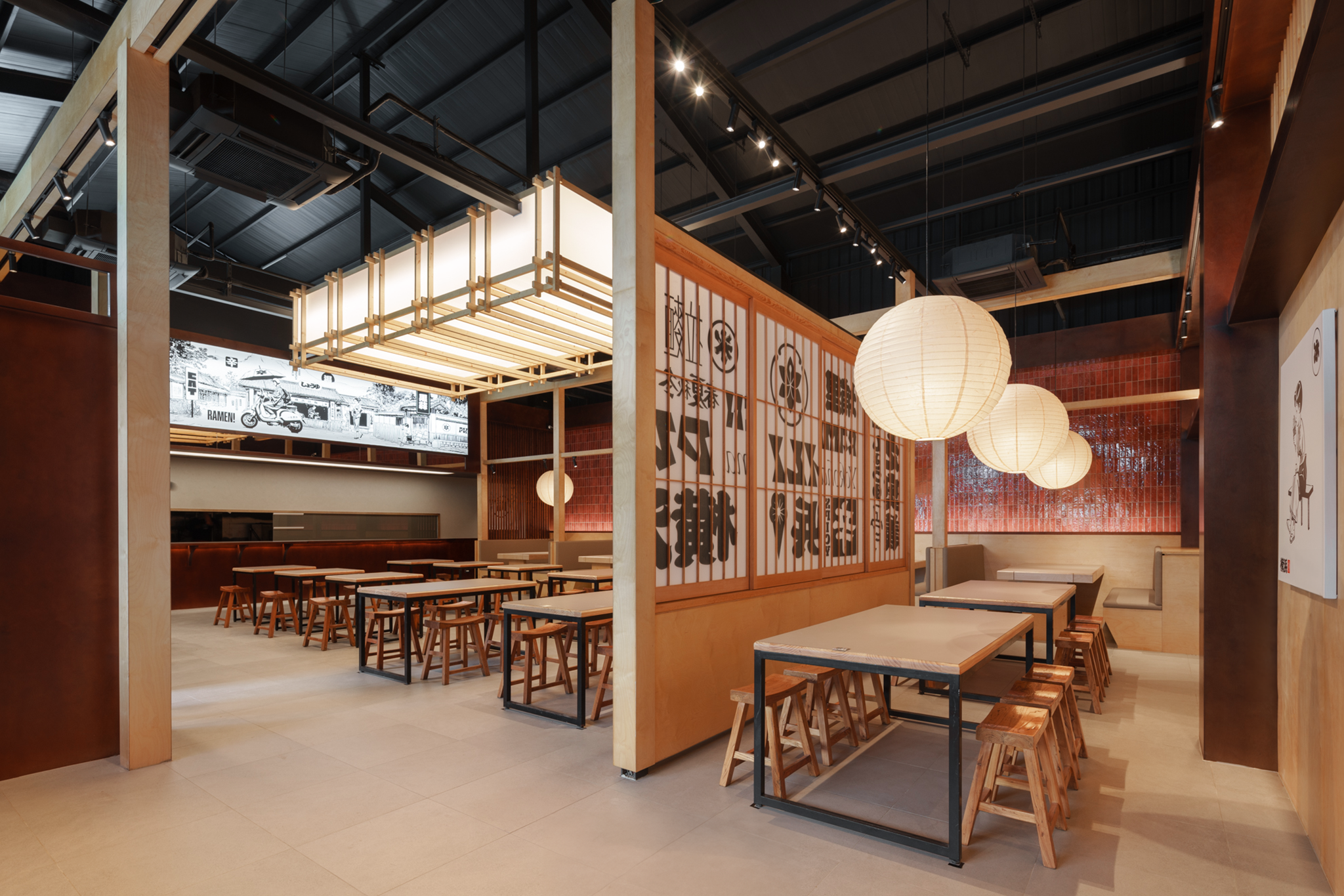
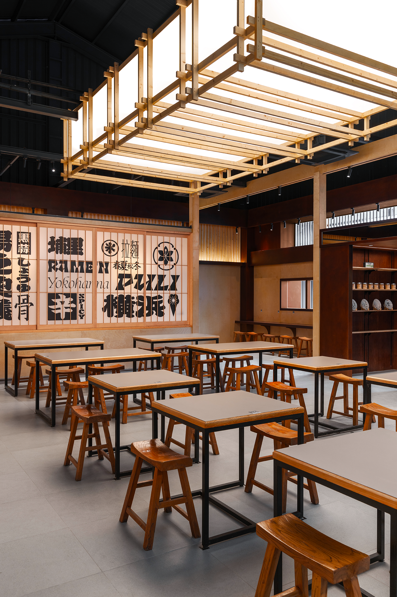
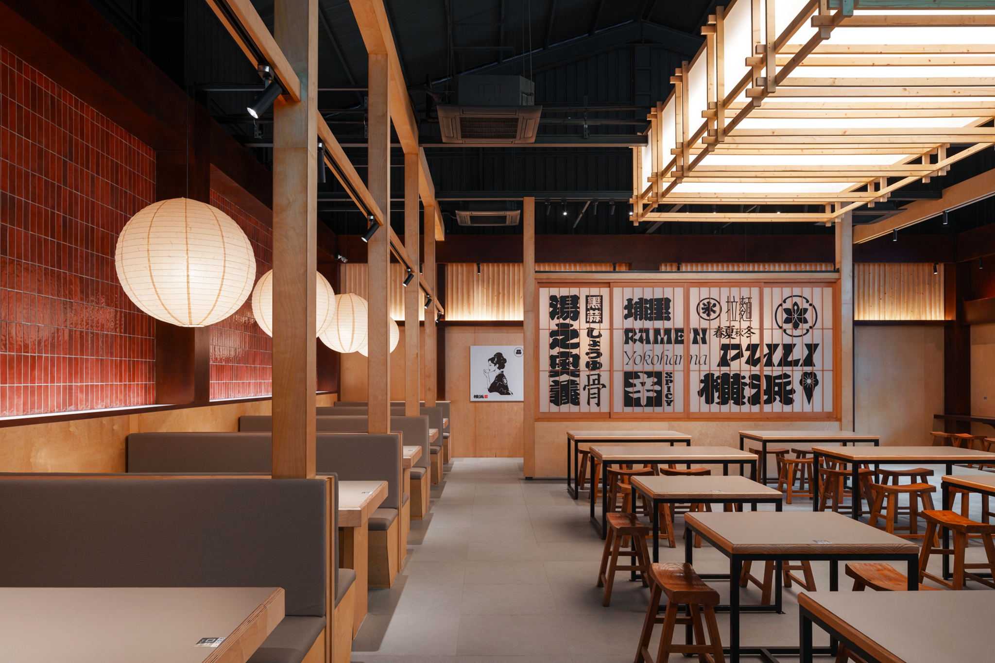
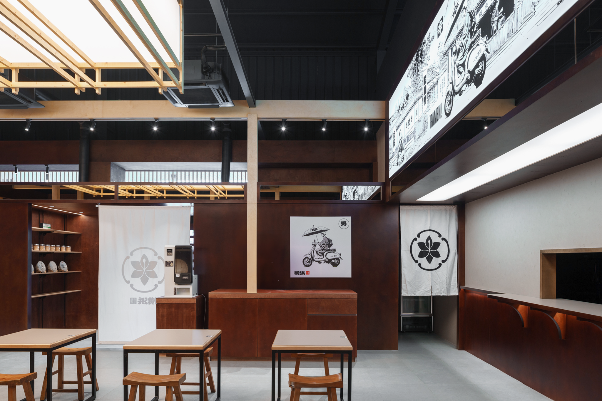
Inspired by the flavours and techniques of Yokohama, Japan, Yokohama Ramen in Puli, Nantou, has been a local favourite for over a decade. As the brand entered a phase of expansion in 2024, we were commissioned to redesign its visual identity and branding. The primary typography for "橫濱" ("Yokohama") combines Edo-period lantern-style characters with Taiwan’s bold calligraphy, creating a full-bodied, handwritten feel. A red square seal with "拉麵" ("ramen") adds a retro touch and vibrant contrast. Reflecting the brand’s focus on innovative Taiwanese flavours rather than strict tradition, we adopted a sleek black-and-white palette and local Puli-inspired illustrations, crafting a modern and distinctive ramen brand image.
承襲自日本橫浜的口味與訓練,位於南投埔里的橫浜拉麵自開幕後十數年來一直廣受當地歡迎,成為融合台灣與日本的代表性拉麵品牌。2024年,由於品牌進入擴店與升級的階段,因此委託我們設計視覺識別與品牌塑造。因應橫濱拉麵的品牌塑造方向,主體文字「橫濱」 參考了大量江戶時代常用的燈籠文字,並同時融合台灣常用厚實的楷體字,字體飽滿有力,略帶手寫的筆觸營造出當代的書法字體感受,而右方的小紅色印章標示「拉麵」,以紅色方形印章形式呈現,增添一絲復古感,同時提供了視覺上的對比,使整體設計更具色彩明度。正因橫浜拉麵的品牌定位不以嚴肅、古法著稱,而是融合台灣味道的自創口味,因此我們在地域感上刻意跳脫特定國家的風格,以當代而俐落的黑白色與大量描繪當地埔里人文特色的插畫,逐步構築出這個跳脫傳統拉麵的品牌形象。















Full Credit
Client: Yokohama Ramen
Art director: Ting-An Ho
Project Management: Ting-An Ho
Space Arrangement: LW Design
Hardware: Szu&Yu Design and Research Office
Photography: YHLAA, Ting-An Ho
Year: 2024
Awards
iF Design Award 2026 - Award Winner
Related Projects: