Bar Pine 松
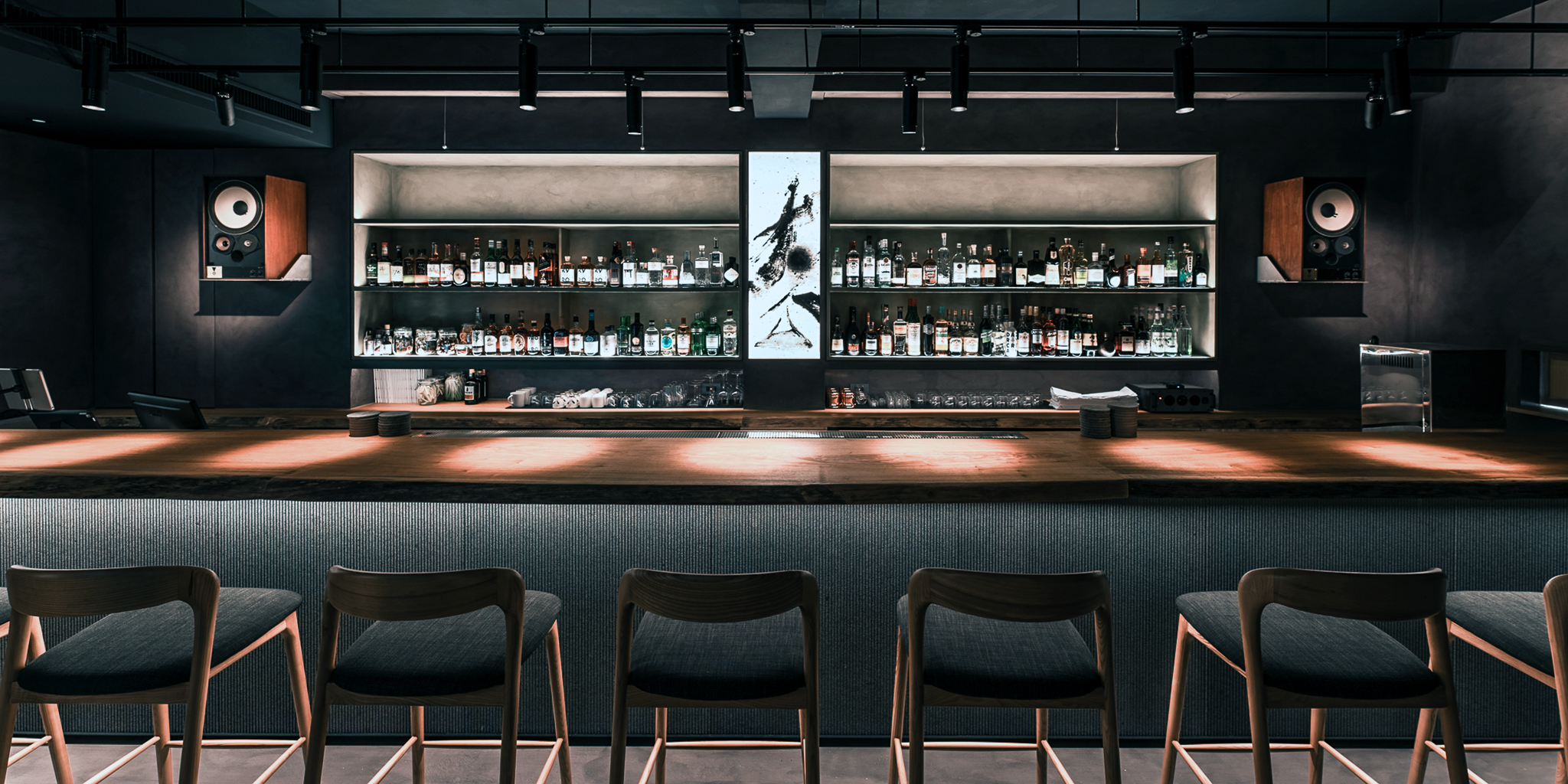
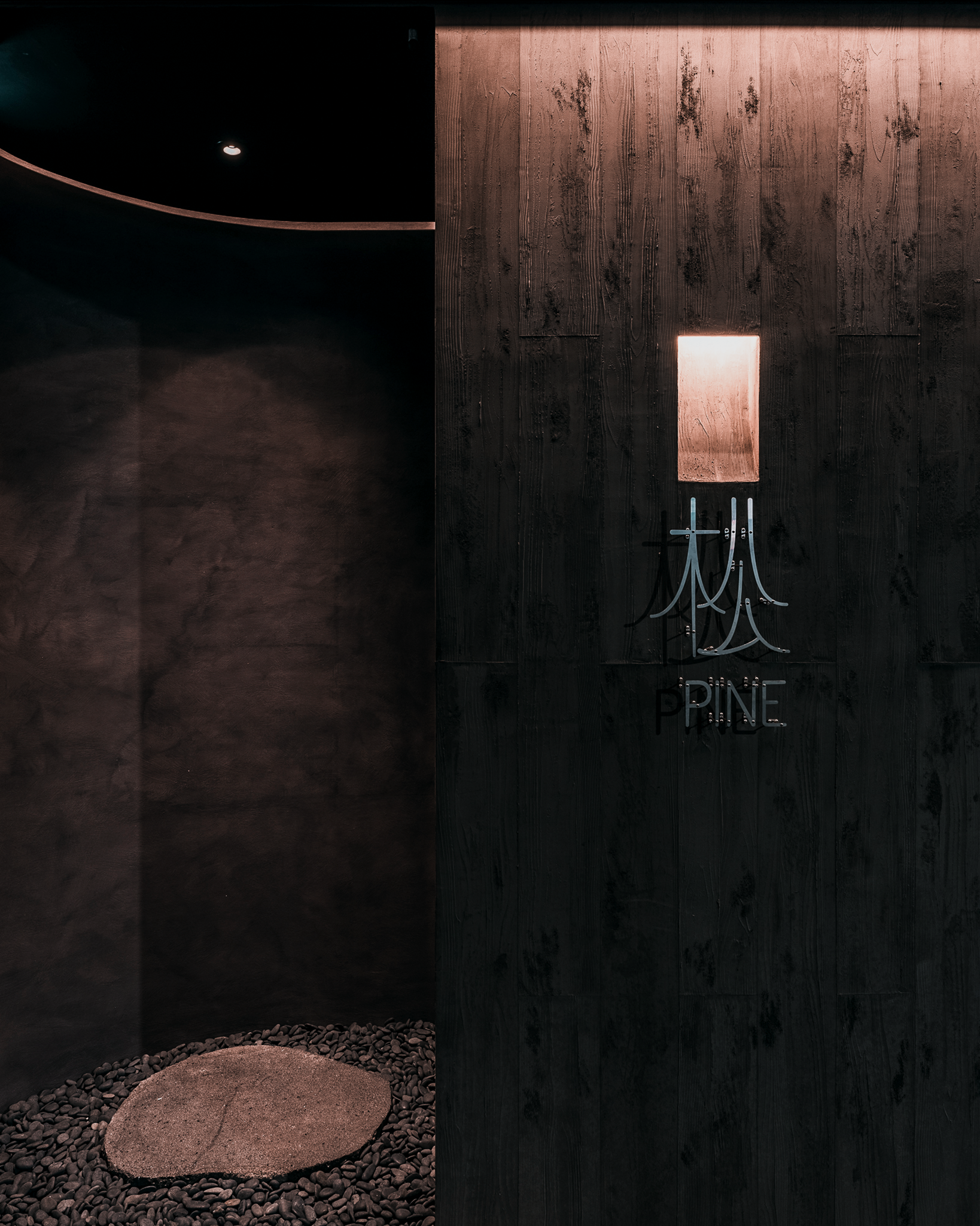
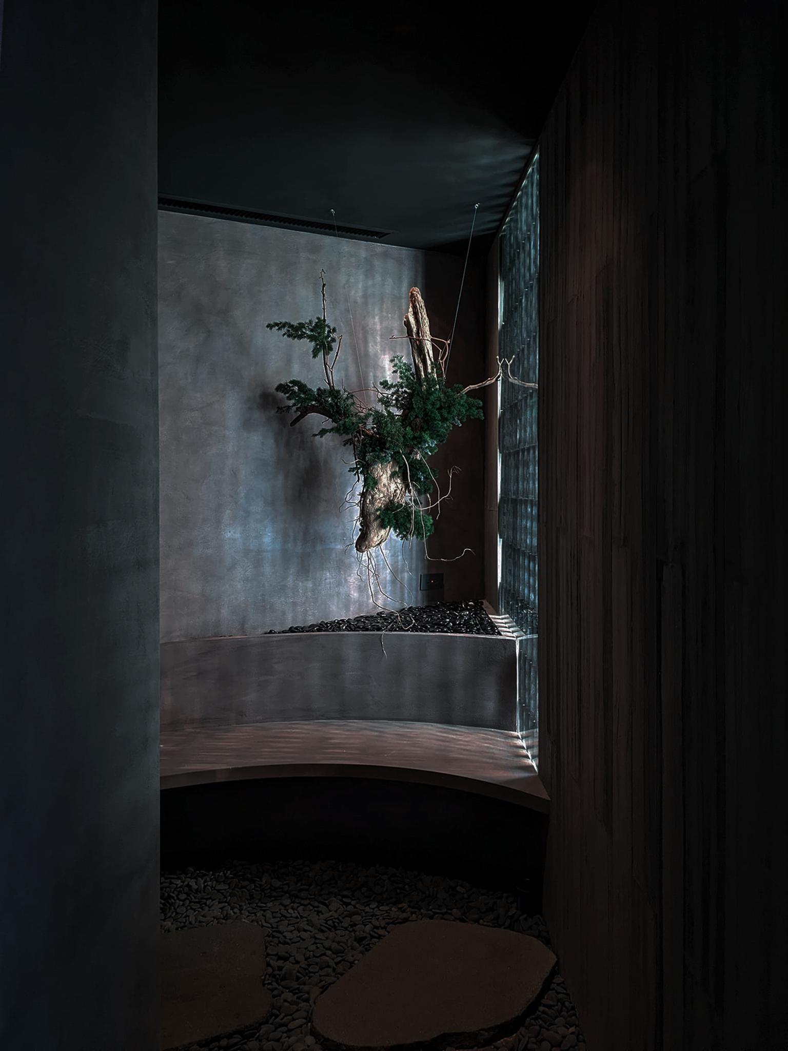
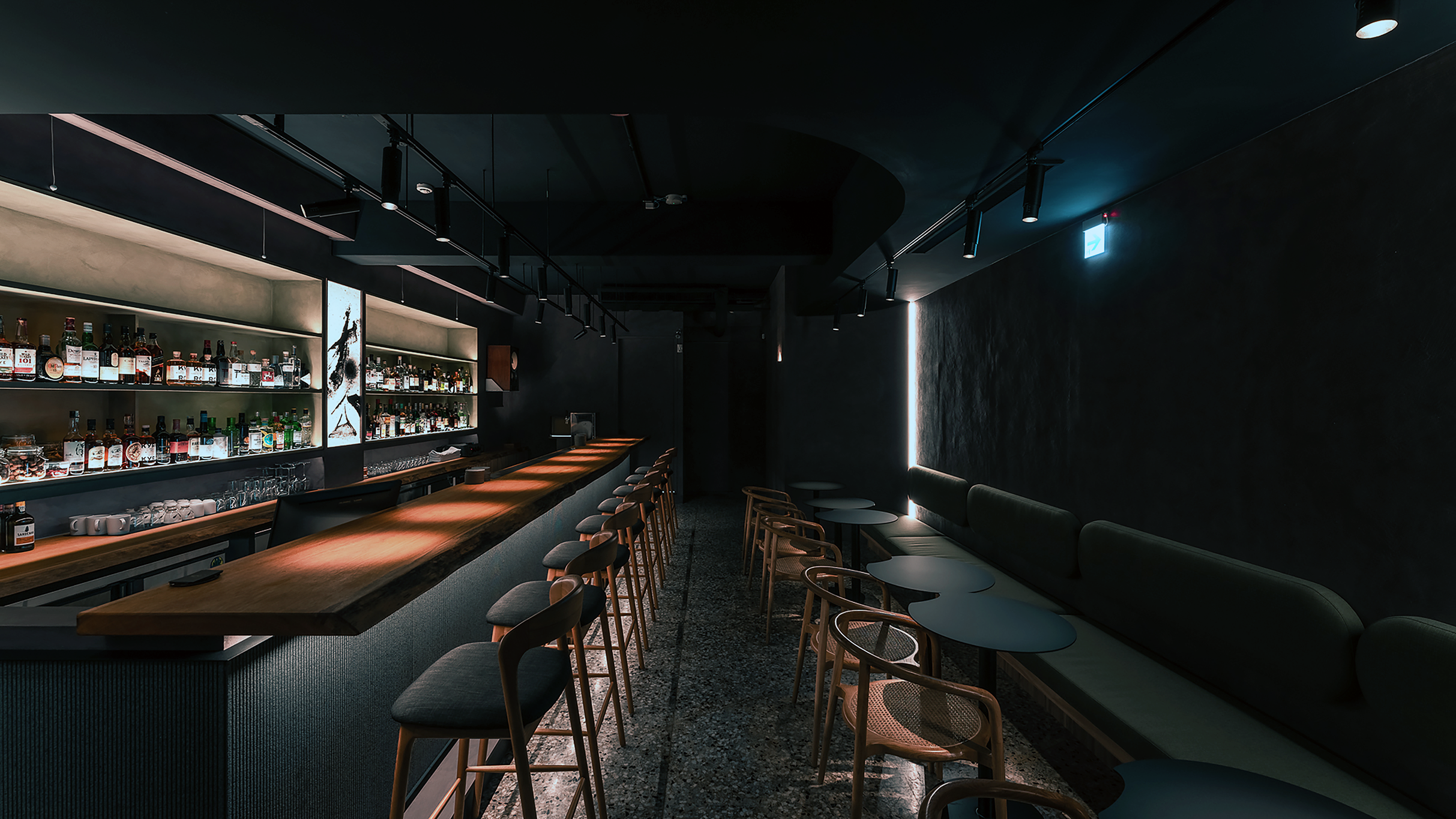
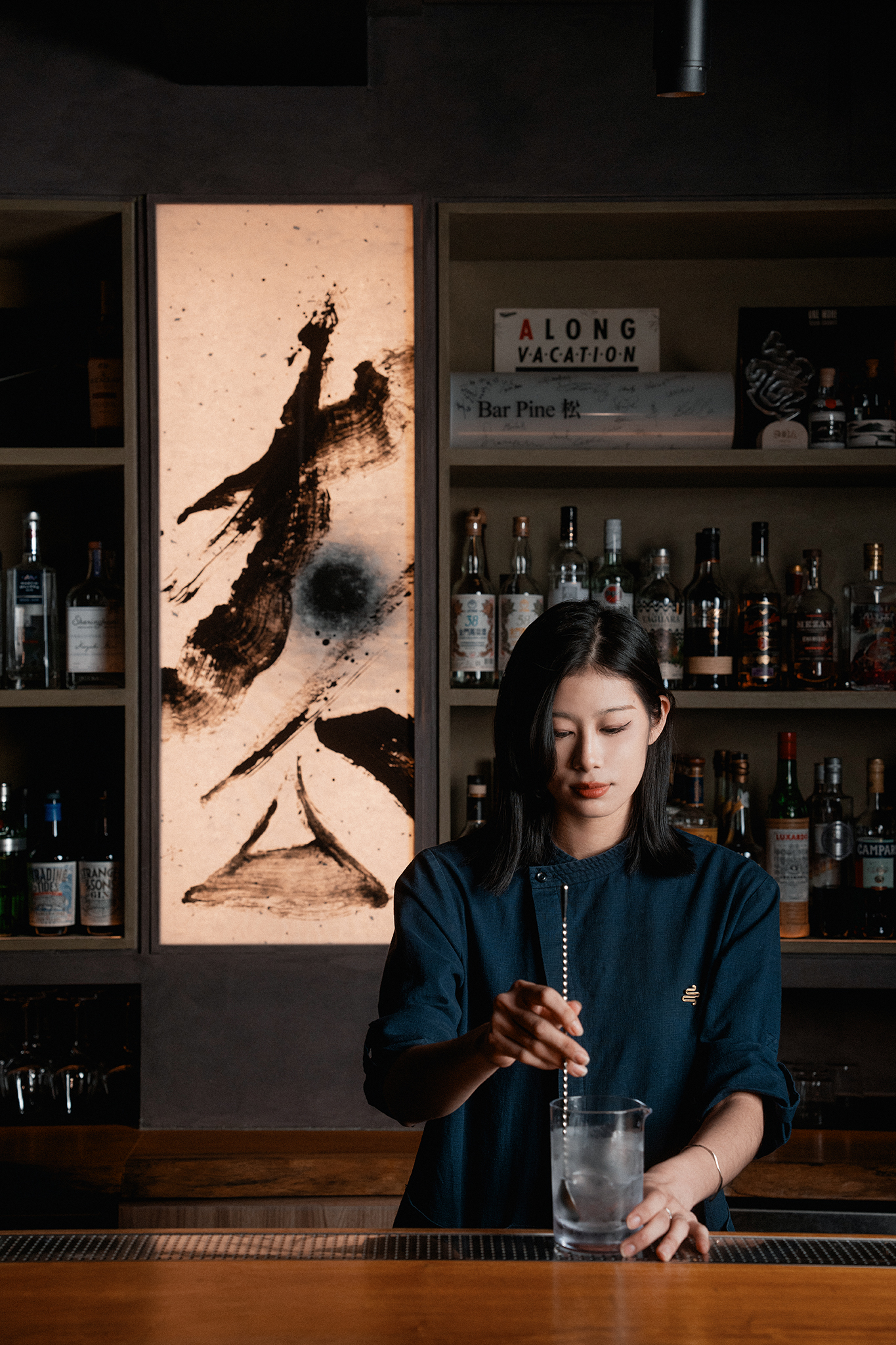
坐落於信義安和文昌街的一家酒吧,以「文化發生之處」為目標於今年九月開業。由於這家店頂樓的松柏、由於前身為木材行的店址、由於酒與木的不可割捨而得名 ——「Pine 松」。東方人自古就有把松樹連結以孤高、低調的投射,也是與梅、竹並稱的歲寒三友,這種「不畏嚴寒」「靜佇高處」的個性我認為也非常吻合 Bar Pine 的性格。
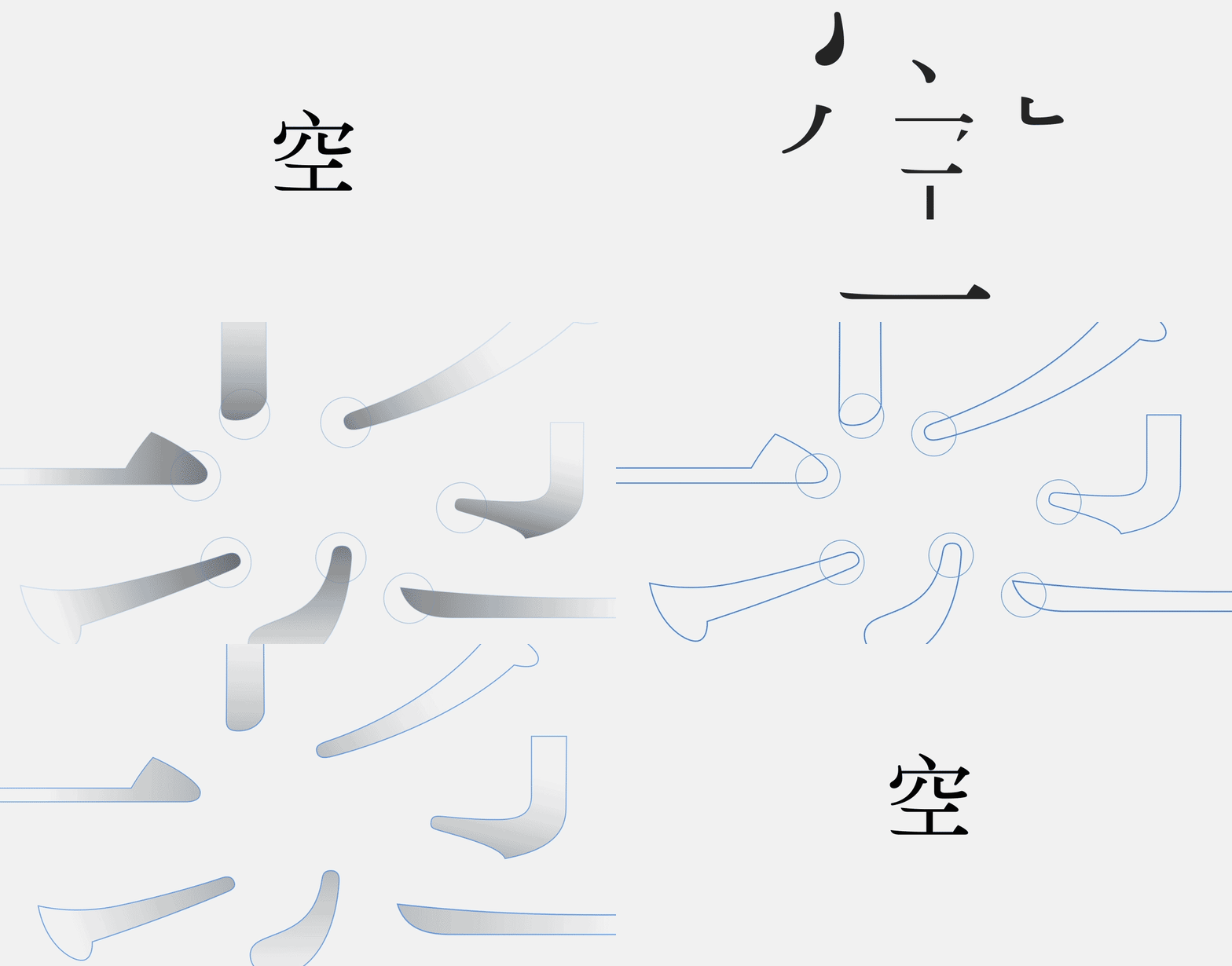
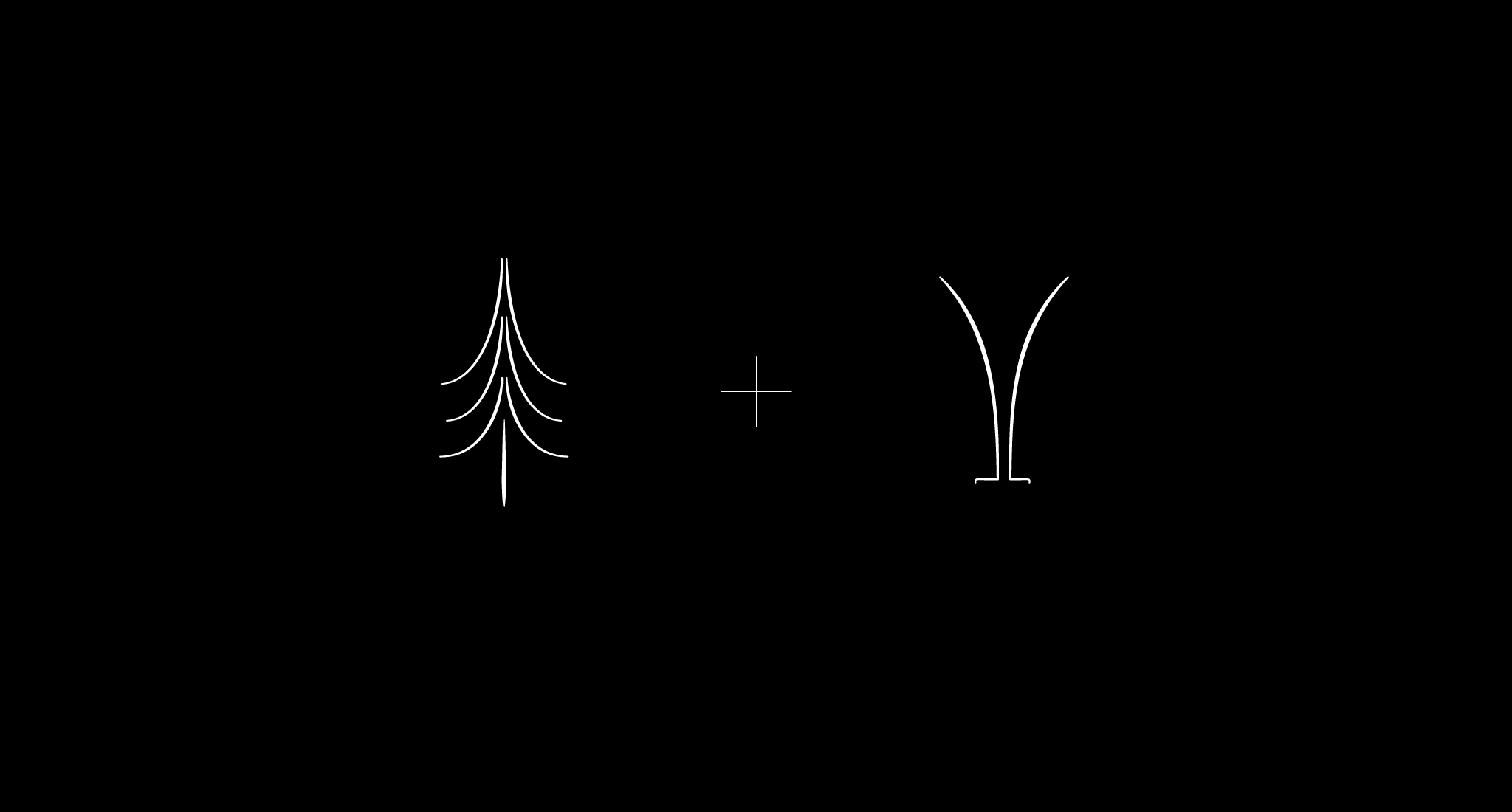
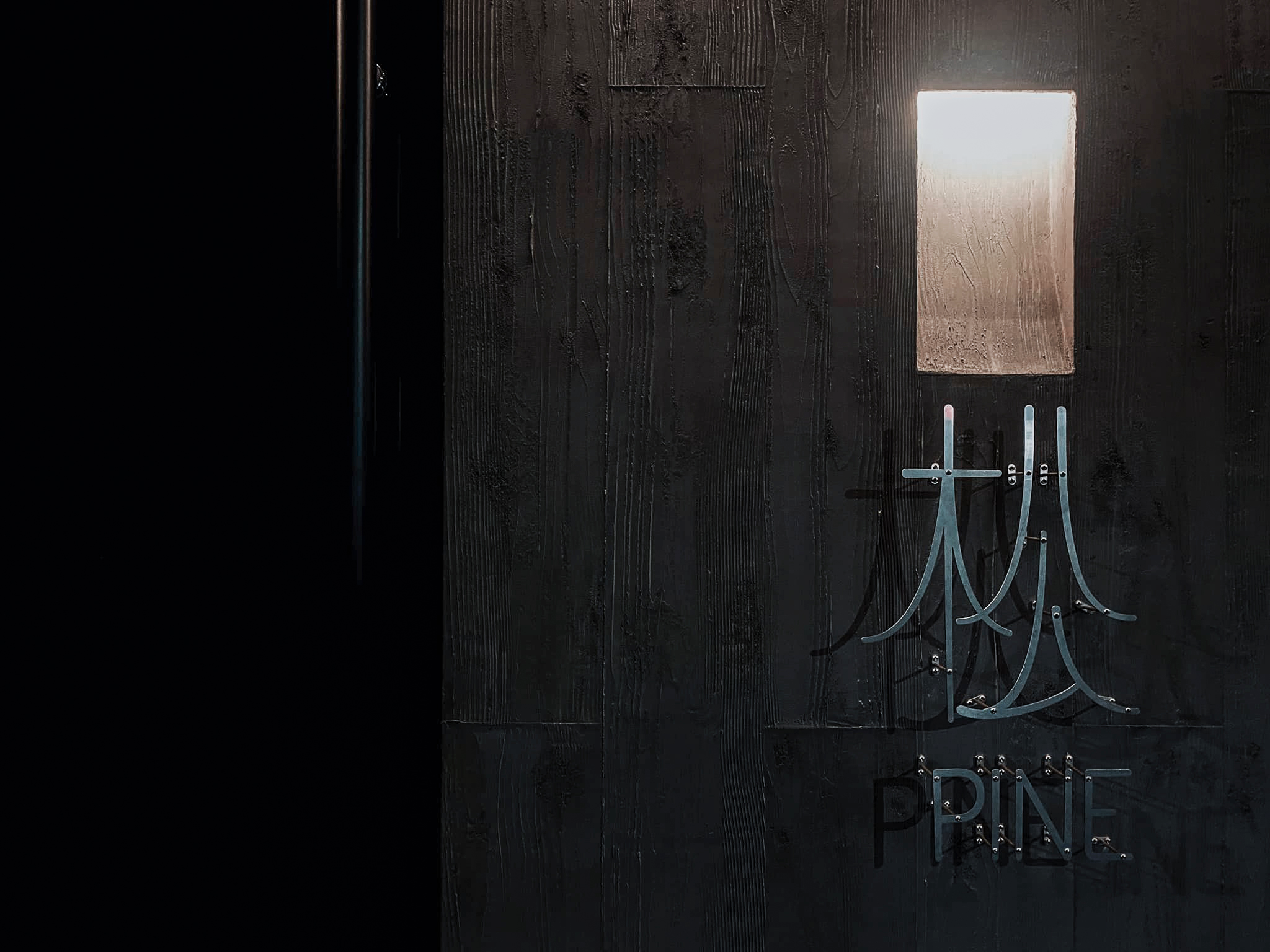
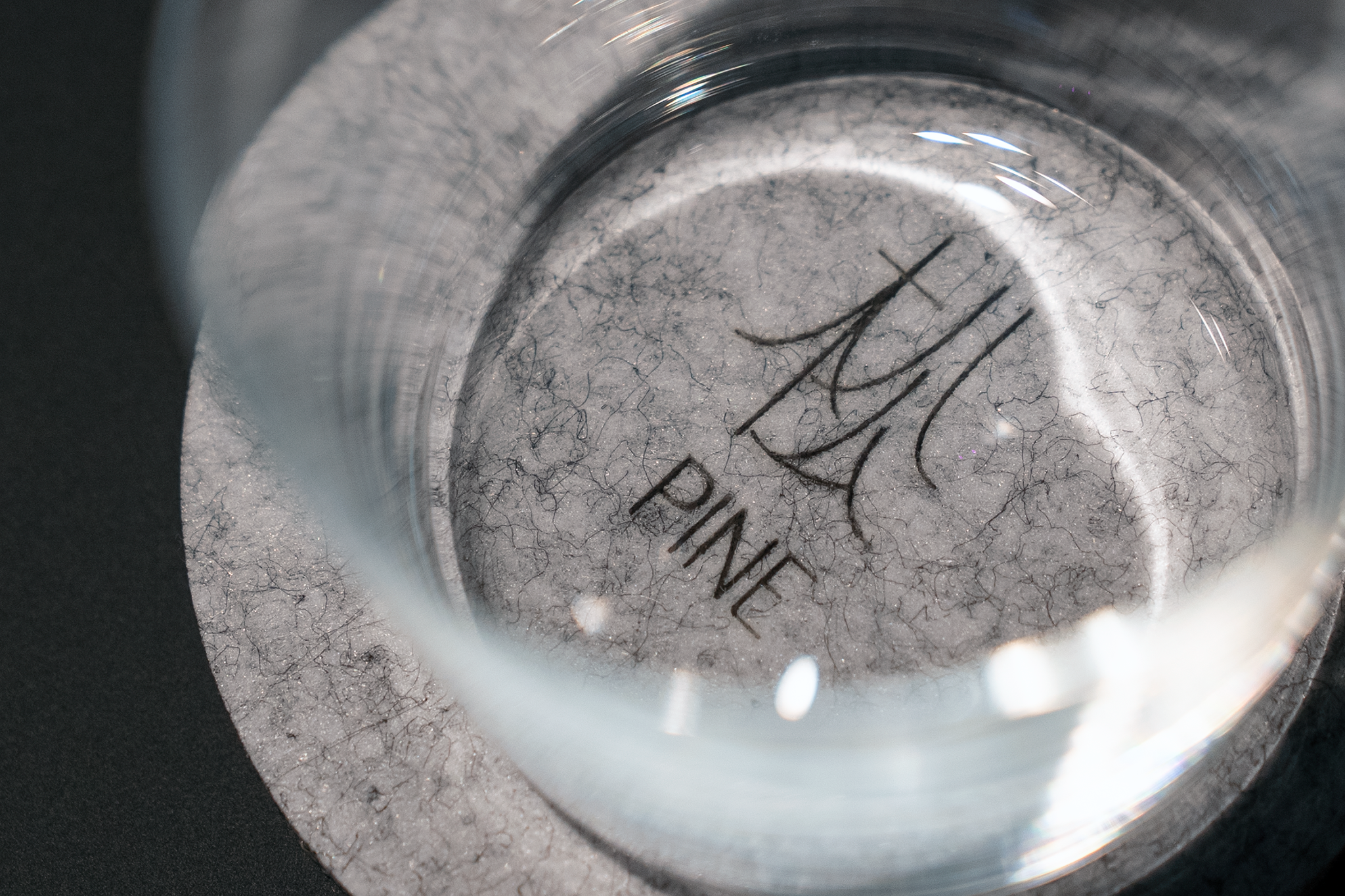
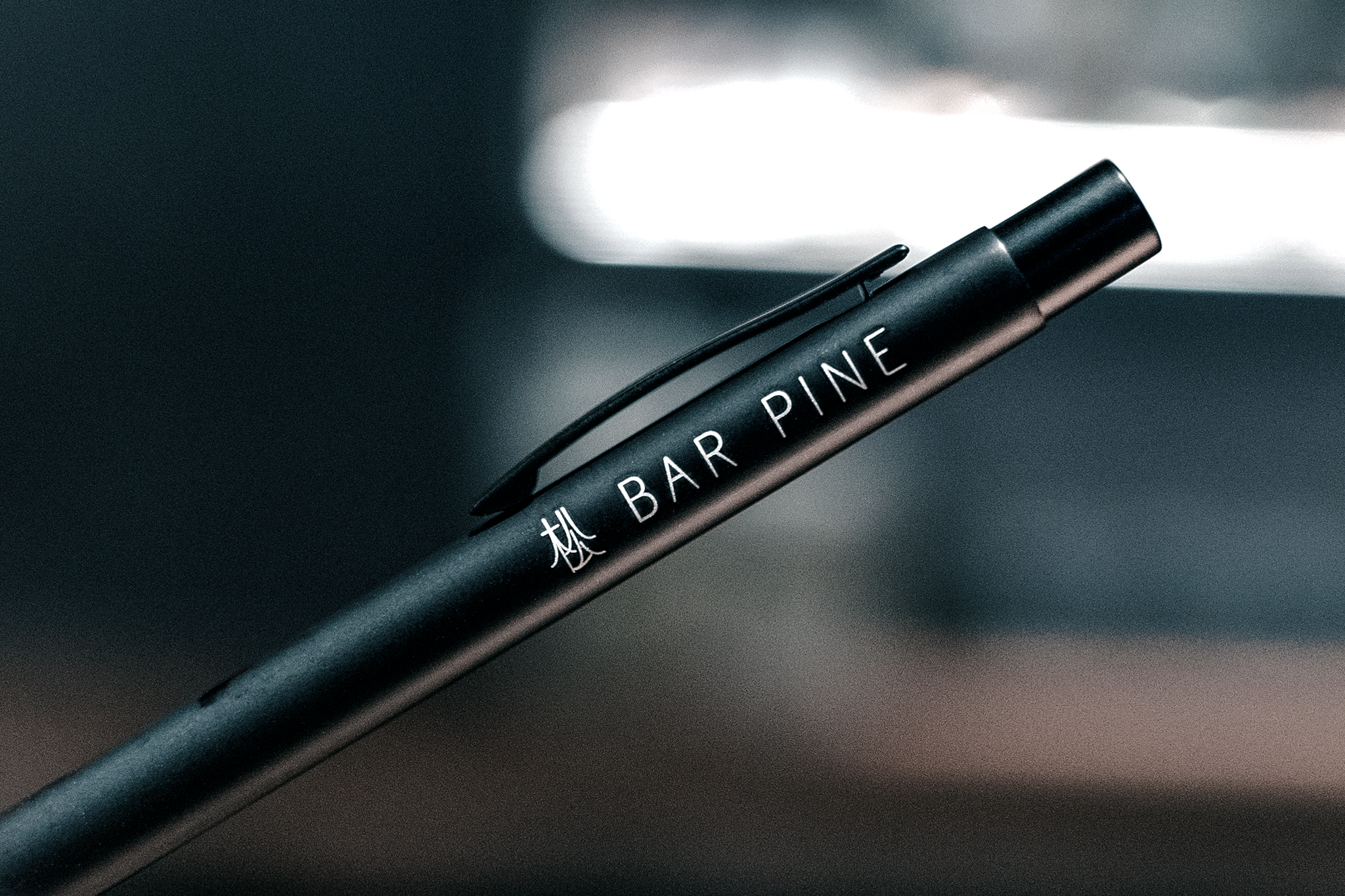
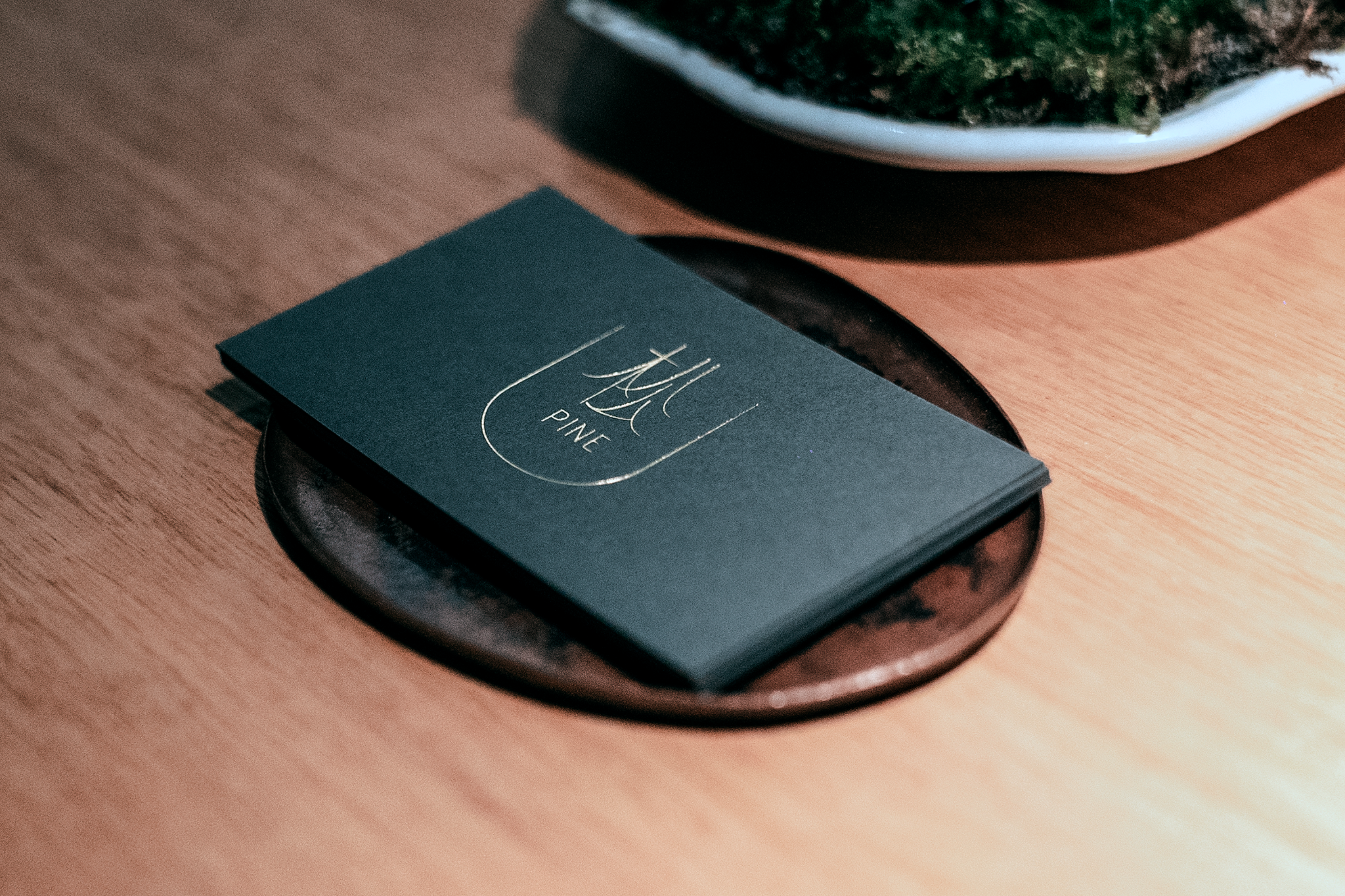
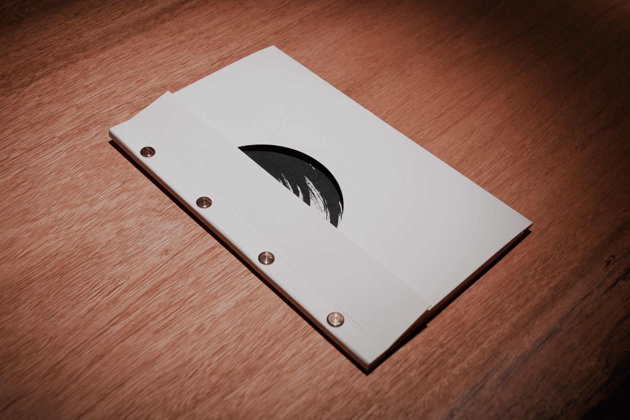
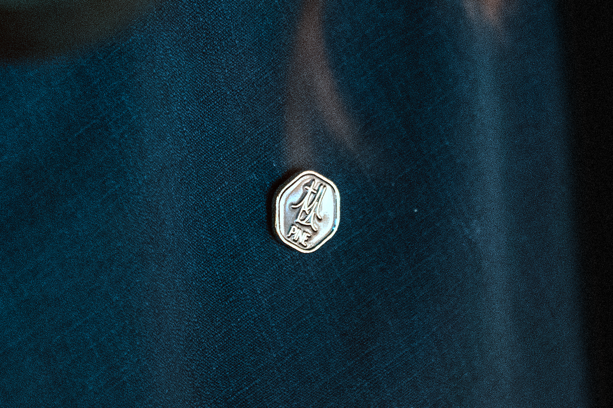
因此在決定標誌款式時,為求如松般低語的形象,我們刻意不直接把松樹的圖案畫進 Logo(Pictoral) 的寫實作風,也避免從英文「Pine」的筆畫去發想風格 (Lettering wordmark),而是將具有當代筆觸的文字:「松」單獨一字做成簡潔的圖標,配置上緊貼松樹的造型,彰顯它的低調、文雅與孤高。
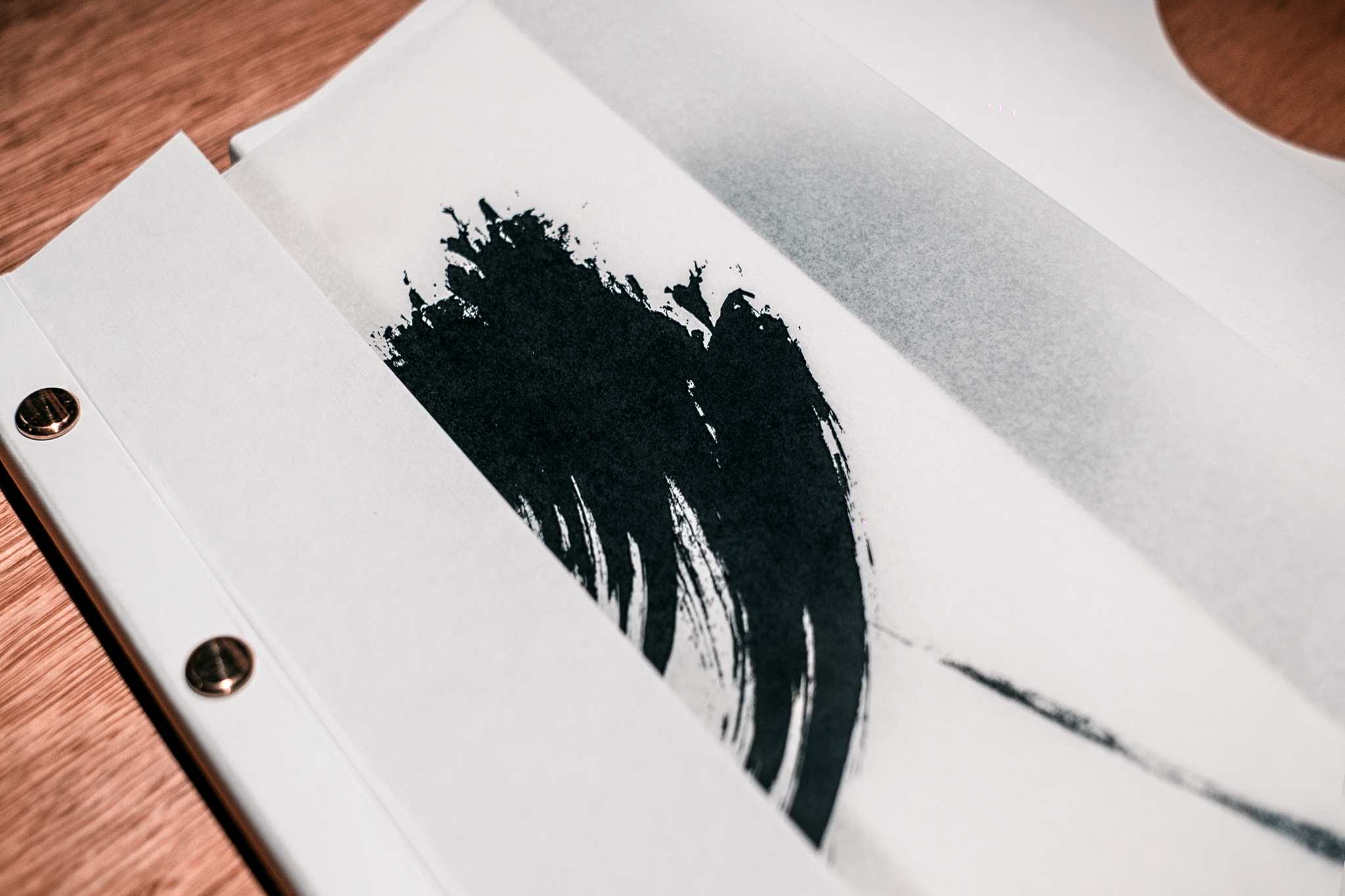
此外,在決定延伸圖標時,我們內部也有一個設計共識,就是「不刻意去追求形式的東方」,運用工筆畫秀麗的筆觸與輪廓,但不直接使用毛筆與水墨的質地,並在視覺上追求「勾勒」而非「繪製」的氣質,藉由細緻而簡潔的線條與用色,簡單幾筆捻出如松般低語的識別系統。
Bar Pine is a bar located in Taipei, the name comes from the fact that there is an old pine tree on the top floor, and also because the location used to be a lumber shop. We decide not to deliberately imitate any specific style, instead we wanted it to exude a “Contemporary Oriental” feeling. Oriental writers have often linked the pine tree with the words “Elegant”, "Loneliness" and "Low-Key" since ancient times. It is also known as the “Three Friends of Winter” with plum and bamboo. I think this hardy, solitary personality fits the bar image very well. When deciding the style of the logo, in order to seek the image of whispering like a pine tree, we deliberately didn’t directly draw the pattern of the pine tree into the logo, and also avoided thinking about the letting of English words, but made the Chinese character "松”(Pine) as a simple icon, and because Chinese characters are pictographs, the slender strokes are already very similar to the shape of a pine tree.














Full Credit ::
Client: Bar Pine
Host: Ariel Hou, Yen-Weng Fang
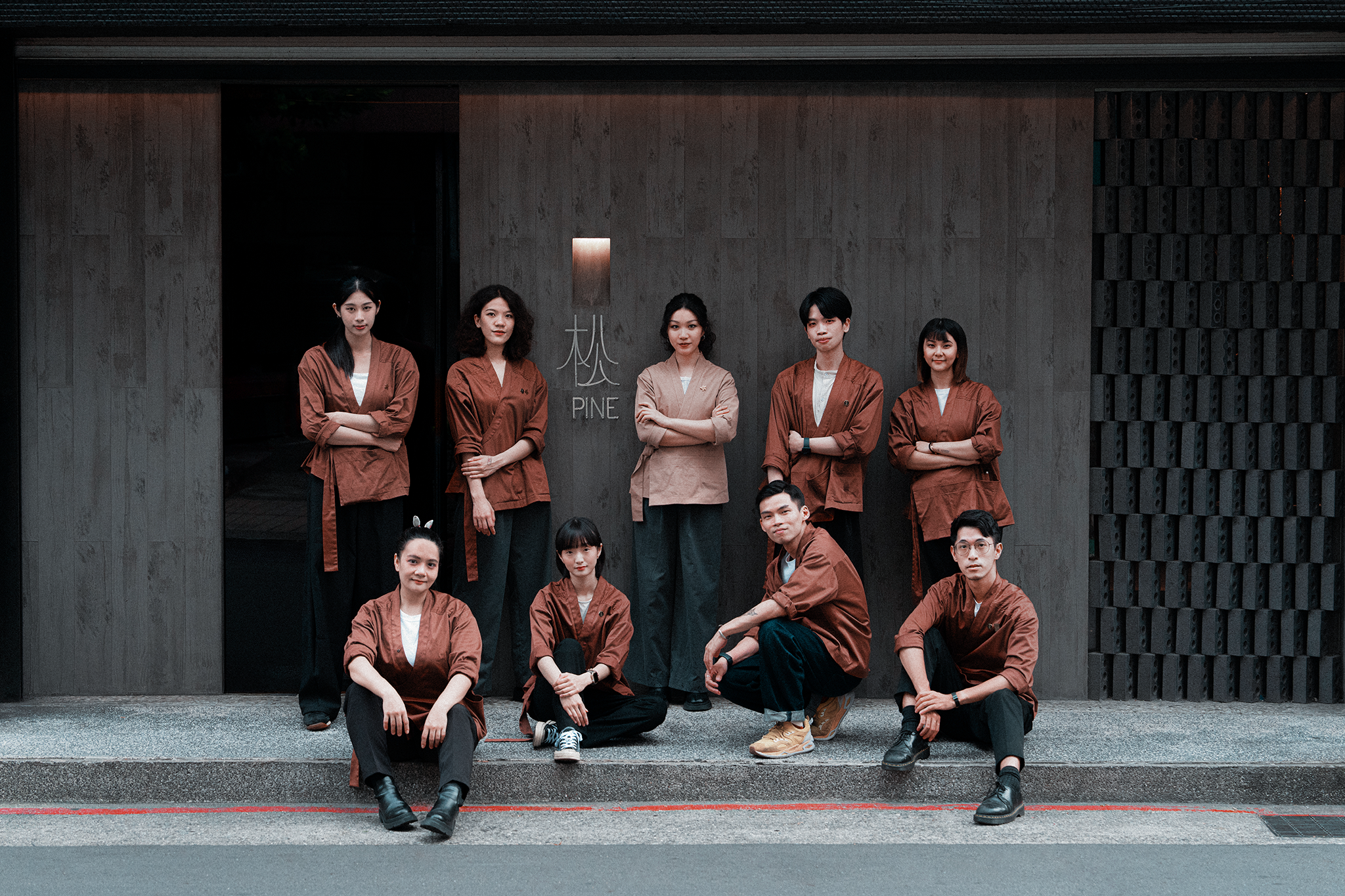
Art Director: Ting-An HoGraphic Design: Ting-An Ho, Ruopu LiSpace Arrangement: In Situ Interior DesignHardware Director: Yan-Ko YangStaff Uniform Design: Val ChenCalligraphy: Godkidlla
Floral: Sensual Flower Point
Retail: Sung Cheng-Jie
Year: 2022Art Director: Ting-An Ho
Floral: Sensual Flower Point
Retail: Sung Cheng-Jie
Awards
Shopping Design Award - Experimental Award
Press
La Vie
Vogue
Marie Claire
GQ
Demi Monde
Wonder.am
Shopping Design


