Type Identity
Client Aikolove Liu
Design Ting-An Ho
Year 2014
Client Aikolove Liu
Design Ting-An Ho
Year 2014
類別 視覺識別
客戶 劉明群
設計 何庭安
年份 2014
客戶 劉明群
設計 何庭安
年份 2014
Info 專案背景
Liu has been directing music videos for a decade, with more than hundreds of works. He has worked with artists throughout the Chinese market and was nominated by the 21th Taiwan Golden Melody Award (GMA) as best music video director.
In 2009, Liu went to Singapore as one of the contestants in Asia’s first Creative Talent Search reality show . In 2014, Liu had directed his first TV series in Singapore, which was co-produced by Starhub and August Pictures.
在經過累積十餘年的影片、攝影與廣告作品後,以音樂錄影帶起家的劉明群於 2014 年決定開設自家影像工作室,並組成一支結合導演、製片、攝影、美術、後期等長才的團隊。因為過去在張震嶽、鄧福如、朱婧汐、徐佳瑩等歌手的MV中均有擔任過藝術指導、字體設計的合作經驗,我們與導演已經有一定的默契與品牌認知,因此受到委託規劃其工作室的識別形象。


Brand Naming & Logo 品牌命名&標誌
The original name of the director's studio was, as his own name, called "Ming-Chun Liu Studio". However, regarding the name-catch strategy, using his own name wasn't the best idea for a company, especially for the Chinese marketing. After quite a few times we discussed, we take the last word of his name: “Chun” as the wordmark, so as the logotype.
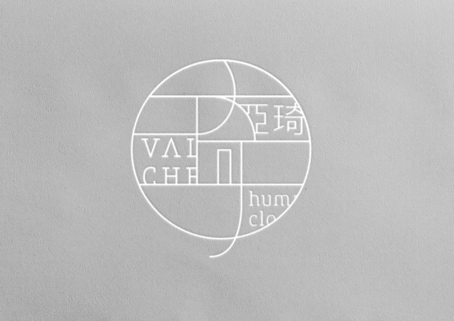
基於客戶(導演)的想法,工作室的命名將依照他的姓名——「劉明群」作為名稱。維持其立意,我們直接使用字體設計作為圖像的延伸,以姓名作為文字標誌(Logotype),而不另外繪製圖案標誌(Mark)。但是每當一間企業使用創辦人的姓名作為名稱,面對品牌思維時,會碰到的最大的一個問題:公司名稱與企業精神其實並沒有太直接的關聯。
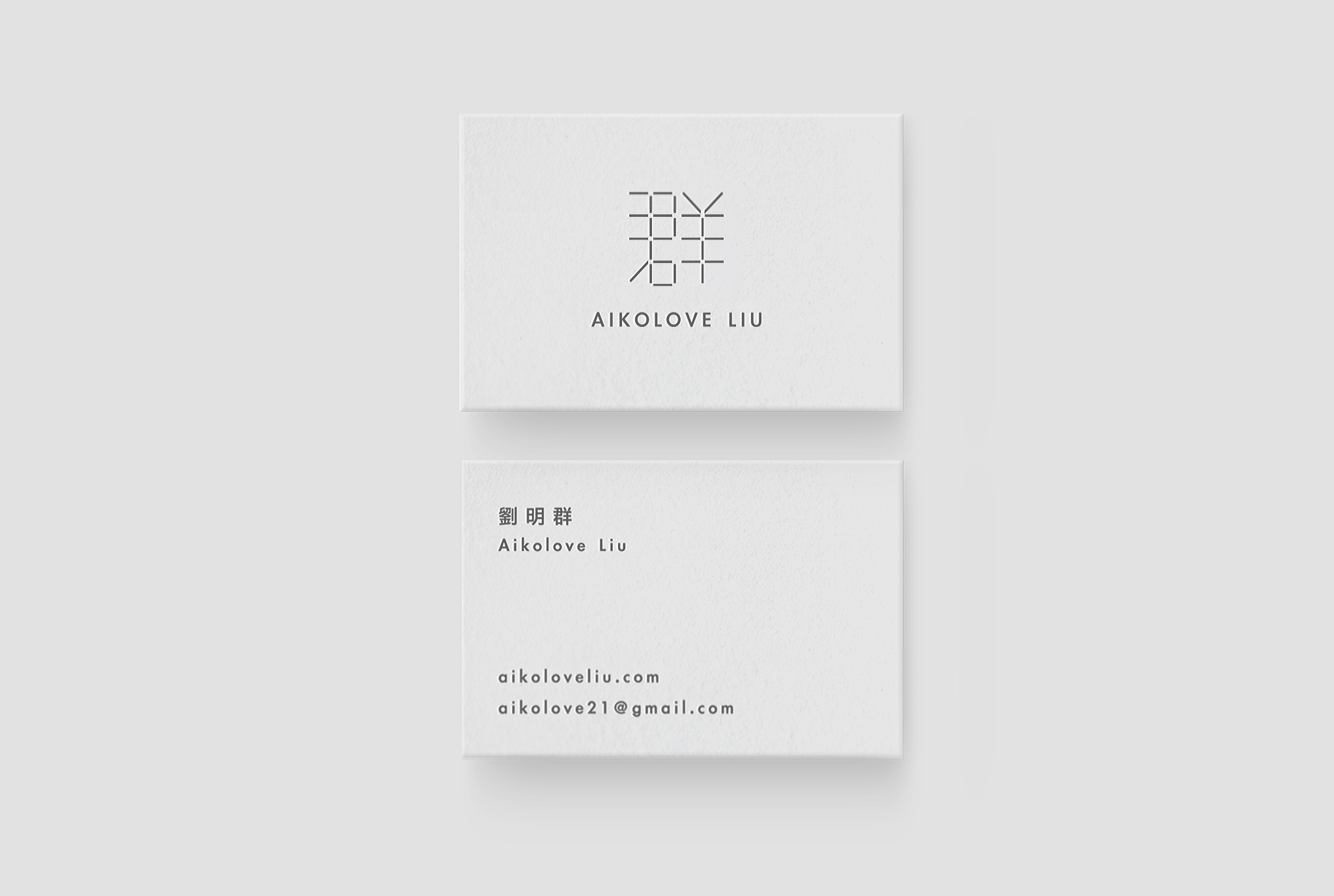
為了避免上述的不協調,在尚未進入識別化、還沒發想視覺的階段,我們便基於策略考量,向導演建議「一個字給人的印象遠比三個字強」,其實沒有必要使用完整的姓名作為標誌。經過數度基調討論後,我們最終決定單取其姓名的最後一字「群」作為標準字(Logo & Logotype)以強化識別力道,並以此規劃標誌。
基於客戶(導演)的想法,工作室的命名將依照他的姓名——「劉明群」作為名稱。維持其立意,我們直接使用字體設計作為圖像的延伸,以姓名作為文字標誌(Logotype),而不另外繪製圖案標誌(Mark)。但是每當一間企業使用創辦人的姓名作為名稱,面對品牌思維時,會碰到的最大的一個問題:公司名稱與企業精神其實並沒有太直接的關聯。
為了避免上述的不協調,在尚未進入識別化、還沒發想視覺的階段,我們便基於策略考量,向導演建議「一個字給人的印象遠比三個字強」,其實沒有必要使用完整的姓名作為標誌。經過數度基調討論後,我們最終決定單取其姓名的最後一字「群」作為標準字(Logo & Logotype)以強化識別力道,並以此規劃標誌。
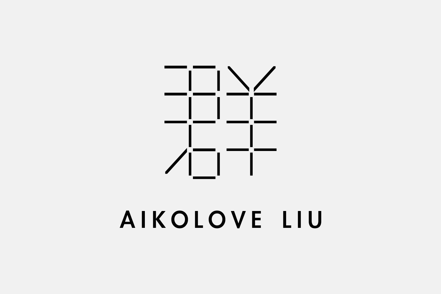
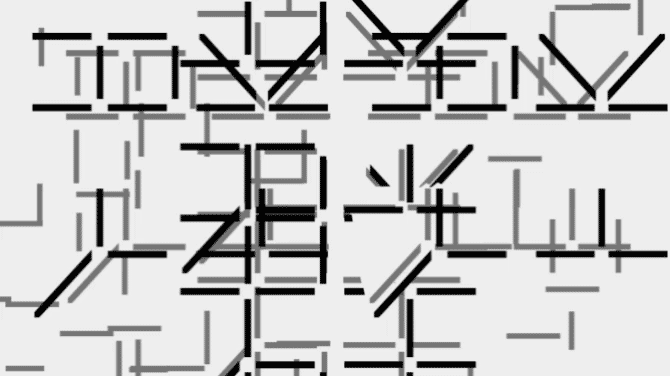
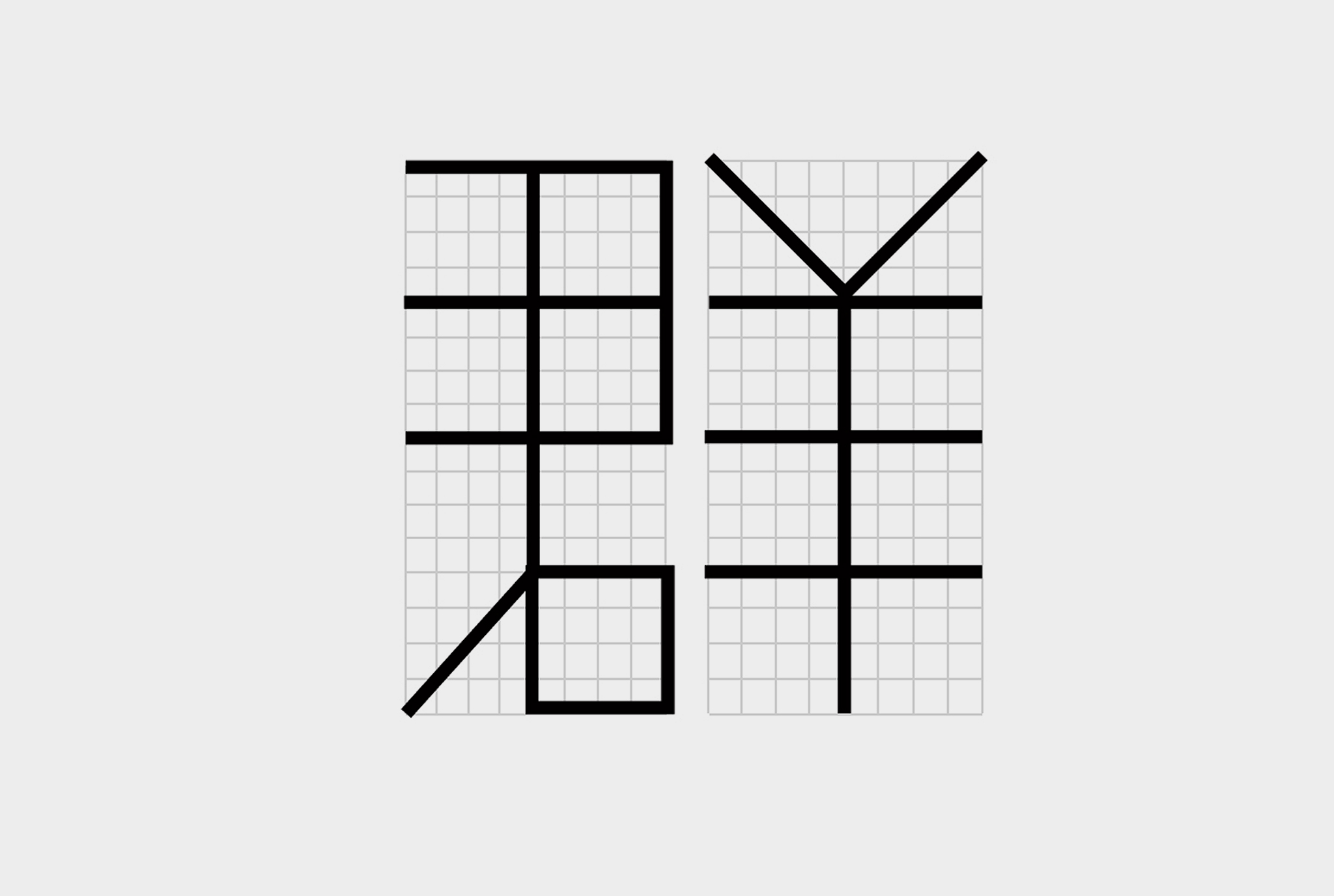 初步文字標誌與網格 Grid System for AikoloveLiu
Design Method 設計方法
For a studio like this doesn't need too much design. At first, I had been asked to design a flexible and ever-extend logo system. Nevertheless, I suggest the director that a single wordmark could meet their demands, and be a complete solution.
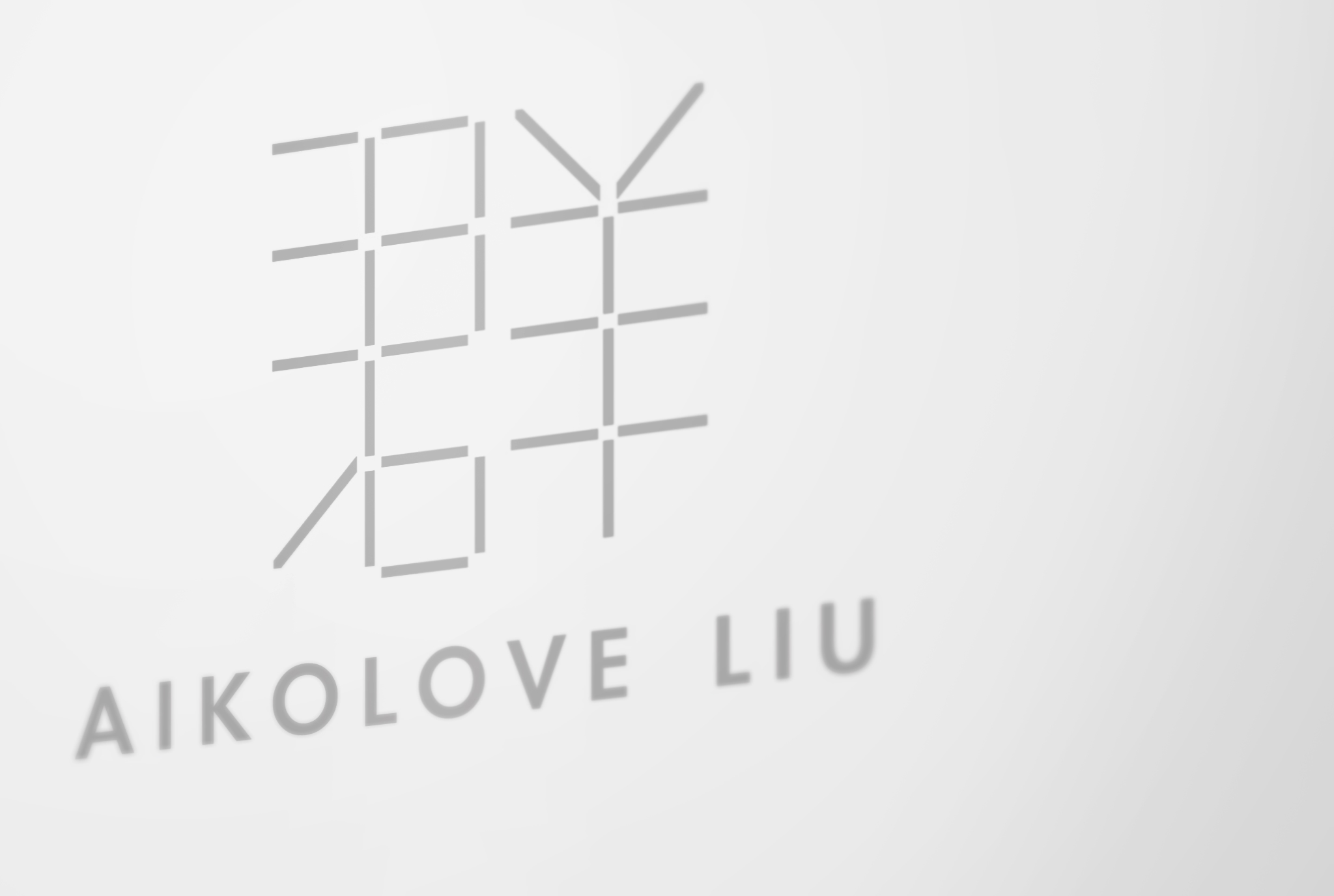
The word "Chun" means "Group" in Chinese. We take that as the original concept, within modern strokes and little design, transform it into an elegant logotype.
對於導演工作室的識別設計,基於「編制」、「受眾」以及「曝光程度」的考量,我們認為不需要太多的延伸或周邊,因此在此階段前便已有共識,構成識別他元素越少越好,單一標誌有時比大量多餘的延伸應用更加合適,而不需過度的設計。
我們取群字中「群聚」之義作為識別意象,呼應一群志同道合的成員組成團隊的初衷,以深化品牌內涵與力道;配合導演作品畫面的詩意與現代感,使用乾淨線條與素面留白手法,完成最終簡潔俐落的識別系統。


Press
Branding Served
Penccil
IdN
Publications
Hanzi ‧ Kanji ‧ Hanja
IdN Magazine
Computer Arts
Related Projects: