Long Cyuan Fire Branch
T Identity
C Pingtung Fire Bureau
D Ting-An Ho
Y 2018
類別 視覺識別
客戶 屏東縣消防局
設計 何庭安
年份 2018
Longcyuan facebook page ︎
C Pingtung Fire Bureau
D Ting-An Ho
Y 2018
類別 視覺識別
客戶 屏東縣消防局
設計 何庭安
年份 2018
Longcyuan facebook page ︎
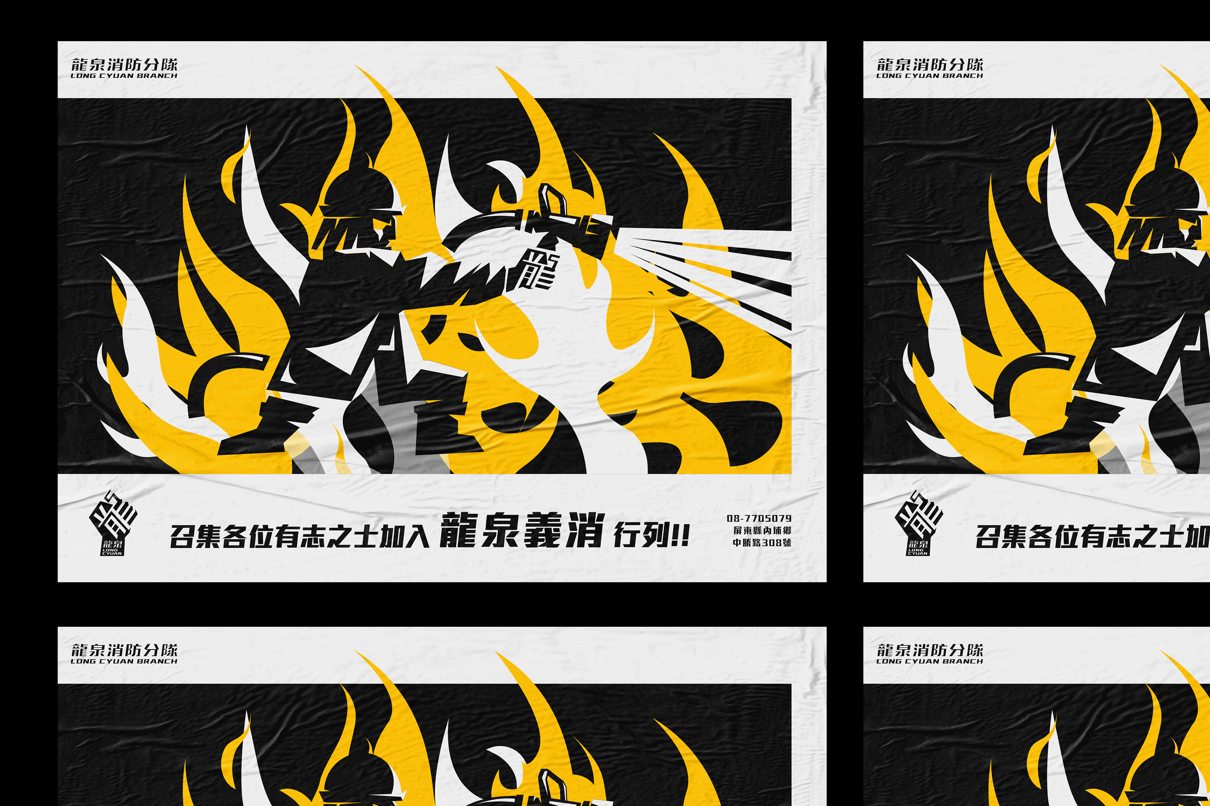
In 2018, I was commissioned to design the identity system for “Longcyuan Fire Brigade,” including its emblem, uniforms, and a series of graphic icons.
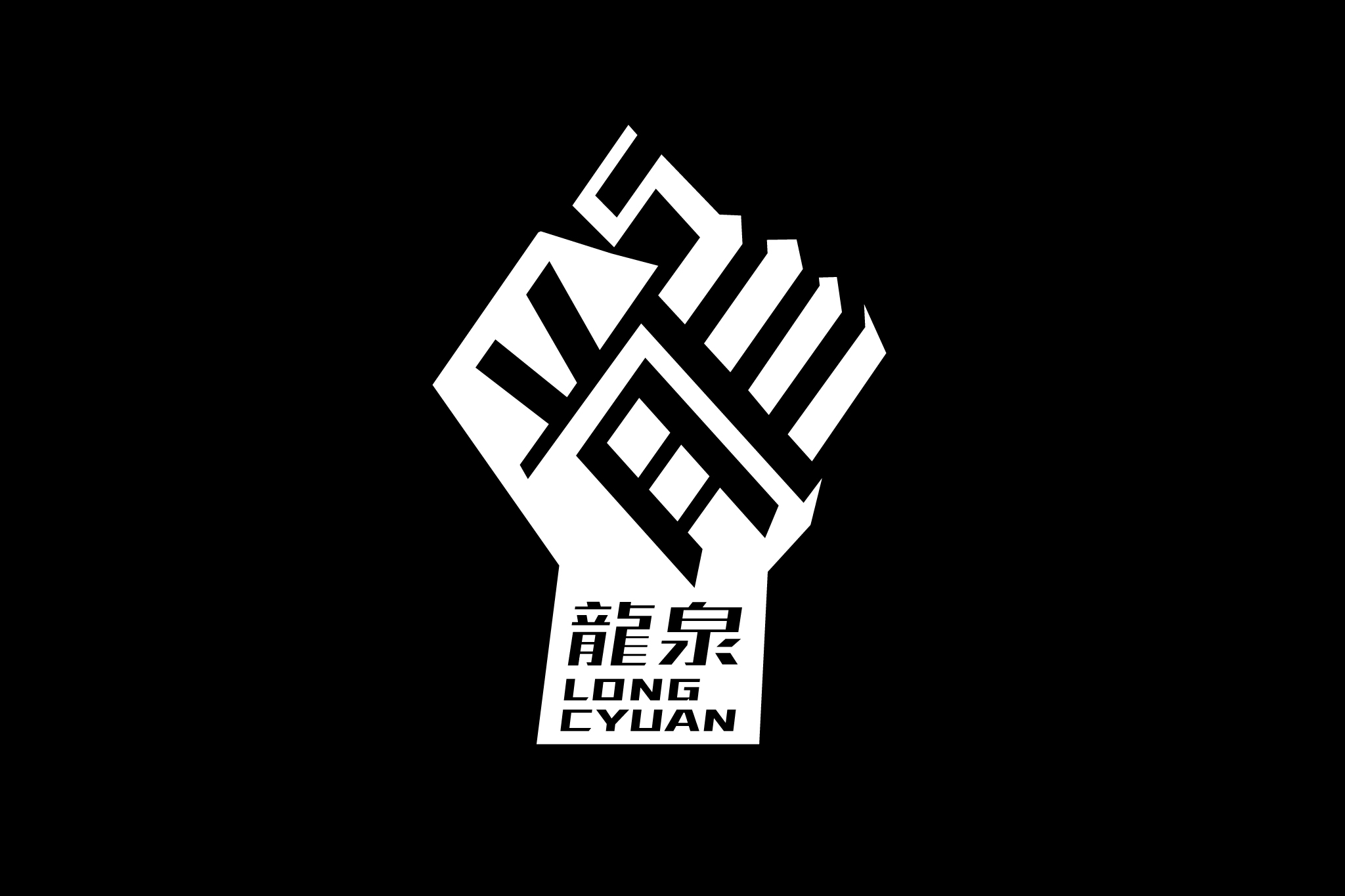
At the time, many fire department identities still relied heavily on decorative public-sector aesthetics and traditional Japanese-inspired “Hikeshi” visual language — bold brush calligraphy, thick strokes, and slogan-driven graphics. This project aimed to move away from that visual fatigue and establish a cleaner, more distinctive direction. To express the spirit of bravery and strength associated with firefighting, the identity focused on the single character “龍” (Dragon) as the core logotype, extended with forms inspired by the idea of a “fist.” The symbol and typography were developed together as a unified system, creating a visual language that felt sharp, bold, and powerful.
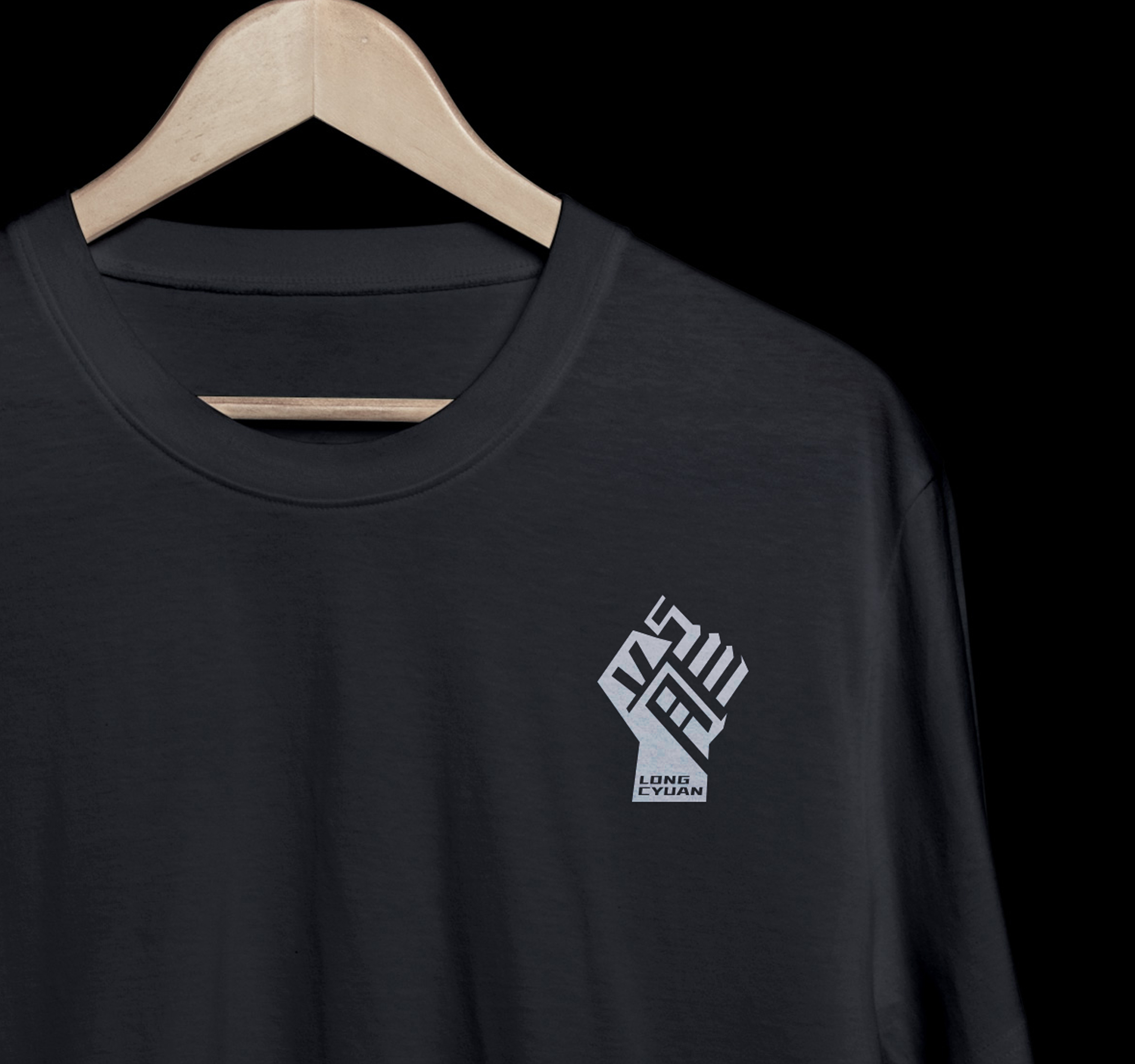
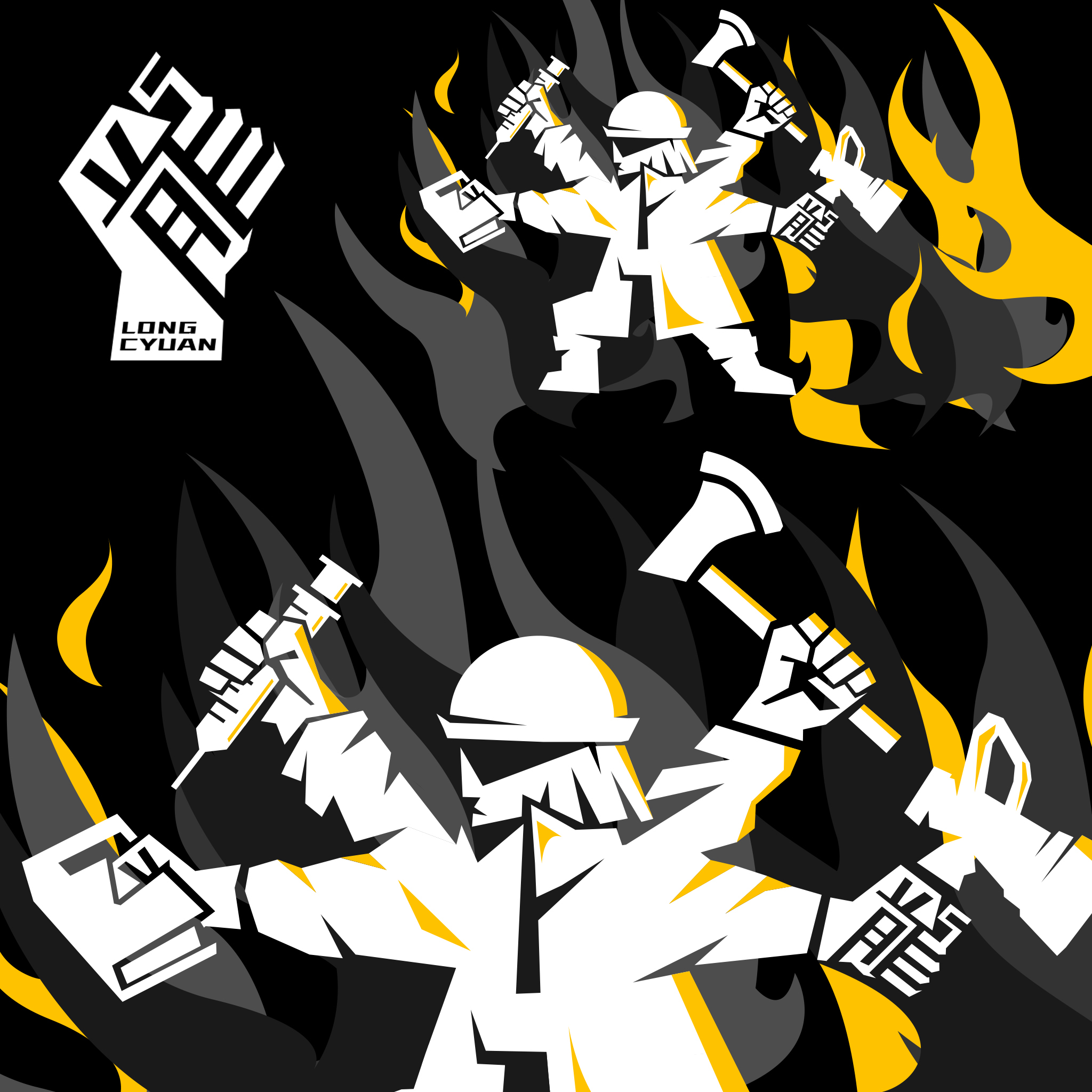
The project was further expanded through illustrations, graphic applications, and colour guidelines, forming a complete and cohesive identity system for the brigade.
At the time, many fire department identities still relied heavily on decorative public-sector aesthetics and traditional Japanese-inspired “Hikeshi” visual language — bold brush calligraphy, thick strokes, and slogan-driven graphics. This project aimed to move away from that visual fatigue and establish a cleaner, more distinctive direction. To express the spirit of bravery and strength associated with firefighting, the identity focused on the single character “龍” (Dragon) as the core logotype, extended with forms inspired by the idea of a “fist.” The symbol and typography were developed together as a unified system, creating a visual language that felt sharp, bold, and powerful.
The project was further expanded through illustrations, graphic applications, and colour guidelines, forming a complete and cohesive identity system for the brigade.
「龍泉消防」為一隸屬於屏東消防局的分隊,所在地為屏東內埔。2018年,我受到設計分隊標誌、隊服,與一系列圖種標誌的繪製委託。過往,許多公部門的識別使用過華麗繽紛的示範,尤其在各種宣導海報與手冊上可見,而大多消防隊的服裝與標誌也都偏好沿用日本的「火消」圖騰,以粗厚鋒徑的毛筆行書寫下各種消防口號為風格大宗;我們希望從這種審美的疲勞之中解放出來,也便於和其他單位作出區別。
為了體現『龍拳』的意像,並從標誌之中彰顯「義勇消防」、「打火英雄」的精神,我們單取「龍」一字做為主要的標準字,並加上「拳」延伸出剛硬與力道的圖樣,並將圖和字整合為一套識別系統,視覺的延伸朝著俐落與大器的方向發展,透過一系列的插畫與色彩規範完善基本系統,完成為龍泉消防分隊的標誌設計。
為了體現『龍拳』的意像,並從標誌之中彰顯「義勇消防」、「打火英雄」的精神,我們單取「龍」一字做為主要的標準字,並加上「拳」延伸出剛硬與力道的圖樣,並將圖和字整合為一套識別系統,視覺的延伸朝著俐落與大器的方向發展,透過一系列的插畫與色彩規範完善基本系統,完成為龍泉消防分隊的標誌設計。


Full Credits:
Client: Fire Bureau of Pingtung
Type: Logo
Design: Ting-An Ho
Year: 2018
Related Projects: