STUDIO 411 ::
專案詳述 Case StudyType Branding
Client STUDIO 411
Design Ting-An Ho
Year 2014
Client STUDIO 411
Design Ting-An Ho
Year 2014
類別 品牌識別
客戶 STUDIO 411
設計 何庭安
年份 2014
客戶 STUDIO 411
設計 何庭安
年份 2014
Info 設計背景
STUDIO 411 was founded in 2014, serving works in branding, motion graphics, corporate identity and fine arts projects. They do not only focus on cool visual effects, but also dedicate to provide branding and identity design by integrating filmmaking arts and digital technology in CG/VFX.
STUDIO 411 成立於 2014 年,提供從動畫、廣告、電影,以至後製特效的影像工作室。這間工作室不只專於製作酷炫的動畫與特效,更致力於為品牌及企業提供明確的設計與創意,並精準針對客戶的需求,創造出驚人的視覺作品。他們的作品以前衛科技的風格及精緻的畫面著稱,作品內充滿新穎的動態符號,並呈現科技與實用並駕的視覺語言。為了調整將工作室的對內文化與對外形象一致,因此在 2014 年啟動了品牌識別開發專案。
STUDIO 411 成立於 2014 年,提供從動畫、廣告、電影,以至後製特效的影像工作室。這間工作室不只專於製作酷炫的動畫與特效,更致力於為品牌及企業提供明確的設計與創意,並精準針對客戶的需求,創造出驚人的視覺作品。他們的作品以前衛科技的風格及精緻的畫面著稱,作品內充滿新穎的動態符號,並呈現科技與實用並駕的視覺語言。為了調整將工作室的對內文化與對外形象一致,因此在 2014 年啟動了品牌識別開發專案。


Brand Strategy 品牌策略
When the studio approached me to create their visual identity they came with a tight brief, asking for a simple, adaptive and responsive logo that could live constantly evolving brand.
經過與工作室團隊深入的品牌調查,針對核心理念、體質、文化、展望等項目分別諮詢,我們獲得了初步的品牌策略。由於工作室鎖定之客群放眼全球,因此視覺形象便不能過於文藝、復古或是潮流;尤其是對於小編制的新創工作室體質,更需要強調其專業感,因此在策略段便將形象專注於「專業」與「新穎」兩大重點。
經過與工作室團隊深入的品牌調查,針對核心理念、體質、文化、展望等項目分別諮詢,我們獲得了初步的品牌策略。由於工作室鎖定之客群放眼全球,因此視覺形象便不能過於文藝、復古或是潮流;尤其是對於小編制的新創工作室體質,更需要強調其專業感,因此在策略段便將形象專注於「專業」與「新穎」兩大重點。


Design Concept 概念發想


Design Execution 視覺開發階段
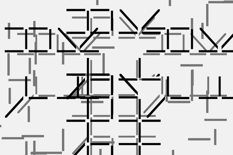
In order to get the very essence of the studio, we reduce the graphics to the most basic unit of the digital image: the PIXEL. Although image quality has constantly improved over recent years, a good animation is still based on a great idea, not just on technique.
Since the logomarks are simple pixels, which are animated, extended and equalised to match the style of studio. The pixels are distinct, simple black and white forms that allow the brand’s creative work to come to the fore. The logos’ movement represents the ever-changing rendering images, this simplicity is practical in application and descriptive in nature, reflecting the behind-the-scenes and working nature of the studio.
從上述策略著手,為提煉出其核心視覺,在一連串的設計發想後,我們挖掘出了數位影像的最基本單位:「像素」作為品牌象徵。儘管當今科技日新月異,動畫的表現形式也隨科技的突飛猛進有大幅度的變化,但是要做好一部動畫作品,仍然不外乎出自有趣的概念,而非酷炫的技術。
以此為基礎,整體識別規畫透過最基本的像素效果詮釋形象,正因為它的簡單和純粹,因此永遠不會過時。由於標誌樣式、配色組合的簡潔,因此應用性與發展度極高;因應工作室大量的配套與影片需求,標誌的動態發展成持續移動的塊格,並如同動畫算圖般跳動游移不停,飛快的將最終成像拼湊顯現。

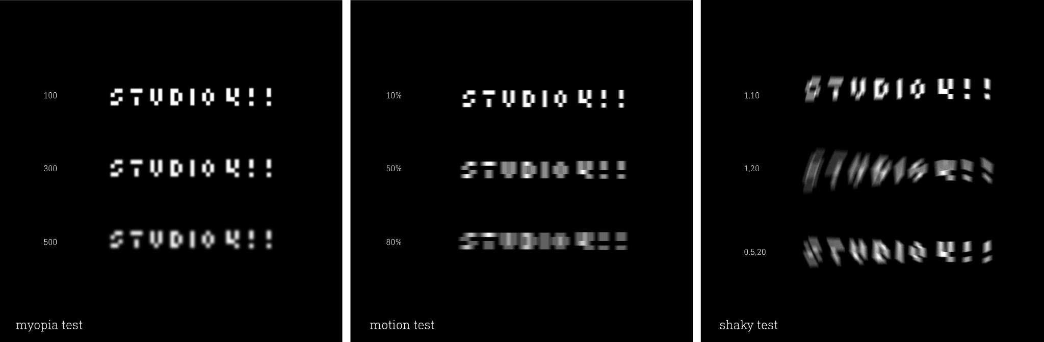 Readable Test 可讀性測試階段
The pixel serves to remind STUDIO 411 of this, and that even through it's east to get carried away with visual effects, even a low-bit system can make a strong corporate identity if it has real style behind it.
我們希望這個設計專案所產生的化學元素是雙向的,即完整的「品牌內化」。未來當工作室識別發揮作用時,除了對外向客戶傳達品牌形象之餘,對內也叮嚀著團隊避免迷失在炫目的技術之中;因為即便在極端的限制下,僅透過最基本的視覺單位,仍能產出卓越的作品。
抱持著這樣的理念,團隊甫成立便有幸獲各知名品牌邀約並進行跨國合作,其規模正以穩定的速度持續成長,貫通品牌訴求的識別系統於是完成。
我們希望這個設計專案所產生的化學元素是雙向的,即完整的「品牌內化」。未來當工作室識別發揮作用時,除了對外向客戶傳達品牌形象之餘,對內也叮嚀著團隊避免迷失在炫目的技術之中;因為即便在極端的限制下,僅透過最基本的視覺單位,仍能產出卓越的作品。
抱持著這樣的理念,團隊甫成立便有幸獲各知名品牌邀約並進行跨國合作,其規模正以穩定的速度持續成長,貫通品牌訴求的識別系統於是完成。


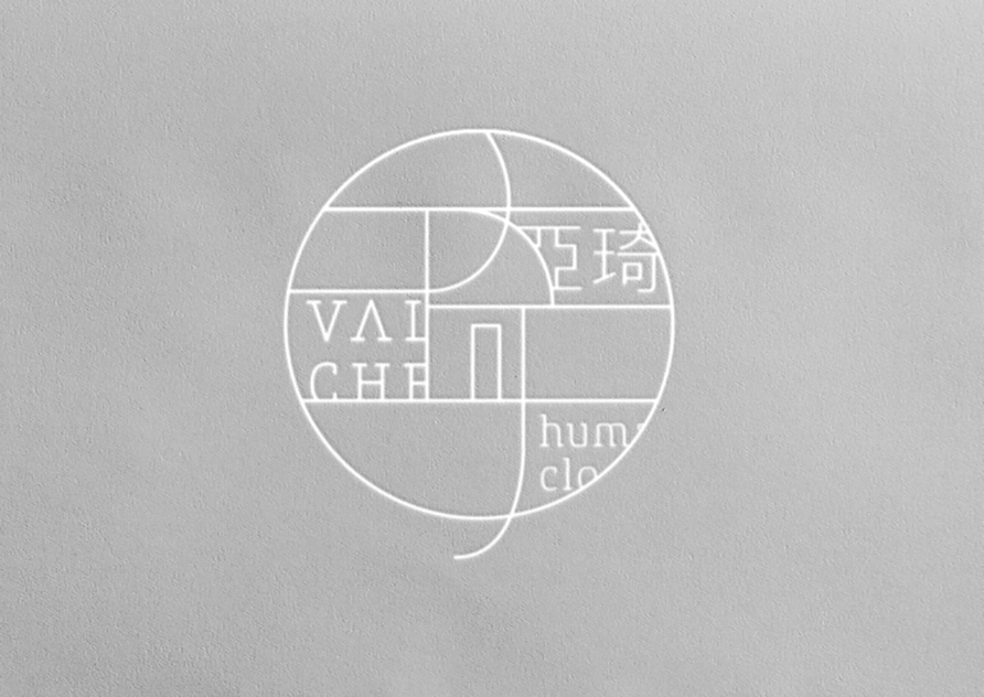
Visual Identity Systemn 視覺識別規劃
 Studio Simulation 工作室模擬
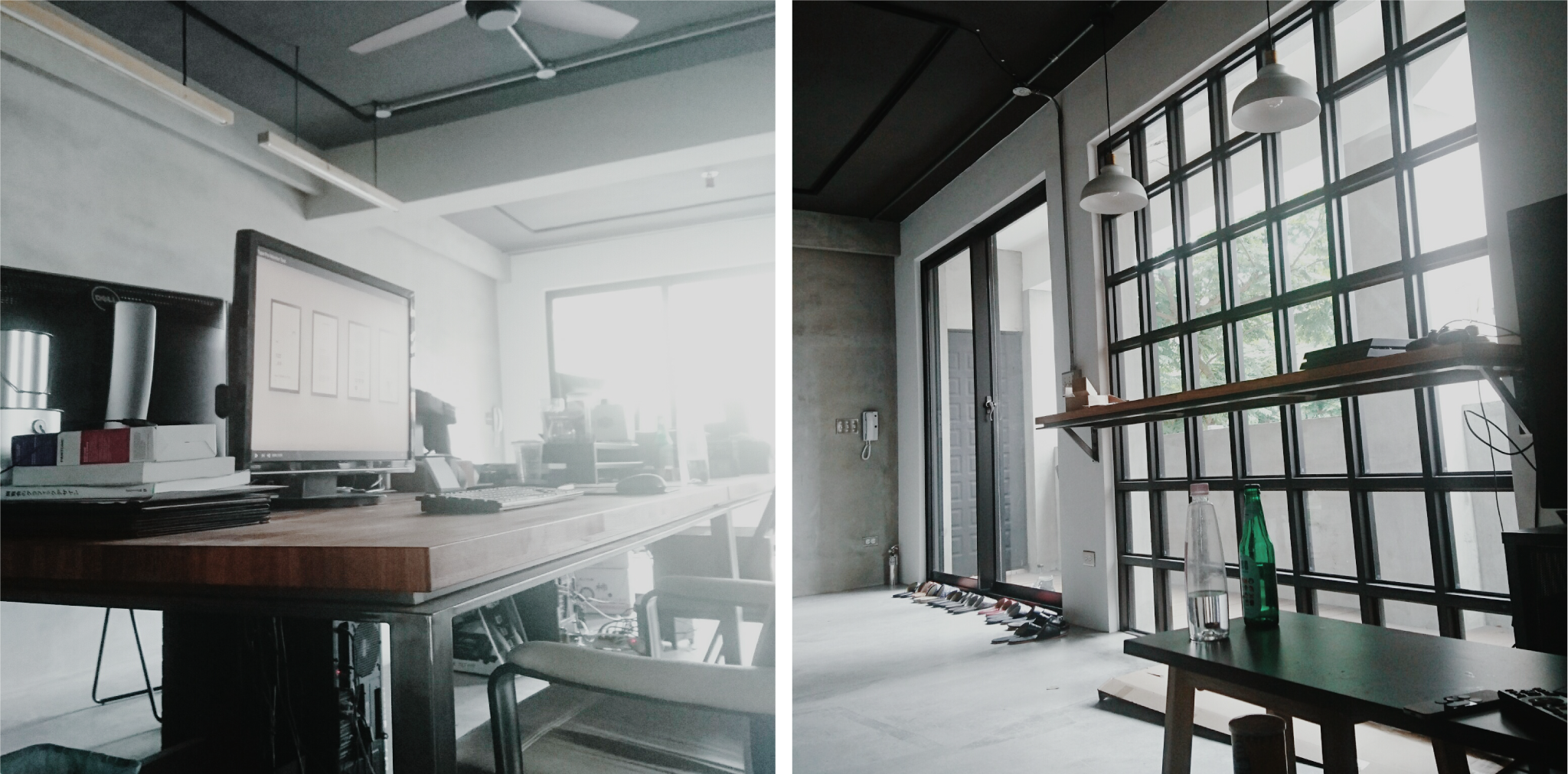

 Studio Interior 工作室內部
Press
Mydesy
Art4D.Asia
Branding Served
Publications
IdN
+81
Type Player 3
Computer Arts
10th Asia Pacific Design
Related Projects: