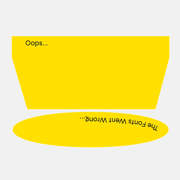
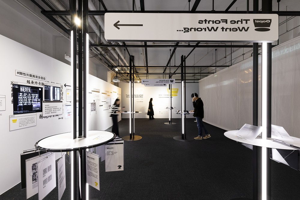
怎辦!字型怪怪的? Oops! The Fonts Went Wrong...
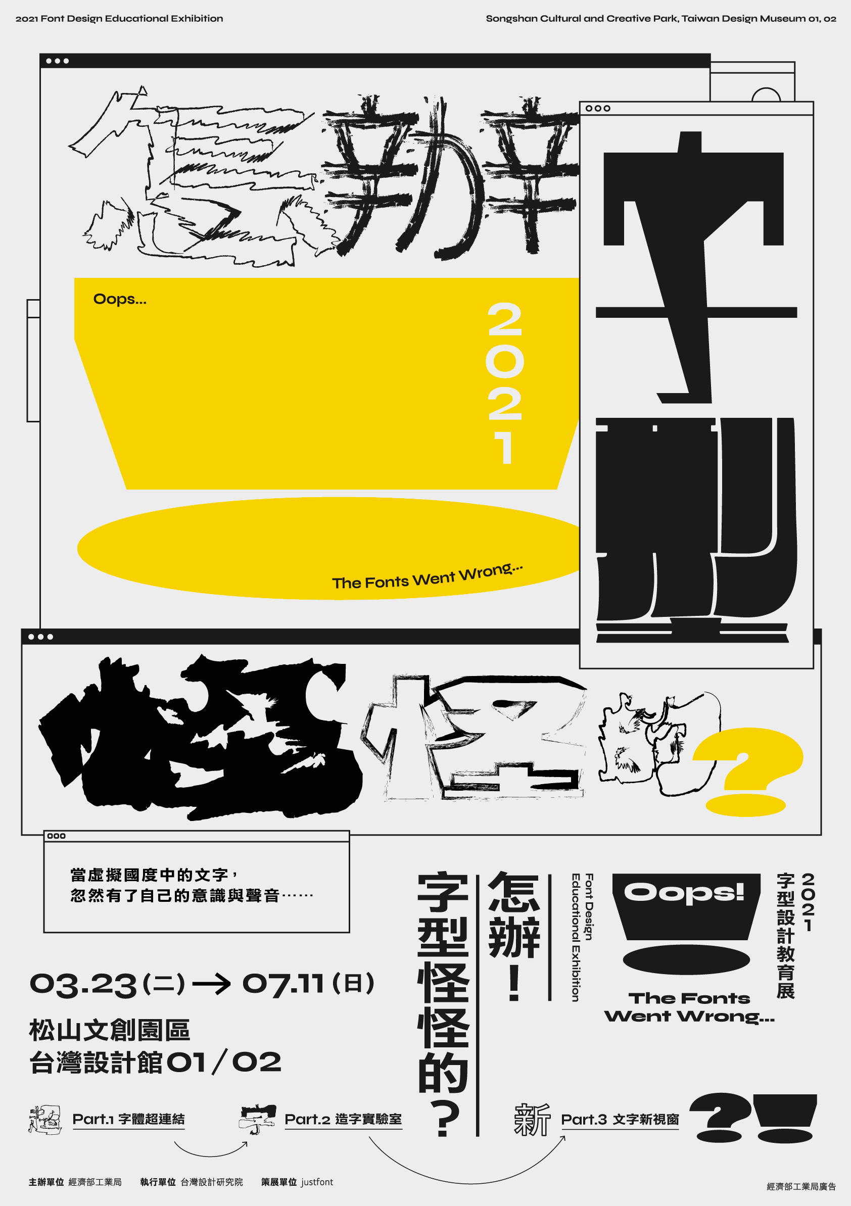
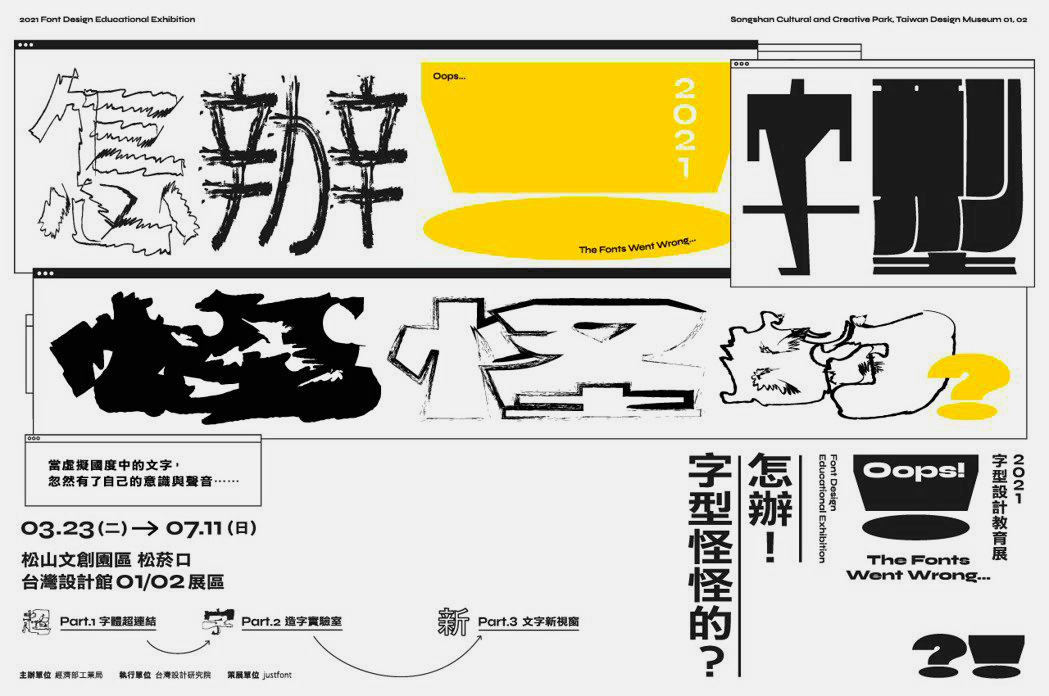
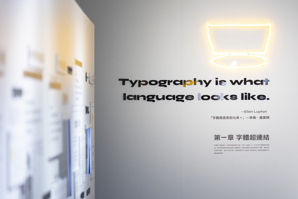
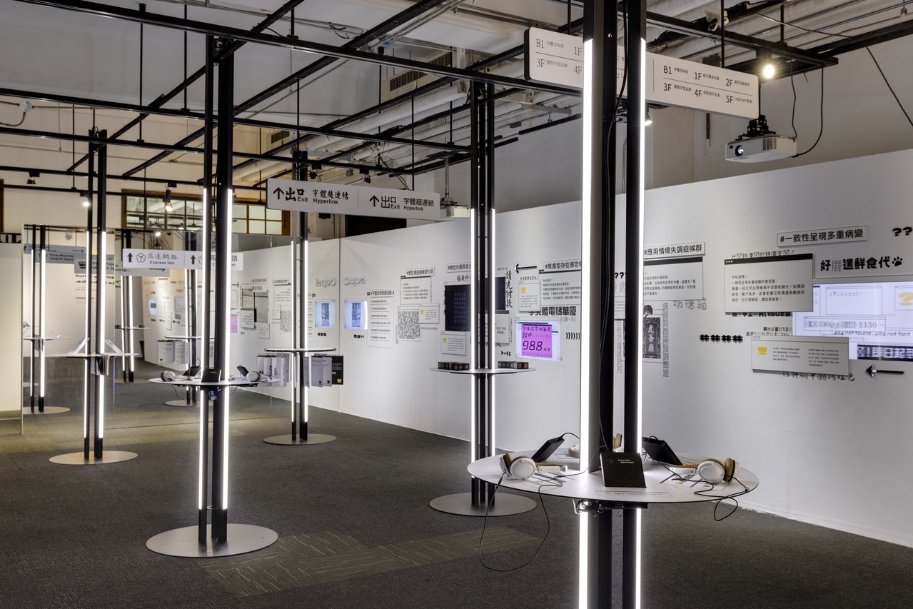
《怎辦!字型怪怪的?》是 justfont 今年為設研院策劃於松山文創園區展出的字型教育展。這場展覽依照不太正常的邏輯談字體。透過虛擬國度中字體的缺席、變異與錯置,讓大家去感受各種不合時宜的情境。或許正因為字體看起來「怪怪的」,我們才能體會它原本有多重要。
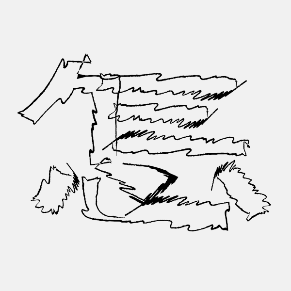
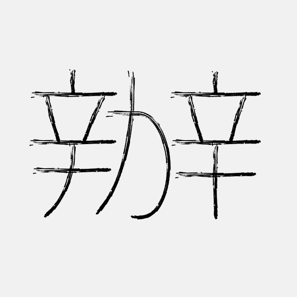
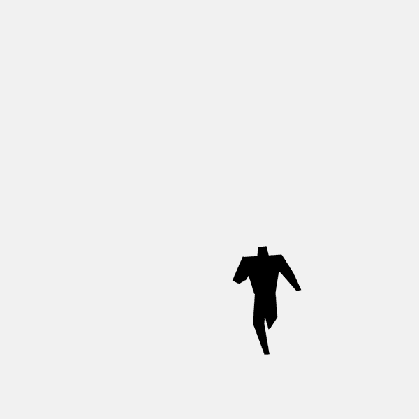
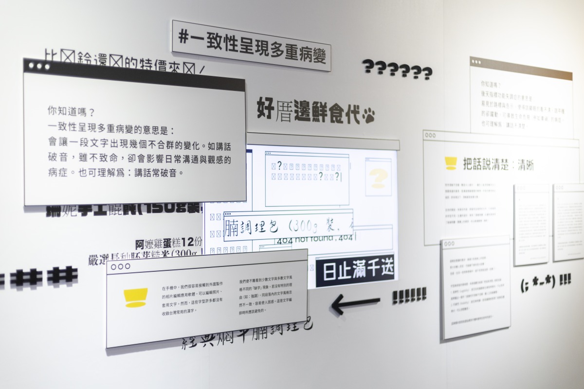
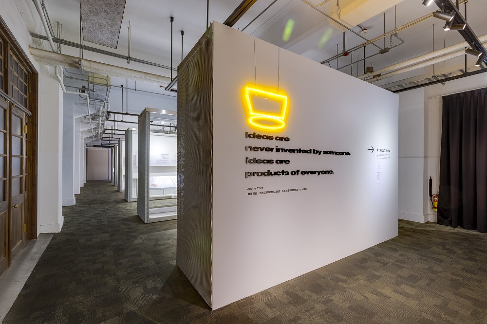
因為此展覽概念是發生在「虛擬國度」之中,為了填補此國度上上下下的世界觀設定,於是我們收到 justfont 的委託,為它打造了一個由文字拼湊而成、資訊量爆炸,充滿各種表現風格,但仍維持著數位質感的展覽視覺。
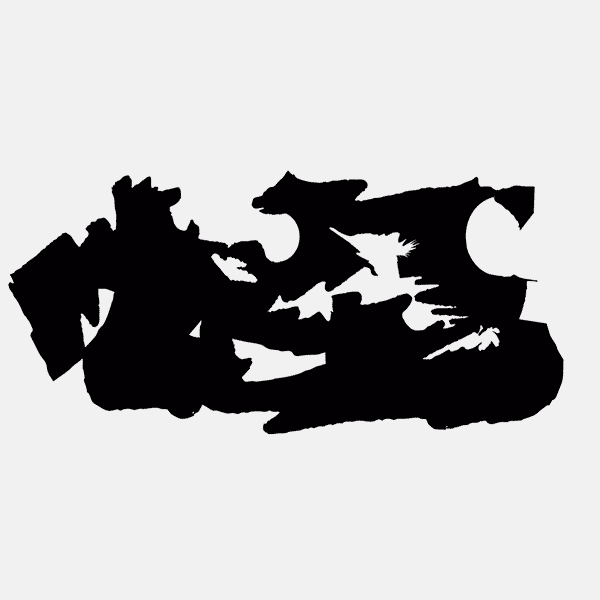
這樣的主視覺,取材自我們小時候上網的體驗。那是網路世界的拓荒時期。當時網站數量還在爆炸性的飛快成長,特效、動圖、語法以炫技之姿一股腦地朝頁面倒進去,瀏覽器才剛被大大小小的廣告塞滿、彈出式視窗又如浪潮淹沒了整個螢幕,一瞬間伴隨著大片藍畫面的赫然翻牌,親切地提醒我們重新開機面對下個回合。這樣擁擠、吵雜而朝氣蓬勃的畫面,在經歷當代擋廣告技術後,已近乎消失殆盡。對我們這一代而言,這反而成了一種「數位的鄉愁」。
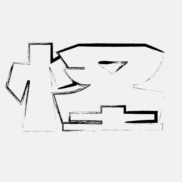
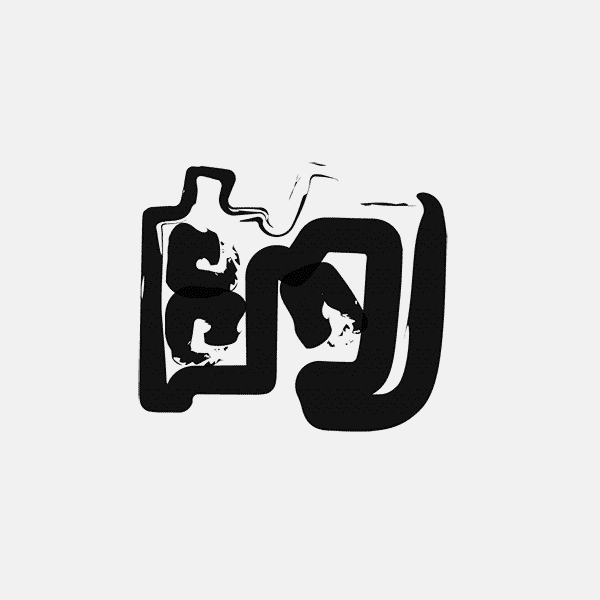
在遙想的網路世界中,那個國度還在網路世界的某處持續生長、破碎、迭代與暴走。或許它們的居民偶爾失禮了點、吵雜了點,但這也正是它們的風俗民情。透過《怎辦!字型怪怪的?》的展覽視覺,讓我得以繼續打造那個雜亂無章、嘈雜紛擾,但也同時層出疊現、生機勃勃,有點怪怪的數位異世界。
"Oops! The Fonts Went Wrong..." is a type education exhibition curated by justfont for the Taiwan Design Research Institute, staged at Songshan Cultural and Creative Park. It examines typography through a deliberately “abnormal” lens. Within a fictional digital nation, the absence, mutation, and misplacement of type immerse visitors in situations that feel out of joint — making the essential role of typography all the more tangible.
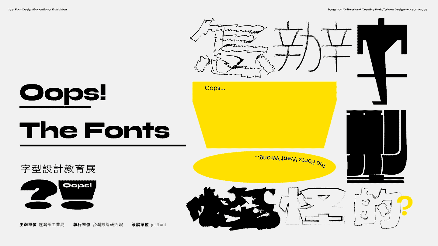
Set entirely in this “virtual nation,” justfont commissioned us to create the main visual: a world built from fragments of text, overloaded with information, stylistically diverse yet grounded in a distinctly digital texture.
The concept draws from the pioneering days of the internet — an era of explosive website growth, when effects, GIFs, and scripts flooded every page; browsers overflowed with ads; pop-ups crashed in like waves; and the sudden flip of a blue screen reminded you to reboot for the next round. That noisy, chaotic, exuberant aesthetic has all but vanished under the reign of ad-blockers, becoming a kind of digital nostalgia for our generation.
In that imagined cyberspace, the nation continues to grow, fragment, iterate, and spiral out of control. Its inhabitants may be brash and loud, but that’s part of their culture. The visual identity of "Oops! The Fonts Went Wrong..." is my way of keeping that unruly, boisterous, yet endlessly vibrant digital otherworld alive.
因為此展覽概念是發生在「虛擬國度」之中,為了填補此國度上上下下的世界觀設定,於是我們收到 justfont 的委託,為它打造了一個由文字拼湊而成、資訊量爆炸,充滿各種表現風格,但仍維持著數位質感的展覽視覺。
這樣的主視覺,取材自我們小時候上網的體驗。那是網路世界的拓荒時期。當時網站數量還在爆炸性的飛快成長,特效、動圖、語法以炫技之姿一股腦地朝頁面倒進去,瀏覽器才剛被大大小小的廣告塞滿、彈出式視窗又如浪潮淹沒了整個螢幕,一瞬間伴隨著大片藍畫面的赫然翻牌,親切地提醒我們重新開機面對下個回合。這樣擁擠、吵雜而朝氣蓬勃的畫面,在經歷當代擋廣告技術後,已近乎消失殆盡。對我們這一代而言,這反而成了一種「數位的鄉愁」。
在遙想的網路世界中,那個國度還在網路世界的某處持續生長、破碎、迭代與暴走。或許它們的居民偶爾失禮了點、吵雜了點,但這也正是它們的風俗民情。透過《怎辦!字型怪怪的?》的展覽視覺,讓我得以繼續打造那個雜亂無章、嘈雜紛擾,但也同時層出疊現、生機勃勃,有點怪怪的數位異世界。
"Oops! The Fonts Went Wrong..." is a type education exhibition curated by justfont for the Taiwan Design Research Institute, staged at Songshan Cultural and Creative Park. It examines typography through a deliberately “abnormal” lens. Within a fictional digital nation, the absence, mutation, and misplacement of type immerse visitors in situations that feel out of joint — making the essential role of typography all the more tangible.
Set entirely in this “virtual nation,” justfont commissioned us to create the main visual: a world built from fragments of text, overloaded with information, stylistically diverse yet grounded in a distinctly digital texture.
The concept draws from the pioneering days of the internet — an era of explosive website growth, when effects, GIFs, and scripts flooded every page; browsers overflowed with ads; pop-ups crashed in like waves; and the sudden flip of a blue screen reminded you to reboot for the next round. That noisy, chaotic, exuberant aesthetic has all but vanished under the reign of ad-blockers, becoming a kind of digital nostalgia for our generation.
In that imagined cyberspace, the nation continues to grow, fragment, iterate, and spiral out of control. Its inhabitants may be brash and loud, but that’s part of their culture. The visual identity of "Oops! The Fonts Went Wrong..." is my way of keeping that unruly, boisterous, yet endlessly vibrant digital otherworld alive.


Visual Identity ::
展覽設計 Exhibition ::
策展 Curator: justfont空間 Space: Wei-Lun Hsu


Full Credits ::
Location: Taiwan Design Museum
Organizer: Industrial Decelopement Bureau
Executor: Taiwan Design Research Institute
Curator: justfont
Visual Identity: Ting-An Ho
Space Design: Wei-Lun Hsu
Year: 2O21
Awards
Golden Pin Design Award - Golden Pin Design Mark
金點設計獎 - 金點勳章
Press
Behance - Official Featured
Type 01 - What Happens When Fonts Go Wrong…
Publications
C-Graphic Index 新世代中華圏グラフィックデザイナーの現在, 2O24
Hanzi•Kanji•Hanja 2, Victionary, Hong Kong, 2O22
Related Projects: