Floating Point Art
T Branding
D Ting-An Ho, Kumo Hsiao
3D Jie Liou, JiaZhen Hong, Hakurei Neko,
Sp Thx Project On Museum
Y 2025
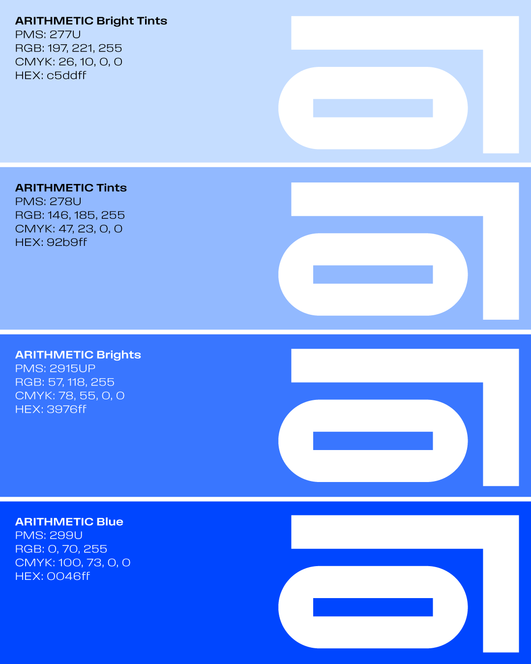
類別 品牌塑造
設計 何庭安,蕭嘉筠
3D 劉承杰,洪嘉震,岳乙宏,陳婷安,林佩珊
感謝 Project On Museum
年份 2025
D Ting-An Ho, Kumo Hsiao
3D Jie Liou, JiaZhen Hong, Hakurei Neko,
Sp Thx Project On Museum
Y 2025
類別 品牌塑造
設計 何庭安,蕭嘉筠
3D 劉承杰,洪嘉震,岳乙宏,陳婷安,林佩珊
感謝 Project On Museum
年份 2025
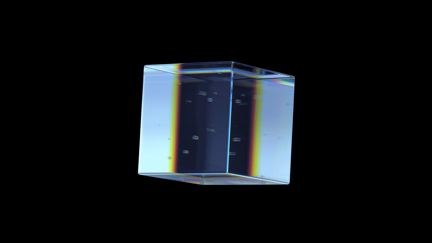
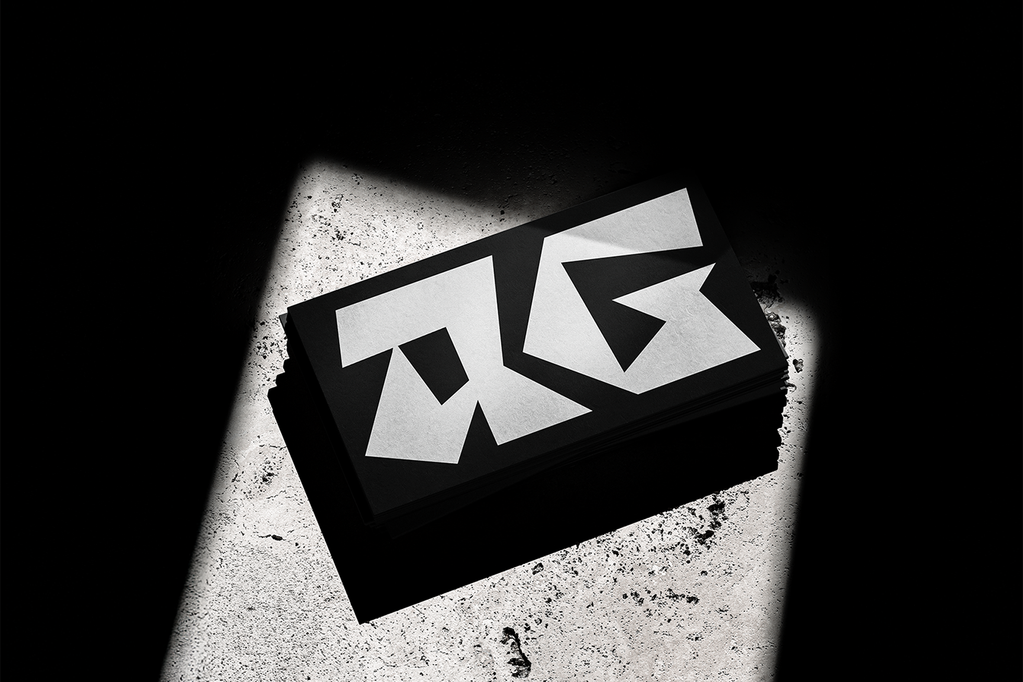
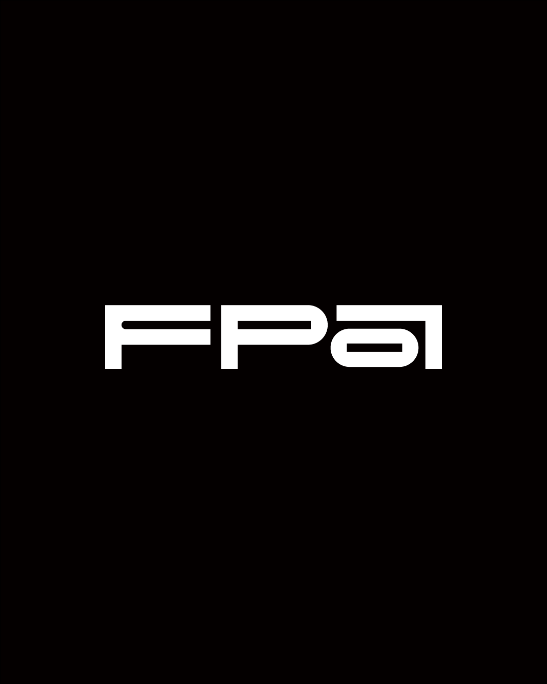
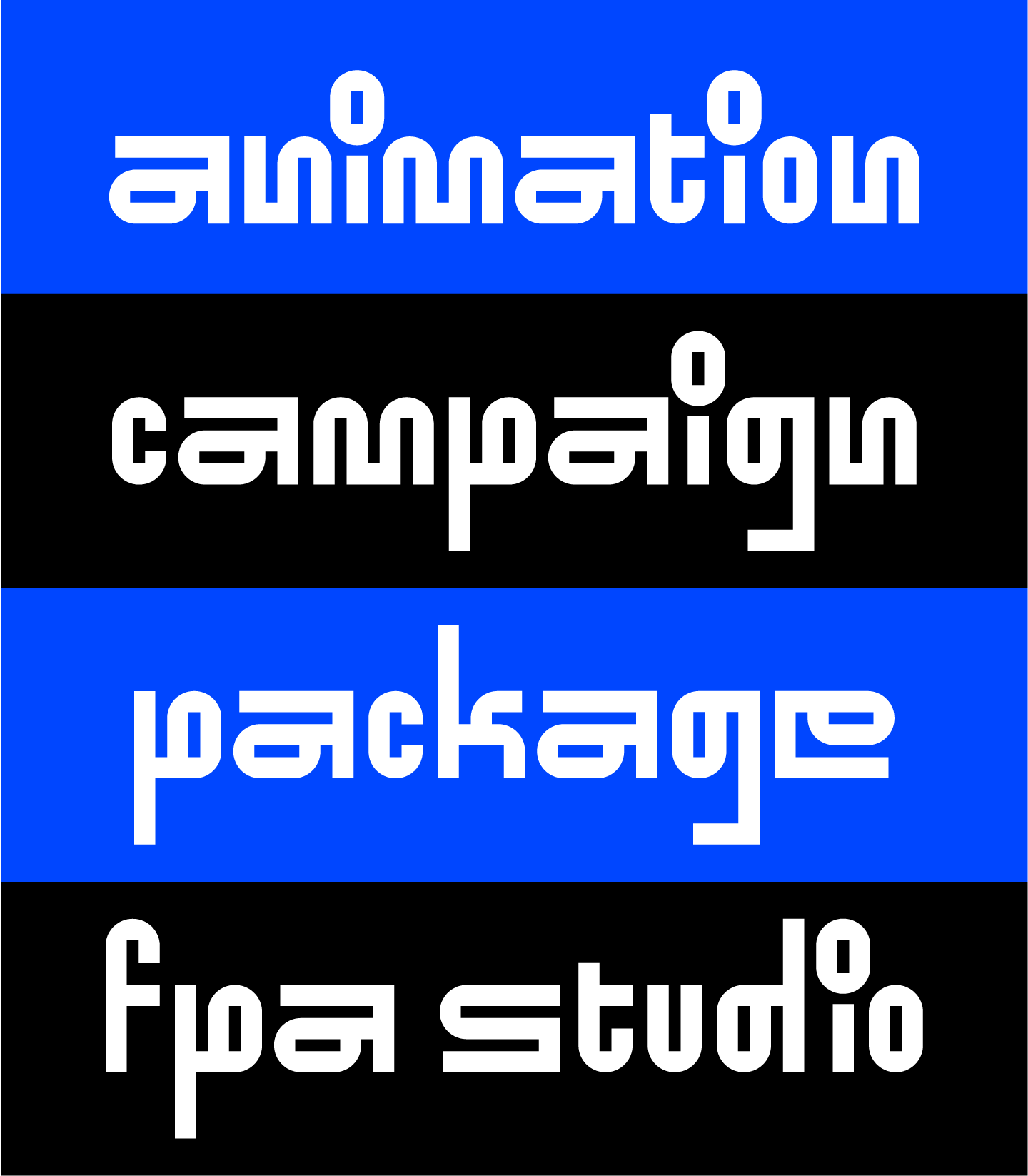
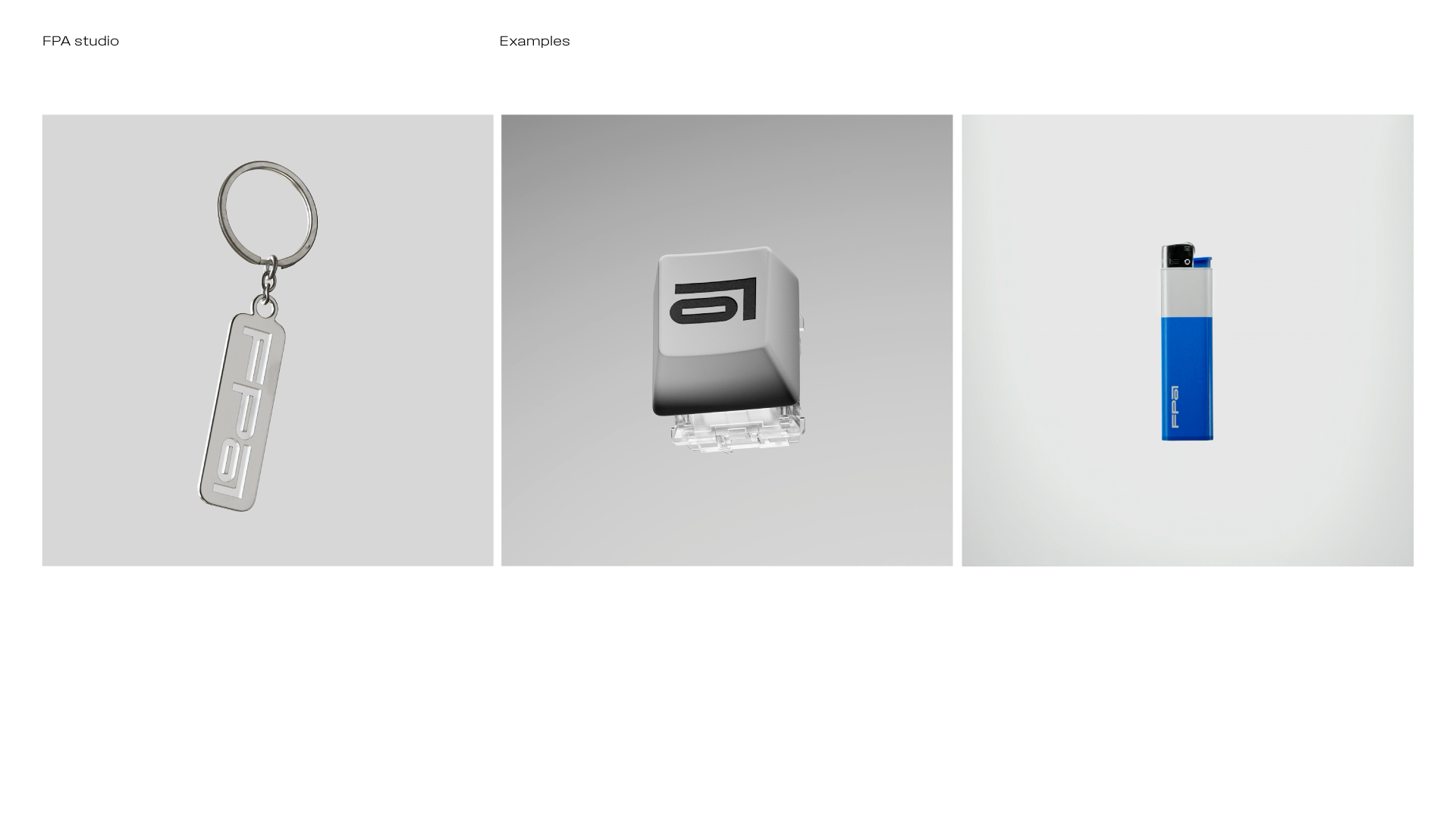
Designing a brand for an emerging moving-image studio often allows for greater openness to experimentation and new methods. FPA studio embodies this mindset, which led them to commission a renewal of their brand identity. Through interviews, three core principles were identified: “form, playfulness, and assembly”. The result is a brand identity built on rapid iteration, forward-thinking approaches, and continuous transformation. This renewal enables FPA to articulate its vision clearly and apply it consistently across its work.
幫影像工作室做品牌有個好處,就是他們都滿敢玩的。全名 Floating Point Art 的 FPA studio 就是這樣的體質,也正因此體質,於是委託我們翻新他們的品牌識別。 「形式感」、「玩樂性」、「意義感」,帶著這三個經由訪談後爬輸出的品牌精神, TINGANHO 由此定調創意風格與調性,並委託 Kumo Hsiao 一起煮字體標誌與視覺風格,依此落入各項應用、印刷,與各種延伸品項。 高速迭代、前沿新穎與不斷翻動的品牌識別於是誕生。 得益於 POM 在前期紮下的基礎,經此翻修,FPA 得以分享自己的願景,用自己的語氣,説自己的故事。


Full Credit ::
Client: Floating Point Art
Design: Ting-An Ho, Kumo Hsiao
FPA Team: Jie Liou, JiaZhen Hong, Hakurei Neko, TingAn Chen, Vin Lin
Special Thanks: Project on Museum
Year: 2025
Related Projects: