B’IN LIVE 必應創造
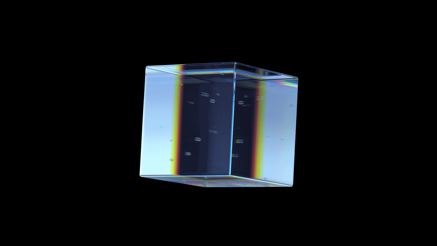
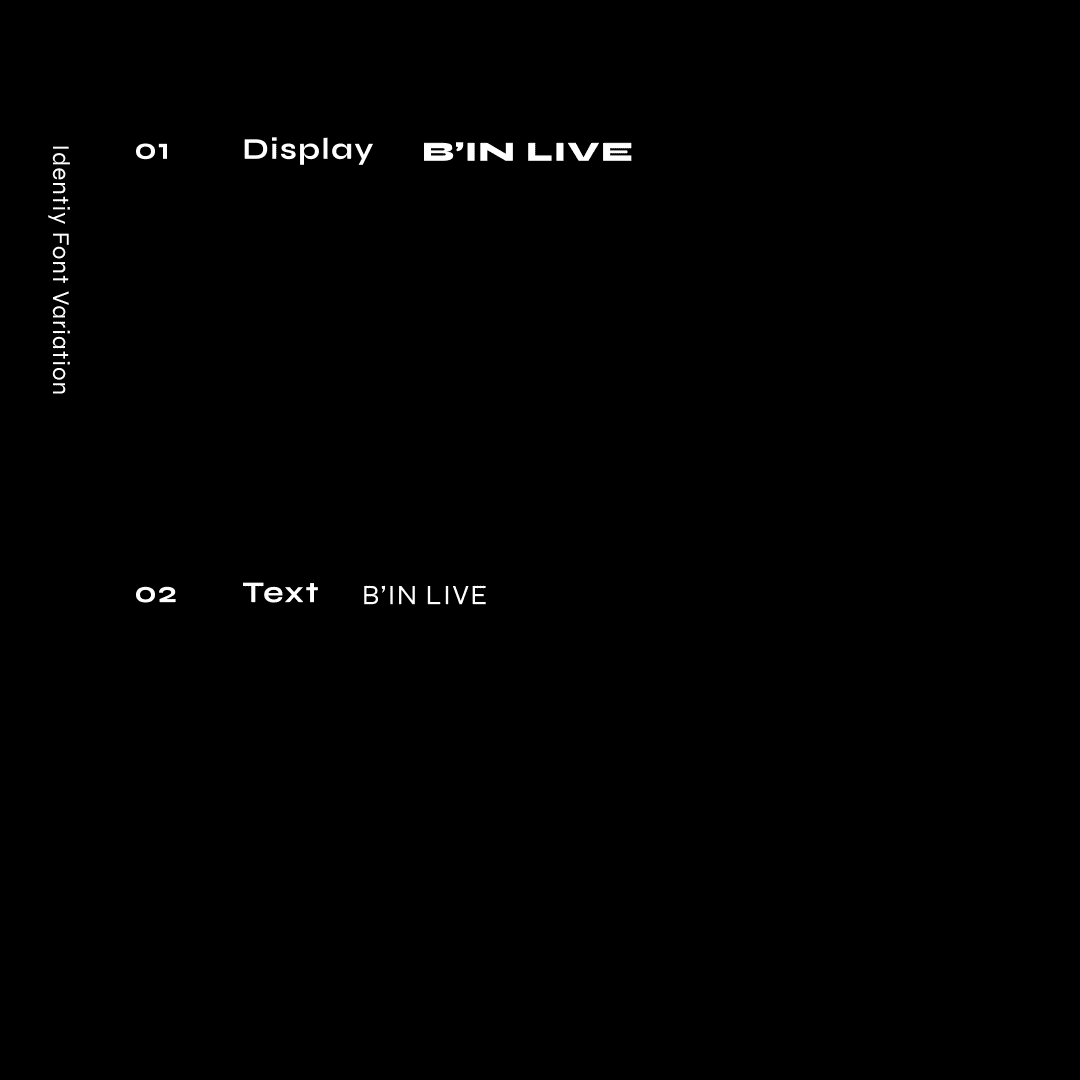
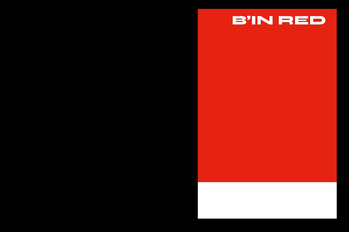
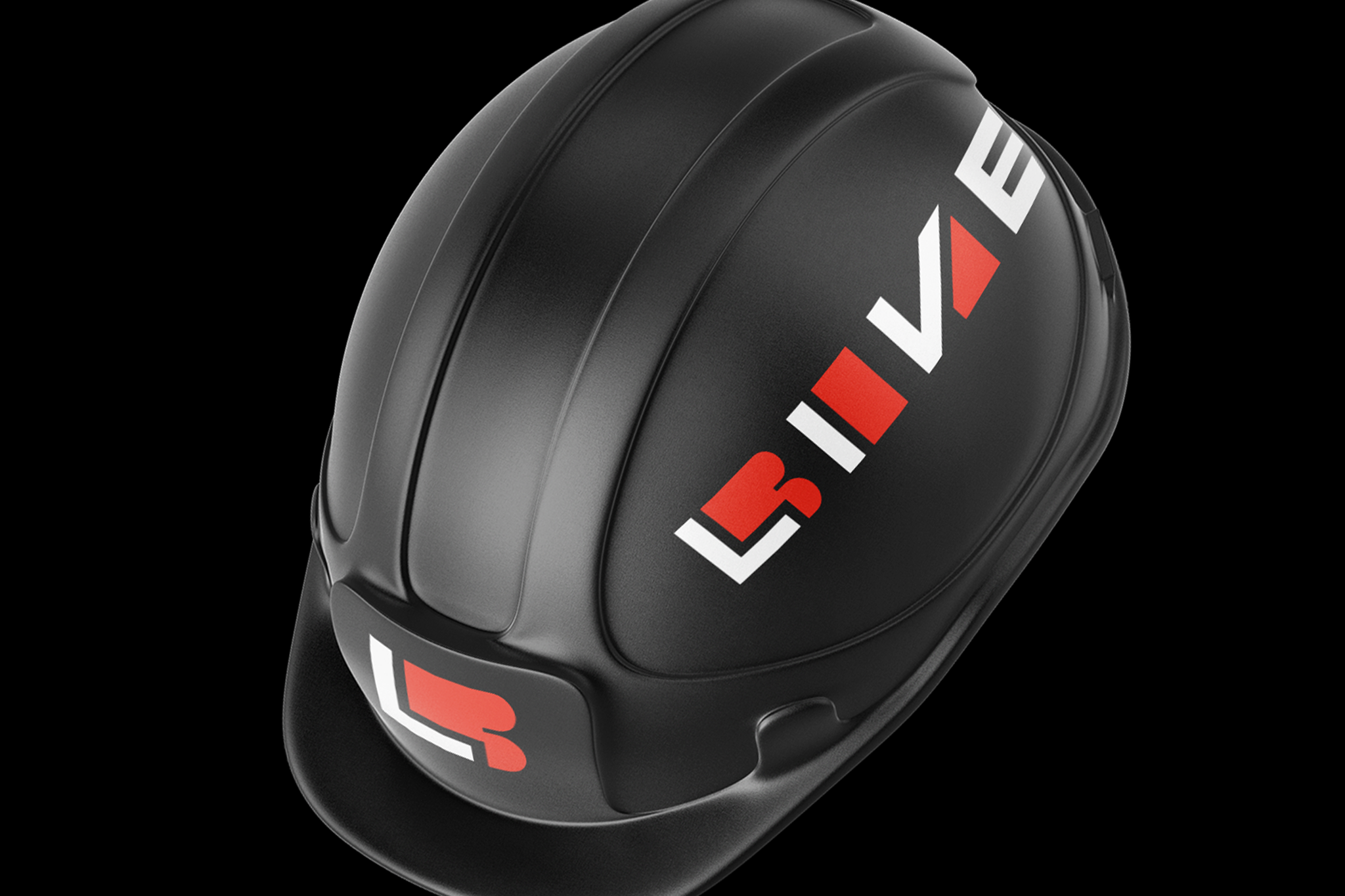
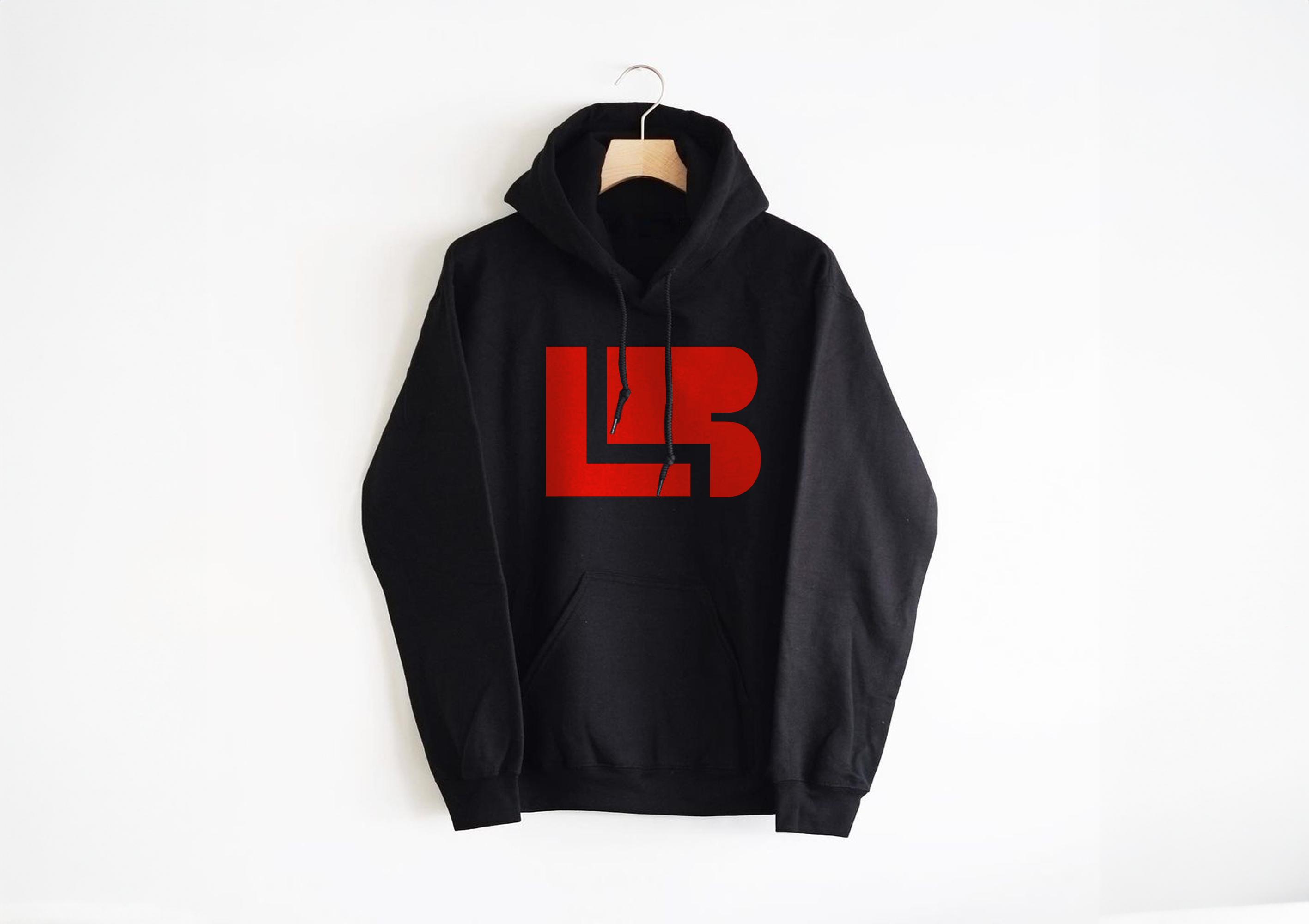
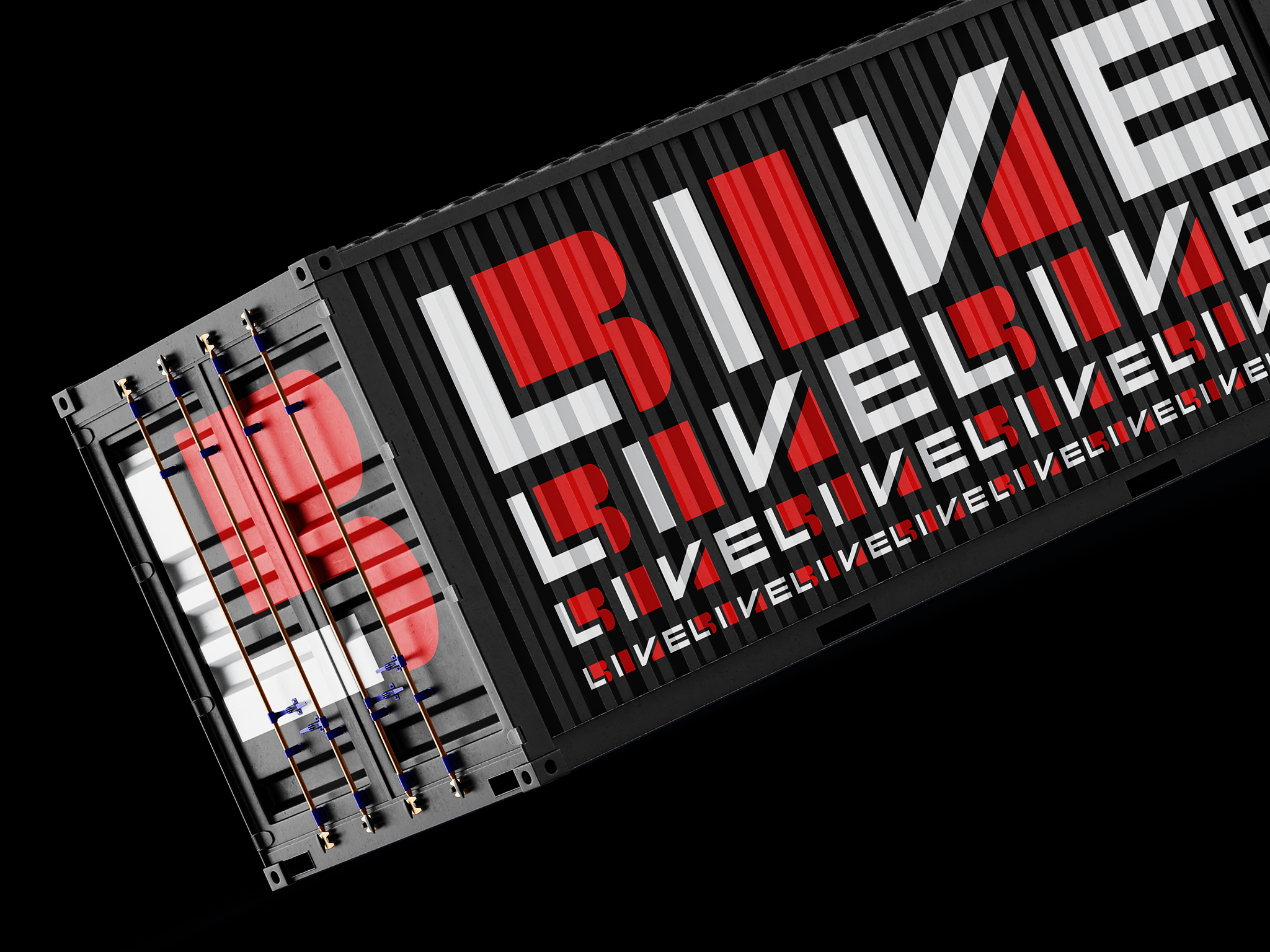
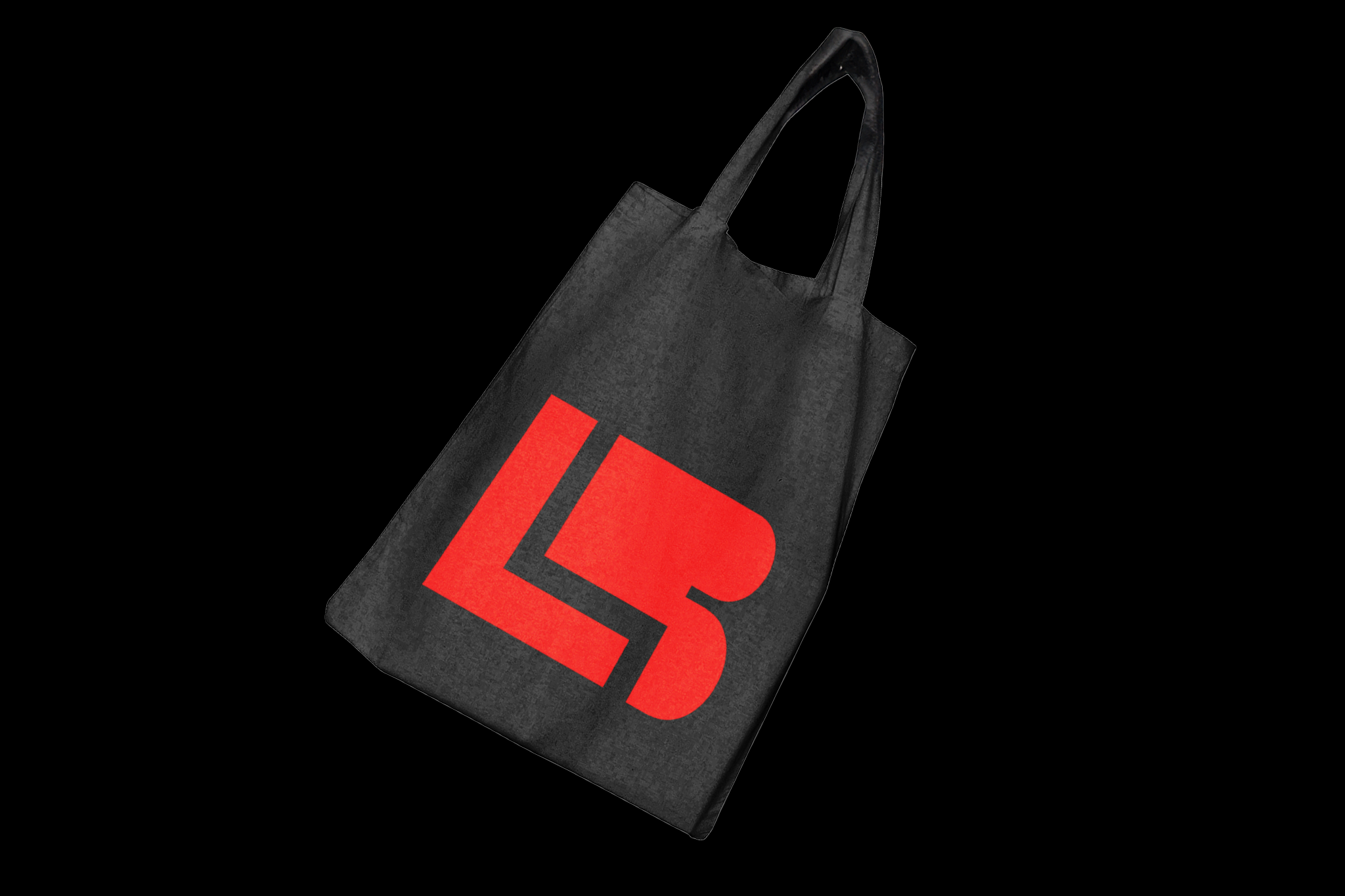
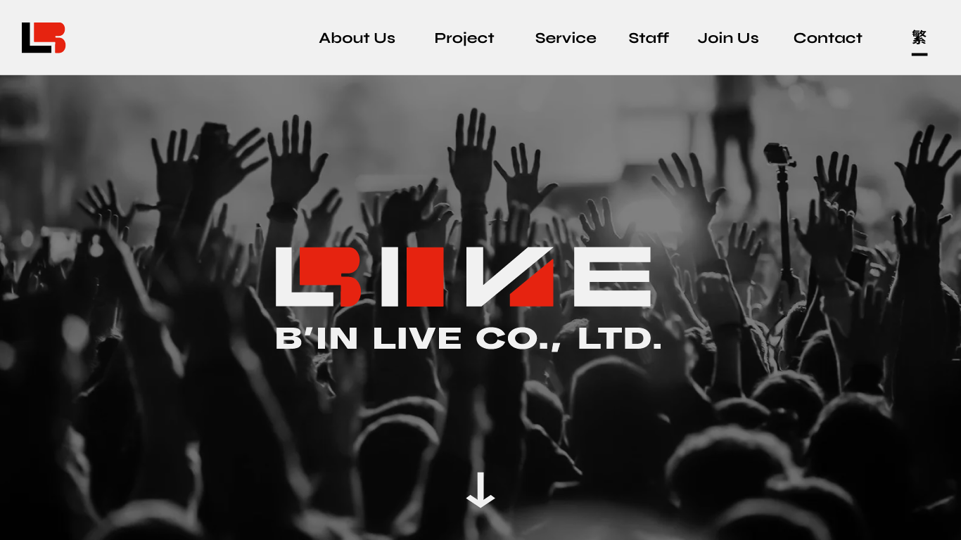
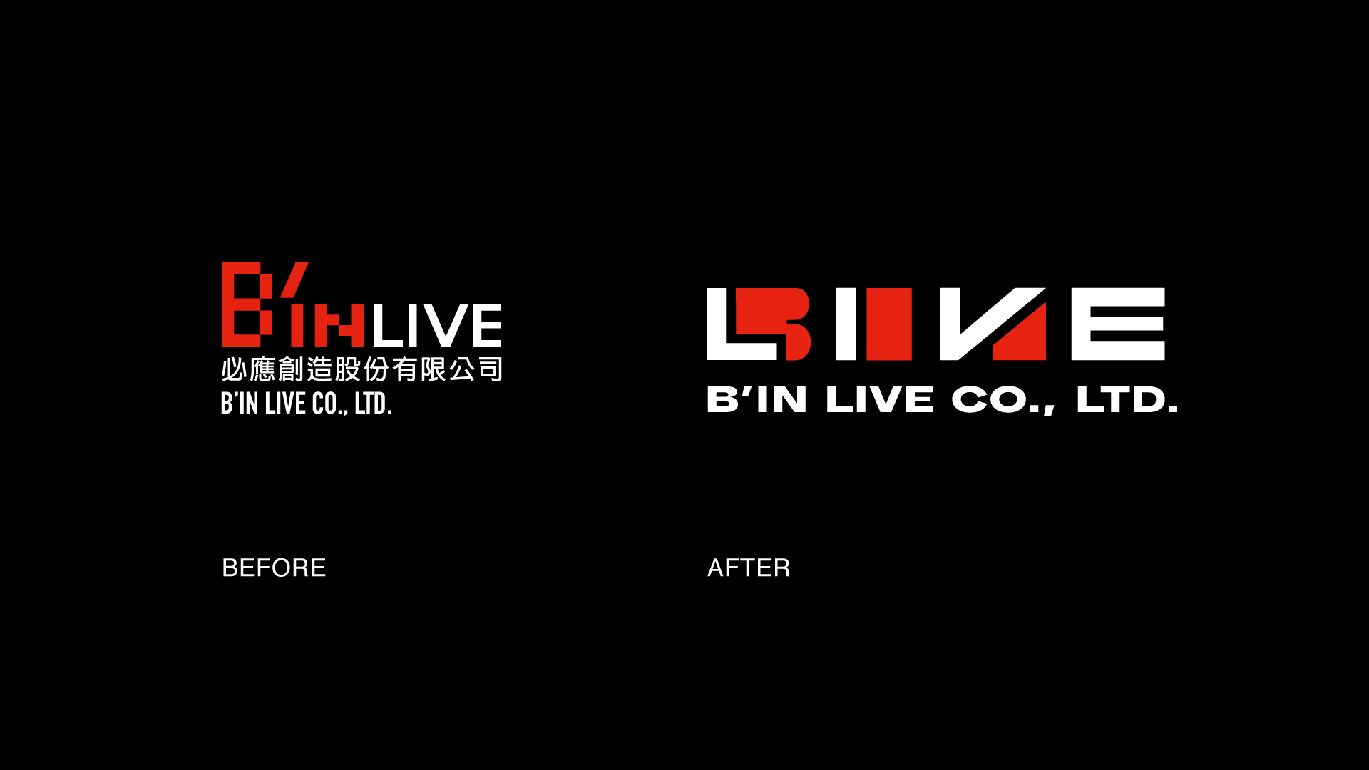
必應創造(B'in Live Co., Ltd.)是一家專業演唱會製作、發行等娛樂服務的公司。2025,因應 B’IN LIVE 創立十週年,依循戰略地圖的實施與成熟,公司適合一個嶄新且更加國際的品牌塑造方向,於是我託進行品牌塑造與識別設計。我們對於「必應」的精神與價值給出了一種新提案,為娛樂與表演搭建橋樑,用產生的化學效應的精神將各方資源媒合,將各界資源視為「無限可能的組合」。為此,我們沿用文字的 「B’IN LIVE」 並轉化為圖標的 「B’IN」 與 「LIVE」 字樣,以兩種不同的顏色組合,以大塊狀的筆畫嵌合出圖標的外輪廓,並以可以翻轉、組合的前後呼應隱喻「組合」的可能,僅有同時出現時才完整可讀,發展出一系列屬於必應創造的識別系統。
B'in Live Co., Ltd. is a leading entertainment company specialising in concert production and distribution. In 2025, celebrating its 10th anniversary and strategic growth, the company initiated a rebranding project with a global focus, commissioning me to develop its brand identity The new concept redefines B'in Live as a connector of entertainment and performance, harnessing synergy to merge diverse resources into limitless possibilities. We transformed the original “B’IN LIVE” logotype into a modular emblem, separating “B’IN” and “LIVE” into distinct elements with contrasting colours. Bold, interlocking strokes form the visual outline, symbolising combination and unity, readable only when both elements come together. This concept establishes a dynamic, versatile visual identity system that reflects the brand’s evolving vision.
B'in Live Co., Ltd. is a leading entertainment company specialising in concert production and distribution. In 2025, celebrating its 10th anniversary and strategic growth, the company initiated a rebranding project with a global focus, commissioning me to develop its brand identity The new concept redefines B'in Live as a connector of entertainment and performance, harnessing synergy to merge diverse resources into limitless possibilities. We transformed the original “B’IN LIVE” logotype into a modular emblem, separating “B’IN” and “LIVE” into distinct elements with contrasting colours. Bold, interlocking strokes form the visual outline, symbolising combination and unity, readable only when both elements come together. This concept establishes a dynamic, versatile visual identity system that reflects the brand’s evolving vision.


Full Credit ::
Client: B’IN LIVE Co., ltd.
Art Director: Ting-An Ho
Design: Ting-An Ho
Year: 2025
Related Projects:
