Name the Tree ::
專案詳述 Case StudyType Exhibition
Client College of Design, USC
Supervisor Dai Fujiwara
Design Ting-An Ho
Year 2013
Client College of Design, USC
Supervisor Dai Fujiwara
Design Ting-An Ho
Year 2013
類別 展覽識別
客戶 實踐大學設計學院
主辦 藤原大
設計 何庭安
年份 2013
客戶 實踐大學設計學院
主辦 藤原大
設計 何庭安
年份 2013
Info 專案背景
Keynote Lecture by Prof. Dai Fujiwara
(former Creative Director of Issey Miyake) The exhibition theme is, “NAME THE TREE.” This project focuses on the trees that grow in towns where people live. The purpose of this project is to create new value with the people of the world including myself, by heightening our awareness of these often overlooked trees and applying roles to natural objects around us
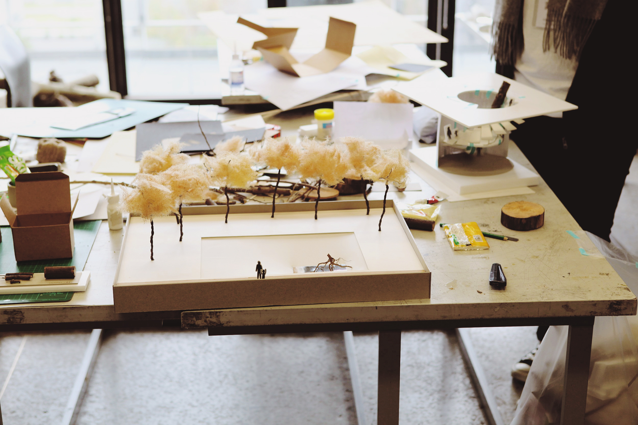
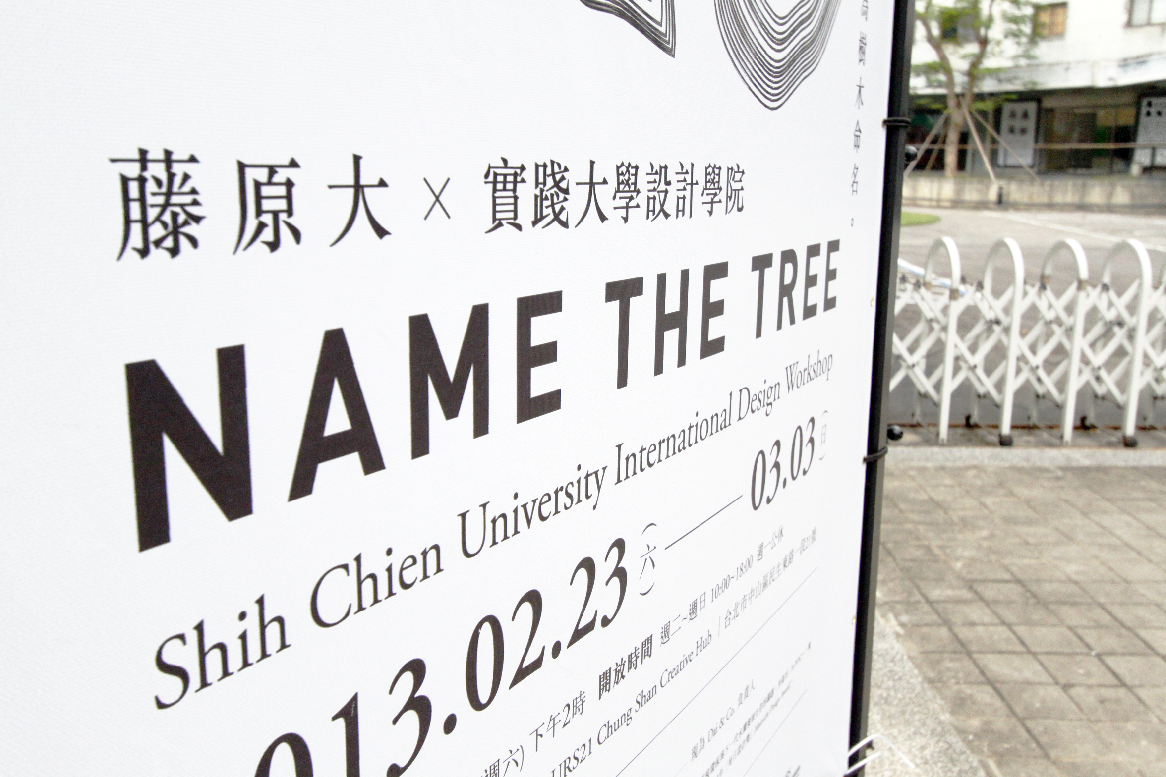
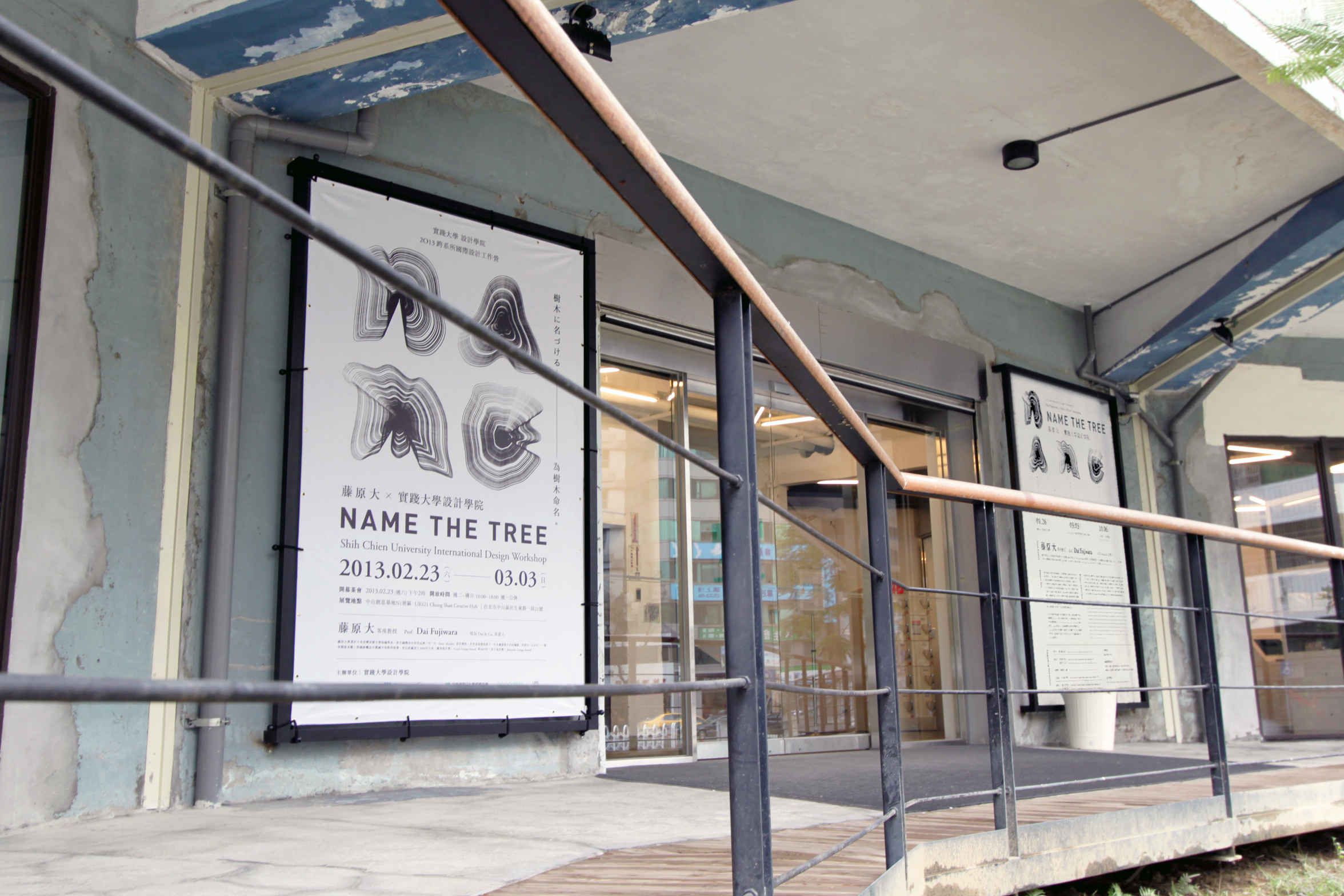
2012年末,前三宅一生設計總監藤原大前往台北,進行了設計專案「為樹木命名」,透過深入認識解析日常生活環境的樹木,研究其背景歷史,為其命名/引介大眾認知,強化研究者對周遭生活物件的細膩觀察,擴展至其專領域,並邀請了數十位橫跨媒體傳達、建築、服裝,以及工業設計的菁英學生,預定在台北、東京皆舉辦展覽。該年我受託為此巡迴展策畫視覺形象(Visual Identity)。
(former Creative Director of Issey Miyake) The exhibition theme is, “NAME THE TREE.” This project focuses on the trees that grow in towns where people live. The purpose of this project is to create new value with the people of the world including myself, by heightening our awareness of these often overlooked trees and applying roles to natural objects around us
2012年末,前三宅一生設計總監藤原大前往台北,進行了設計專案「為樹木命名」,透過深入認識解析日常生活環境的樹木,研究其背景歷史,為其命名/引介大眾認知,強化研究者對周遭生活物件的細膩觀察,擴展至其專領域,並邀請了數十位橫跨媒體傳達、建築、服裝,以及工業設計的菁英學生,預定在台北、東京皆舉辦展覽。該年我受託為此巡迴展策畫視覺形象(Visual Identity)。
Design Concept 設計概念
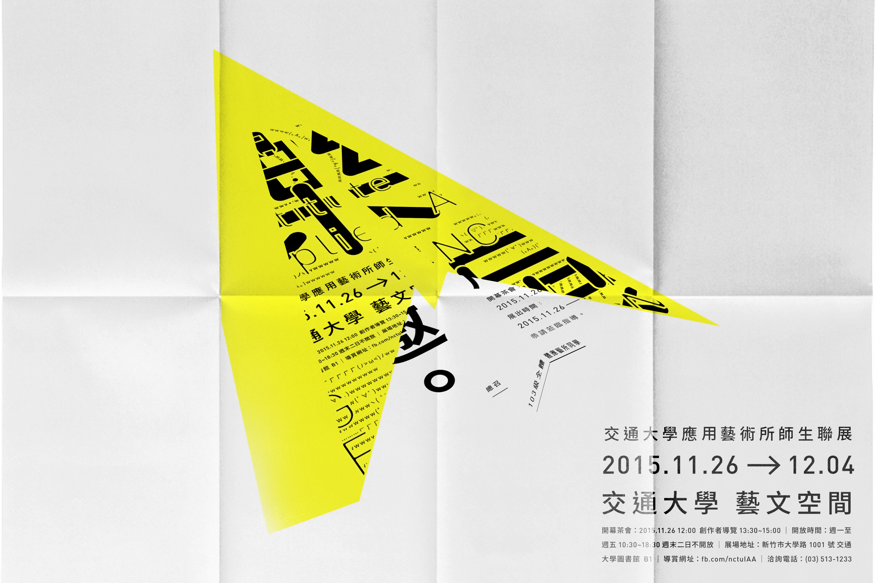
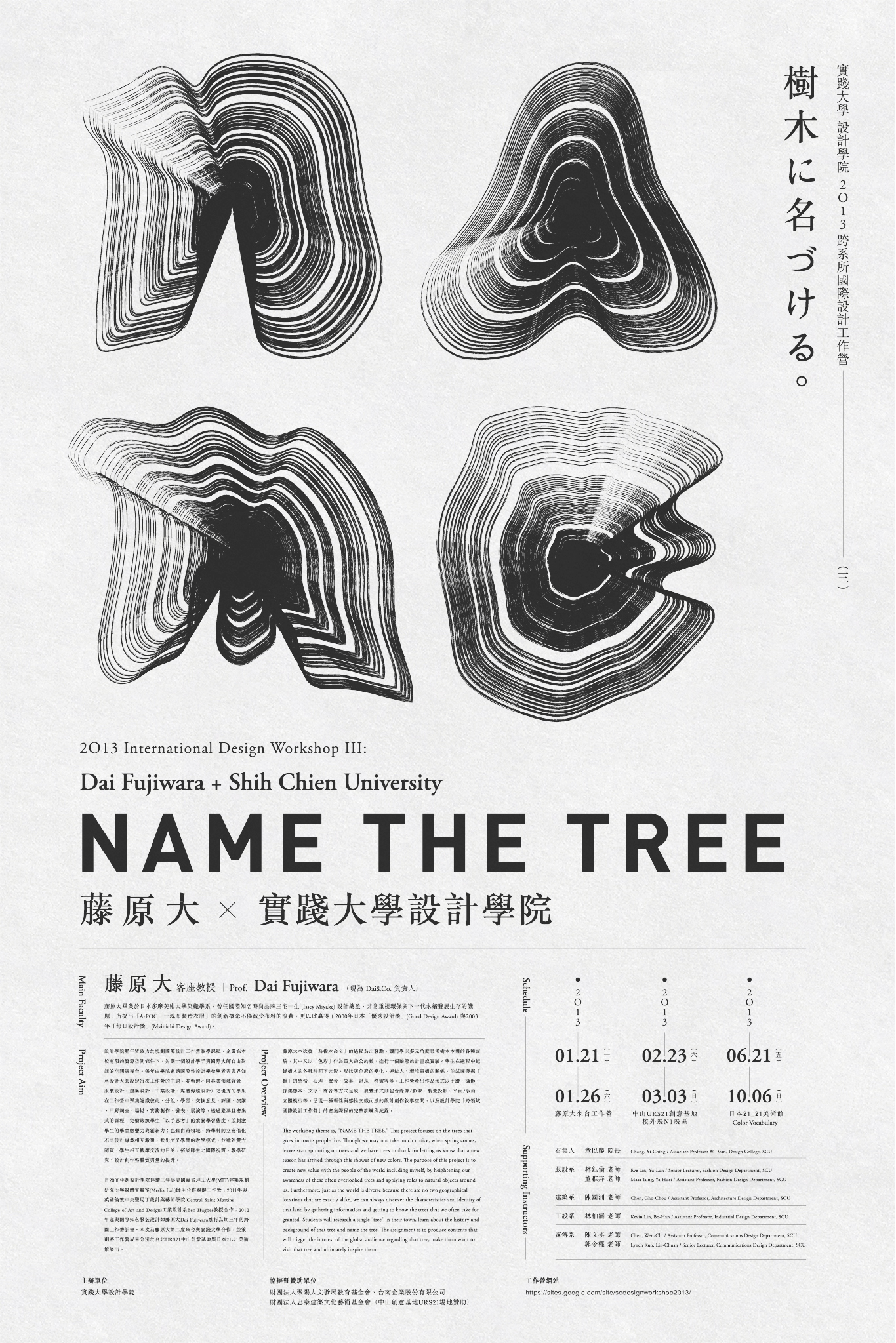
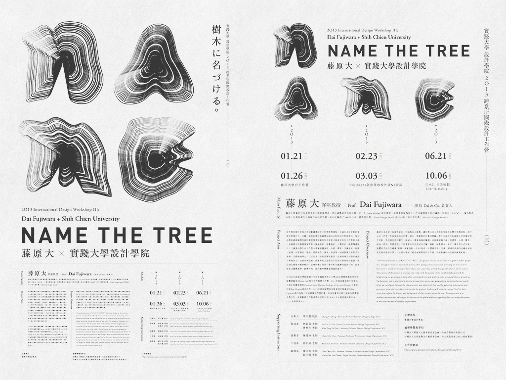
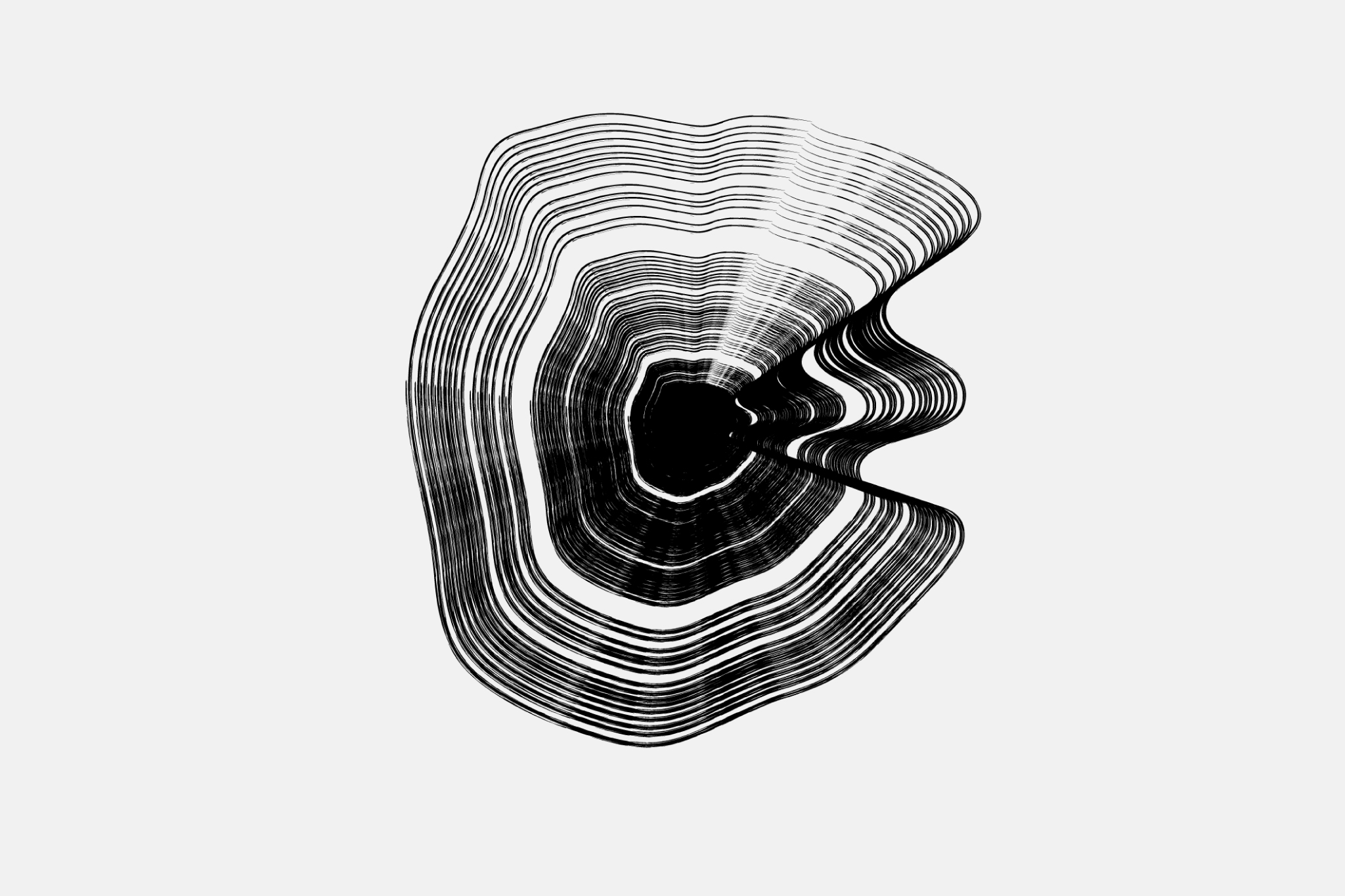
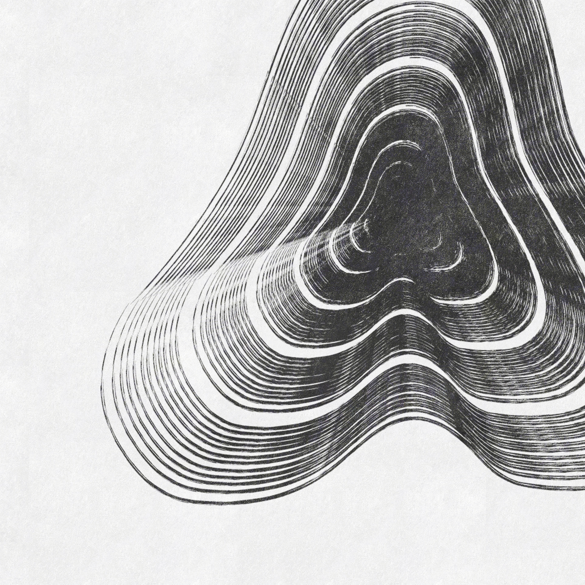
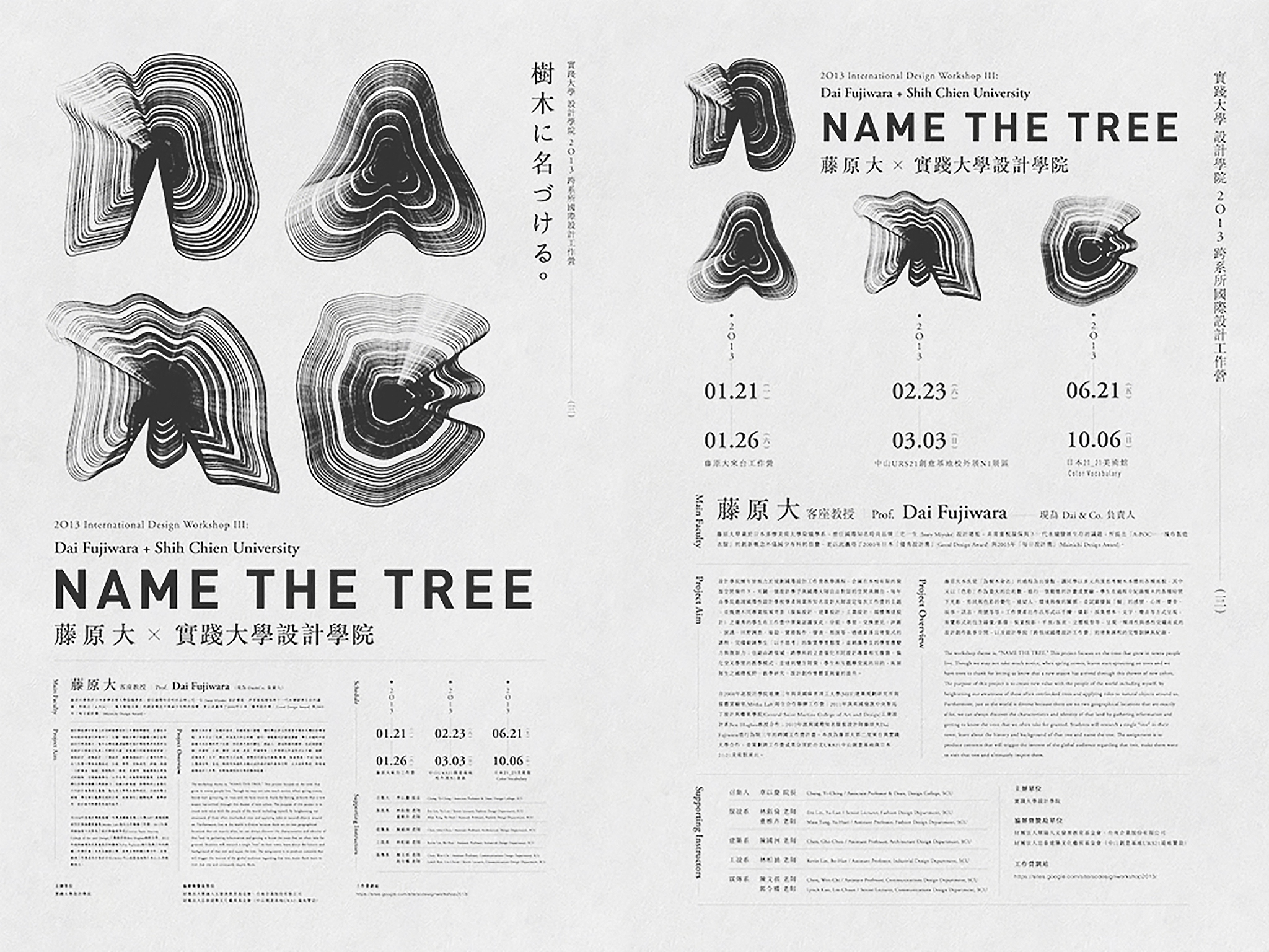
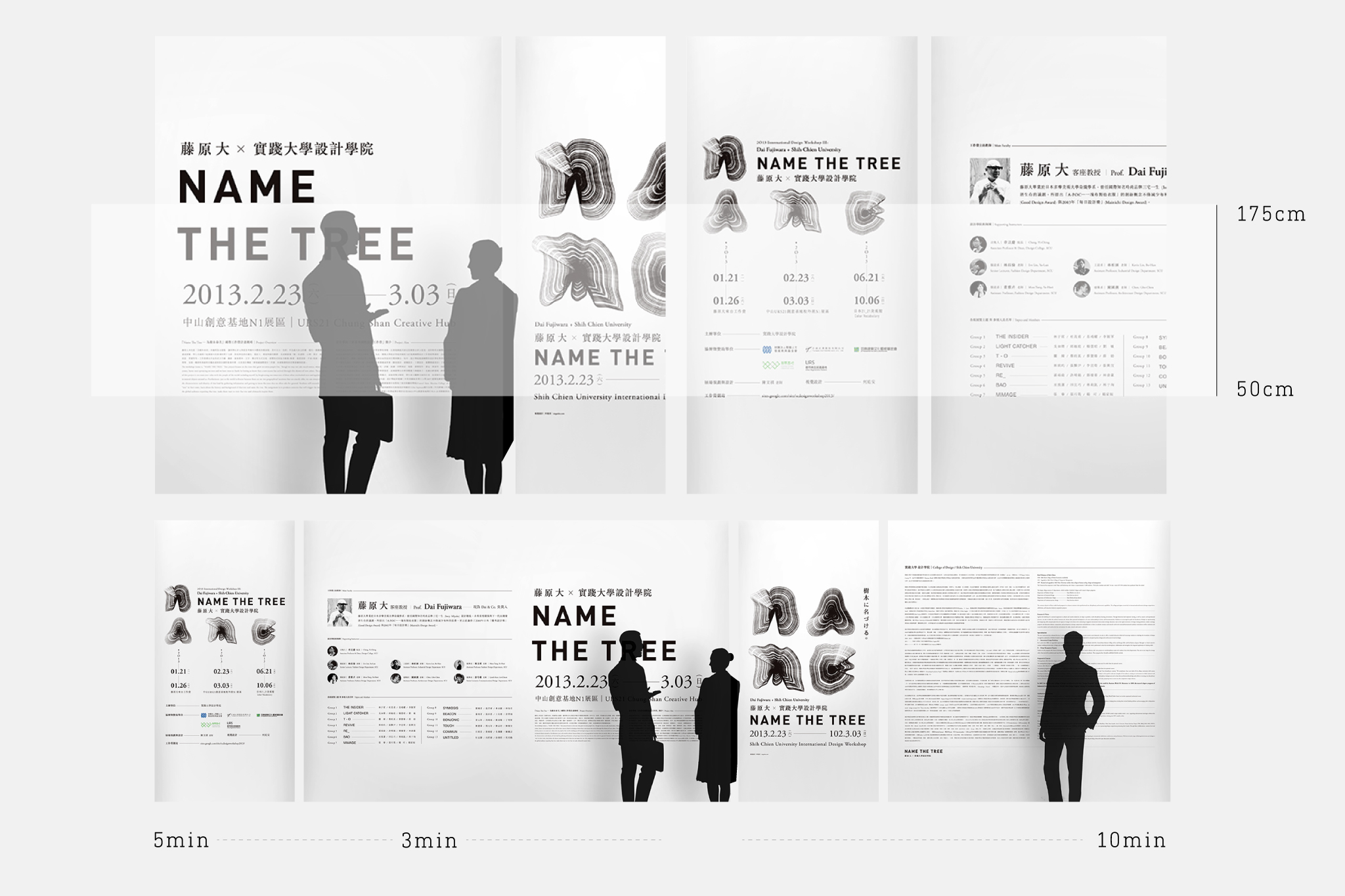
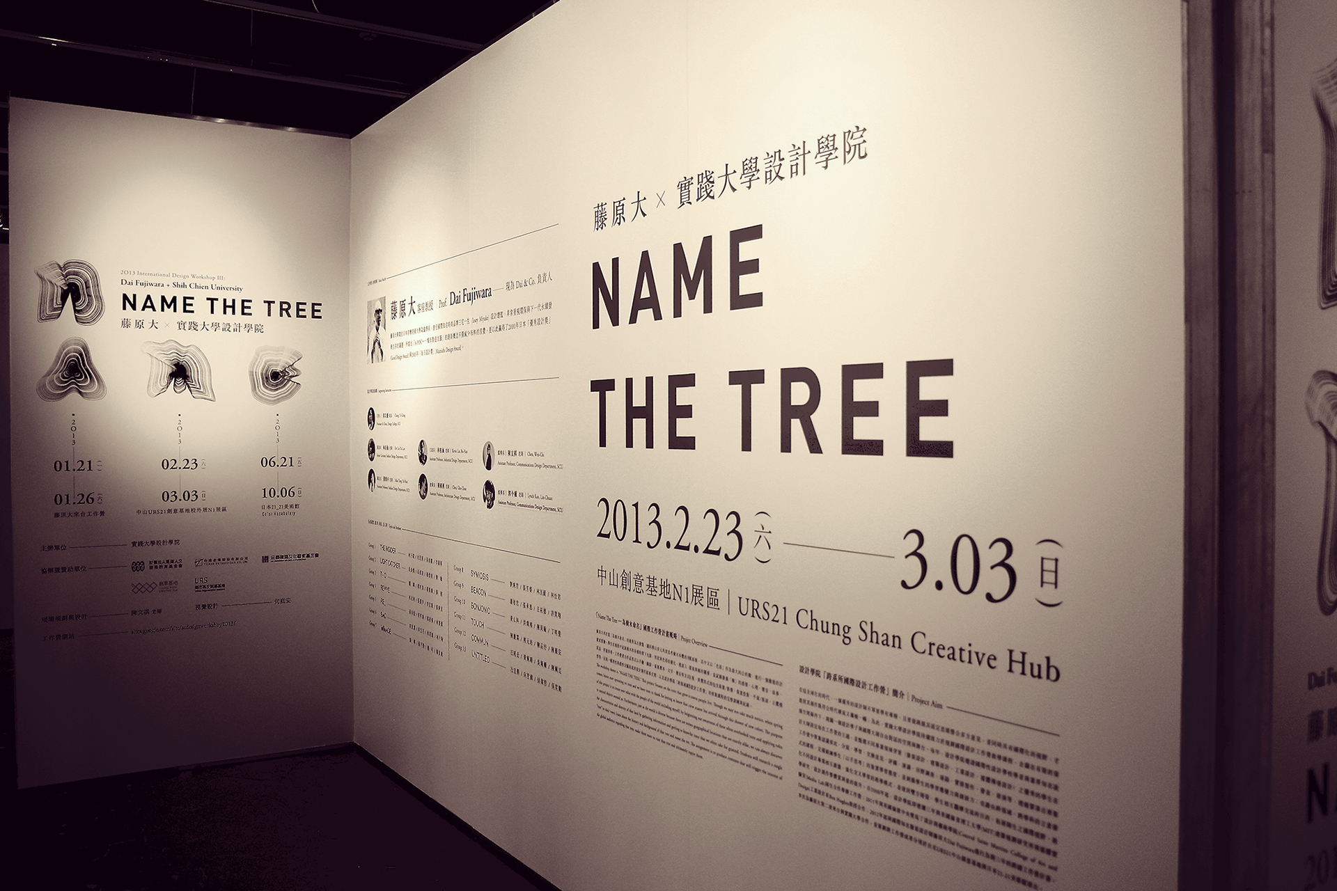
The concept of the design is to confuse people's eyes, make them wonder if the graphic is a typeface or some shapes of the tree rings. The style of poster are also deliberately laid out to be like a encyclopedia, and as well close to both the Taiwanese and Japanese graphic designing style.
In order to reflect the rich academic achievements, the main wall focuses on the creation of the discussion, excluding fancy and unnecessary symbols or colors, simply to lines and text constitute the visual exhibition, While maintaining the rigor of the research part of the exhibition.
由於展覽訊息量龐大、細項繁雜,因此視覺開發階段務求迅速,連同發想、提案,至印刷並順利開展,只有兩周的準備時間。考量到展覽的主要客群跨越台灣與日本,並將於台北中山創意基地、東京 21_21 美術館等地展出,我認為需要準備一個意念明確、概念清晰,而且得以讓不同國家的群眾都能輕易閱讀的主視覺,因此取展覽名稱中的「NAME」為主文案,融合樹木的「年輪」意象,並以此作為展覽標準字,並在視覺風格上亦緊抓住日本與台灣二地的設計脈動,編排方式同時整合兩地的閱讀習性。


Space Arrangement 展場微調
The main goal of all the walls is "smooth reading", so including reading line, height, distance, individual paragraph's reading time, and local light, all have made adjustments to guide the audience into the right rhythm.
Finally, thanks to the outstanding project management and curator, in the highly efficient time schedule, we still keep a lot of surplus state of the opening ceremony, and successfully held a multi-national tour planning exhibition.
展場設計階段,考量到此次展覽內容為學術成果展,因此為體現其豐碩的研究過程,主牆面部分著重於創作論述表現,不添加任何花俏或不必要的符號或色彩,並單以線條與文字構築展覽視覺,同時維持展覽研究部分的嚴謹;由於所有牆面都以「順暢閱讀」為主要目標,因此包含閱讀動線、可視高度、站位距離、個別牆面的閱讀時間、重點局部光等,都特別做了調整,以此引導觀眾在觀賞展覽時的節奏。最終,有賴傑出的專案管理與策展人,在高效率的時間排程下,以最完整的狀態開幕展出,並順利於多國舉辦巡迴企劃展。


Press
Etapes
MyDesy
Typography Served
Chromatic Watch
Awards
Outstanding Chinese Typography Award - Winner
Asia Pacific Design Award - in Book
ADC Young Gun Designer Award - Winner
Publications
IdN
+81
Type Plus
Type Player 3
Design 360°
Computer Arts
Asia-Pacific Design
Related Projects: