"LE" Group Exhibition
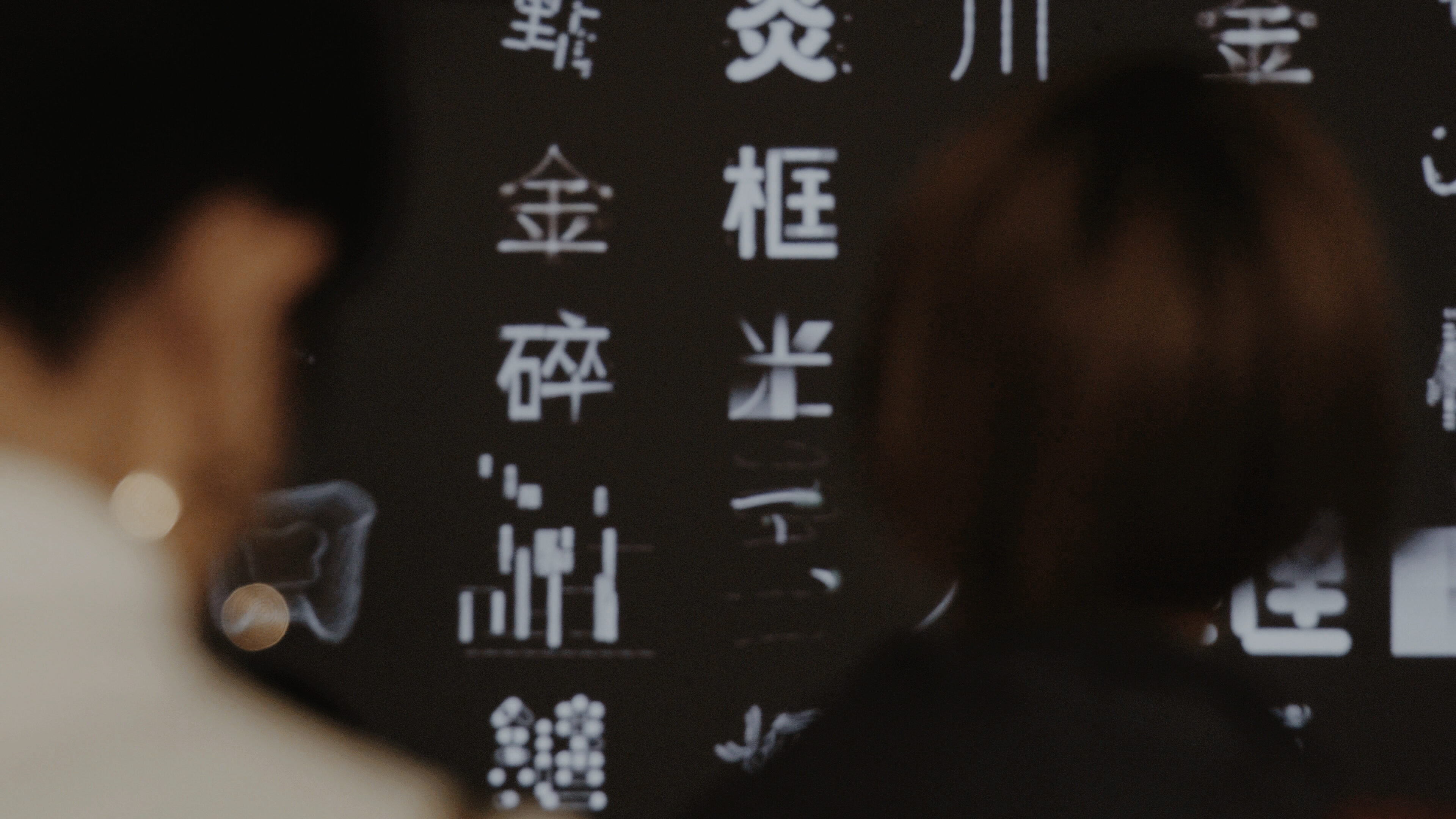
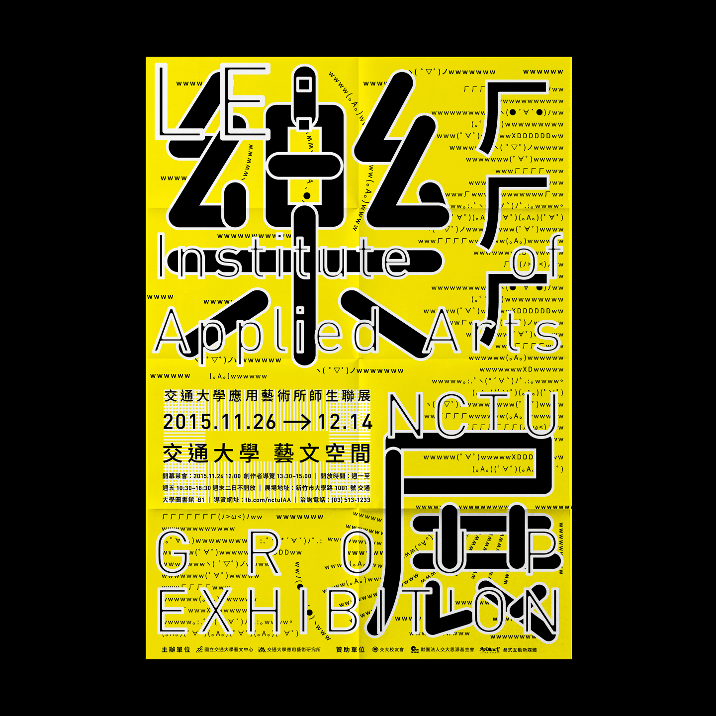
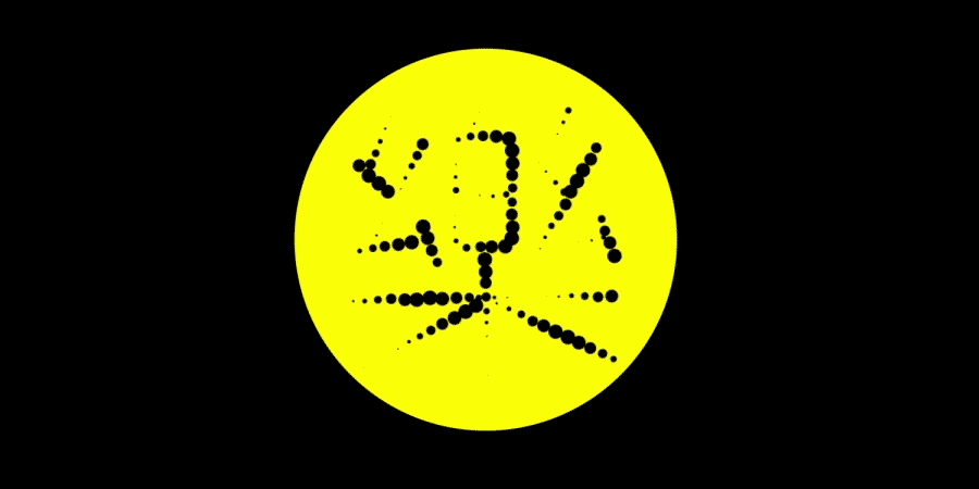
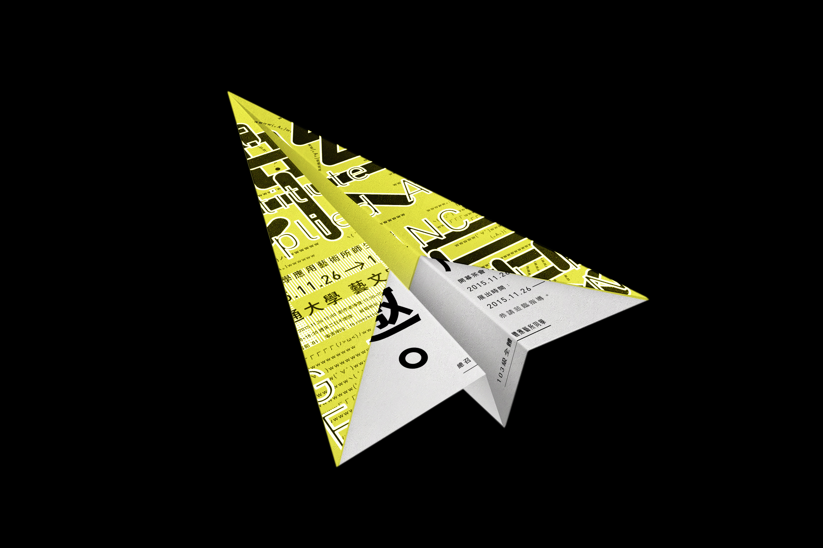
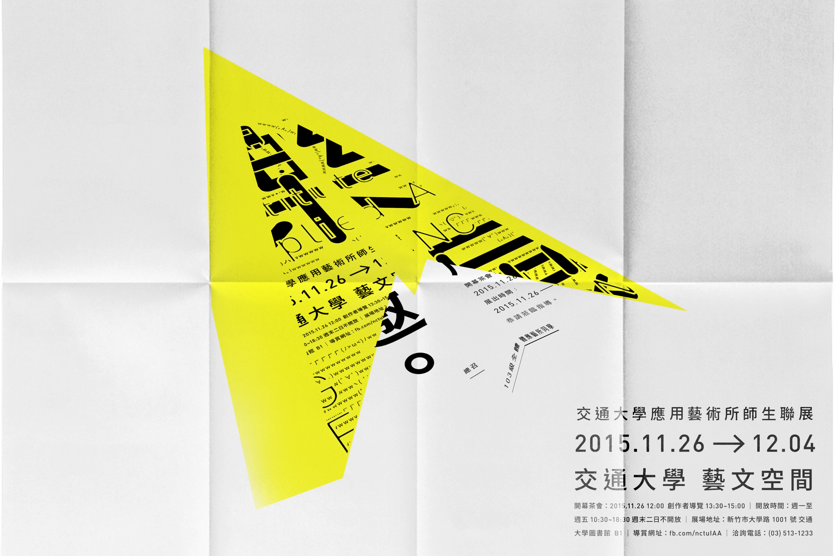
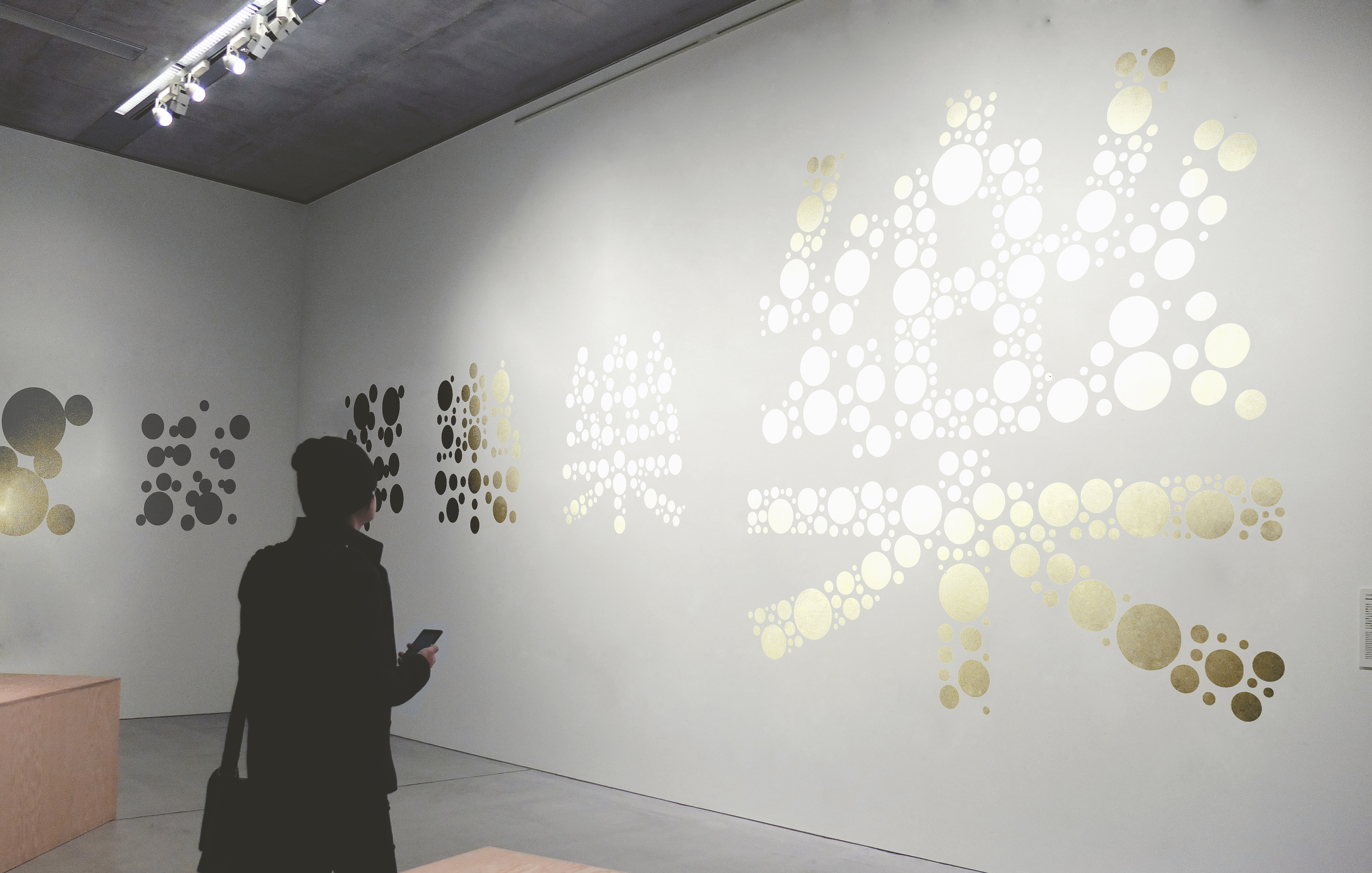
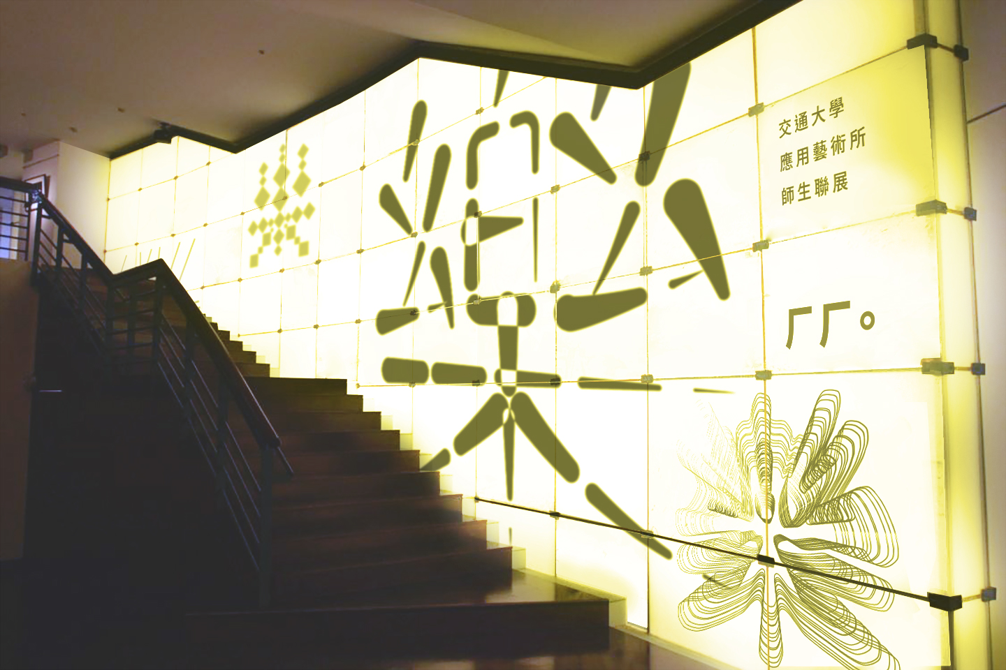
For a group show at the Institute of Applied Arts at NCTU, we created the identity to sit alongside the exhibition. Taking on a palette of black and yellow it makes a punchy impact but is softened by the use of white on the reverse of materials and outlined letters. The series of posters stand out as the same character is manipulated into different styles from hand-drawn type to more graphic and illustrative interpretations to create multiple iterations. This cacophony of approaches alludes to the different work that’s on show but still intrigues the viewer. Echoing the idea of change is the set of invites that have been designed with fold lines already in place to encourage the viewer to play with invite’s physical form and turn it into a paper plane. It’s a playful touch and helps towards making the initial glare of the identity less brash and more delicate.


Press
It's Nice That
Etapes
MyDesy
Design Everywhere
Student Show
Publications
+81
Type Hybrid
Los Logos
Exhibitions
ADC Young Guns Design Exhibition
30 Visual Designers in Taiwan
Chinese Characters Design Bennale Exhibition
Related Projects: