10th Tung-Min Award
專案詳述 Case Study
Type Event
Client SCCD
Design Ting-An Ho
Year 2012
Client SCCD
Design Ting-An Ho
Year 2012
類別 活動識別
客戶 實踐大學
設計 何庭安
年份 2012
客戶 實踐大學
設計 何庭安
年份 2012

Info 設計背景
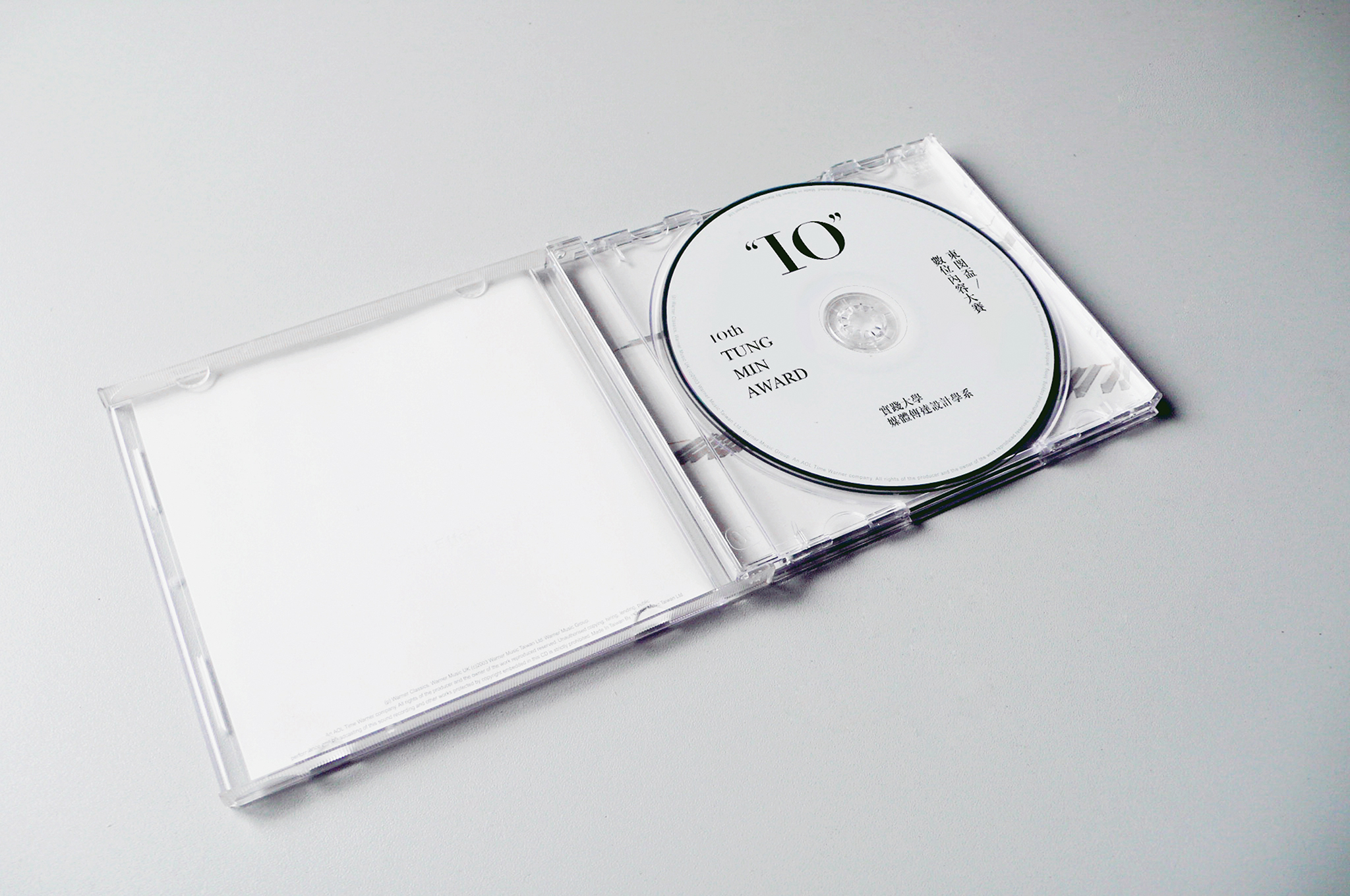
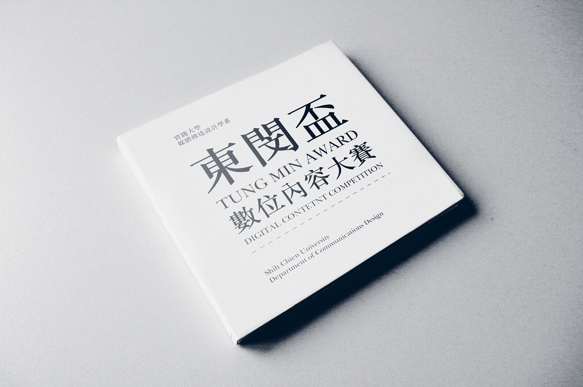
Tung-Min Award is a digital content competition organized by Shih Chien University, college of design, including animations, digital arts and new media works. In 2012, the event also entered its 10th anniversary, I was entrusted to design its visual identity.
每年一度在實踐大學的設計學院,為紀念創校者謝東閔先生,由媒體傳達設計學系將舉辦以數位內容為主的設計大賽,並接受全國的學生餐與報名。此賽為鼓勵數位內容創作者、提升創作風氣,競賽內容包含動畫、互動、新媒體等領域。2012 年,此賽進入重點十周年,我受委託為此競賽設計活動主視覺。
每年一度在實踐大學的設計學院,為紀念創校者謝東閔先生,由媒體傳達設計學系將舉辦以數位內容為主的設計大賽,並接受全國的學生餐與報名。此賽為鼓勵數位內容創作者、提升創作風氣,競賽內容包含動畫、互動、新媒體等領域。2012 年,此賽進入重點十周年,我受委託為此競賽設計活動主視覺。
Design Concept 設計概念
In view of the 10th anniversary of this tournament, I think it's time to make this award step into a national representative game. The past few sessions of the award mostly using random number, coding and digital visualization for the main visual identity. We need a declaration of the classic image, and set a grand ceremony for the tenth anniversary of this game.
有鑑於此賽逢十周年,我認為此時是自尚為年輕的競賽進入帶有歷史意義的階段;過去幾屆的活動視覺多半以數位符碼、亂數演算的數碼化視覺為主,此時正好需要一個宣告性的經典形象,並為此訂下十周年的隆重格調,區分此屆前後的風格。
為求隆重而不過度嚴肅,流程首先從字體選擇出發;在典雅的襯線體中,挑選出略帶時尚氣息的歐文字體,並以此作為形象基調。在斟酌重點文案階段,由於「東閔盃」一詞在過去幾屆多有運用,識別性已經足夠,因此將重點文案放在「10周年」與「數位」二者上;活動形象與標準字以此二詞組合,誕生出專屬於此屆的活動標誌。
有鑑於此賽逢十周年,我認為此時是自尚為年輕的競賽進入帶有歷史意義的階段;過去幾屆的活動視覺多半以數位符碼、亂數演算的數碼化視覺為主,此時正好需要一個宣告性的經典形象,並為此訂下十周年的隆重格調,區分此屆前後的風格。
為求隆重而不過度嚴肅,流程首先從字體選擇出發;在典雅的襯線體中,挑選出略帶時尚氣息的歐文字體,並以此作為形象基調。在斟酌重點文案階段,由於「東閔盃」一詞在過去幾屆多有運用,識別性已經足夠,因此將重點文案放在「10周年」與「數位」二者上;活動形象與標準字以此二詞組合,誕生出專屬於此屆的活動標誌。


Visual System 視覺系統
隨著主視覺概念順利生成,相應的配套與透過襯線字體組合而成的圖像表現,藉一系列歐文符號與明體字的編排,堆砌出獨屬於十週年款式的識別象徵,並貫穿整套活動識別的視覺周邊。


除了傳達經典十周年以外,在其他應用層面也盡量減少化設計的「個性」,因此用色系統極為限制,盡量以白底黑字為主,除去無相干的裝飾線條,在字體與構成的經典雅致之餘,透過嚴謹的版面構成,使整體視覺仍能緊貼於現代與簡約,並開拓另一種數位審美的視野。


Full Credits:
Type: Event Identity
Client: Shih Chien University, College of Design
Design: Ting-An Ho
Project Manager: I-Hsiang Chang
Year: 2012
Press
Mydesy
Behance Featured
Related Projects: